

The Situation and What Was Actually on the Line
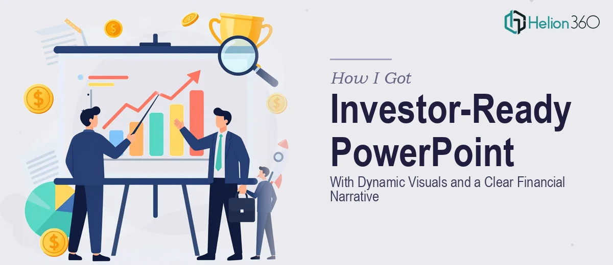
I had just launched my e-commerce business and needed to show up at networking events looking like I had it together. That meant a presentation slide deck that could do real work in the room — not just something with a logo on a white background, but a deck that communicated my brand, my numbers, and my story clearly enough that a potential investor or partner would take me seriously after five minutes.
The stakes were straightforward: first impressions in early-stage business conversations are almost impossible to recover from. A cluttered, inconsistent, or visually amateur deck signals that the business behind it might be the same. I also needed the deck ready within two weeks — there was a networking event on the calendar and I wasn't going to show up underprepared.
As soon as I started thinking through what a properly built investor-ready PowerPoint presentation actually required, it became obvious this wasn't something to wing.
What I Found the Solution Actually Required
I spent some time researching what separates a presentation that gets traction from one that gets politely set aside. The gap is larger than most people expect.
The first signal of real complexity was the financial narrative layer. An investor-ready deck isn't just slides with bullet points — it needs data visualized in a way that tells a directional story. Revenue projections, unit economics, market sizing — each of those requires a chart type chosen deliberately, with a visual hierarchy that guides the eye to the right conclusion without the presenter having to narrate every number.
The second signal was brand consistency at scale. Across 15 to 20 slides, every font size, color, spacing rule, and icon style needs to hold. One slide with a slightly different shade of blue or an inconsistent heading weight breaks the professional impression immediately — and it happens more easily than people expect when building in PowerPoint without a properly locked slide master.
The third signal was structural logic. The story arc of a networking or investor deck follows a specific sequence — problem, solution, market, traction, ask — and each slide needs to earn its place. Deciding what to cut, what to combine, and how to sequence the narrative is editorial work that requires knowing how these audiences process information.
What Building This Presentation Well Actually Involves
The structural and narrative work comes first and is harder than it looks. A proper deck audit starts by mapping every piece of content the founder has — brand materials, product details, financial projections — against a proven slide architecture. For an investor-facing deck, the standard sequence runs roughly 10 to 14 slides covering problem, solution, market size, business model, traction, team, and the ask. Deciding what belongs in each slot, what gets cut entirely, and how to keep each slide to a single clear idea is editorial judgment that takes experience. Founders who draft this themselves often end up with slides that are simultaneously over-packed and under-argued.
The visual mechanics layer is where most DIY attempts fall apart visibly. A well-built presentation runs on a 12-column layout grid with consistent margin rules — typically 40 to 60pt on all sides — and a three-level type hierarchy: 36pt for slide titles, 24pt for primary body, 16pt for supporting callouts. Chart selection follows clear rules: waterfall charts for financial bridges, grouped bar charts for comparisons, single-metric stat cards for KPI callouts. Getting these right in PowerPoint means working inside a properly structured slide master, not adjusting individual slides by hand. Building and propagating that master correctly is a multi-hour task for someone who hasn't done it dozens of times.
Polish and brand consistency across the full deck is the final layer — and the one that separates a deck that looks like a real company from one that looks assembled. That means a locked palette of no more than four brand colors applied with discipline, icon sets sourced from a single style family, photo treatments that match in tone and crop ratio, and spacing rules that hold on every single slide. The friction here is cumulative: a 20-slide deck has hundreds of individual design decisions, and inconsistency in any of them is visible to a trained eye. Without a systematic approach — working from masters and templates rather than slide-by-slide — the review and correction cycle alone can consume a full day.
Why I Brought in Helion360 to Handle It
Once I understood what a properly built investor-ready PowerPoint presentation actually required, the decision was immediate. I didn't have the design tooling, the slide master expertise, or the two-plus weeks it would have taken me to learn and execute this at the level the audience deserved.
Helion360 handled the full project end-to-end and delivered fast — the complete deck was turned around well within my two-week window. They took the raw content I provided, built the narrative architecture from scratch, applied a visual system across every slide, and handled the financial data visualization so that the numbers told a clear directional story without needing to be explained out loud.
What made it work was that they already had the process, the tooling, and the pattern recognition for exactly this kind of deck. There was no learning curve on their end — just execution at the level the project needed.
What I'd Tell Anyone Looking at the Same Problem
The deck that came back was the kind of presentation I couldn't have built myself in the time available — visually consistent, narratively tight, and credible enough to open real conversations at the event. The financial slides in particular held up under questions because the visuals made the story legible at a glance.
If you're preparing for investor conversations or networking events and you're looking at the same gap I saw — content that needs to become a presentation that actually performs — the smart move is to engage a team that does this work all day rather than learning it yourself under deadline pressure.
If you're in that spot and want it handled end-to-end without the weeks of learning curve, Helion360 is the team I'd engage — they delivered for me fast and brought exactly the execution depth this kind of presentation requires.