

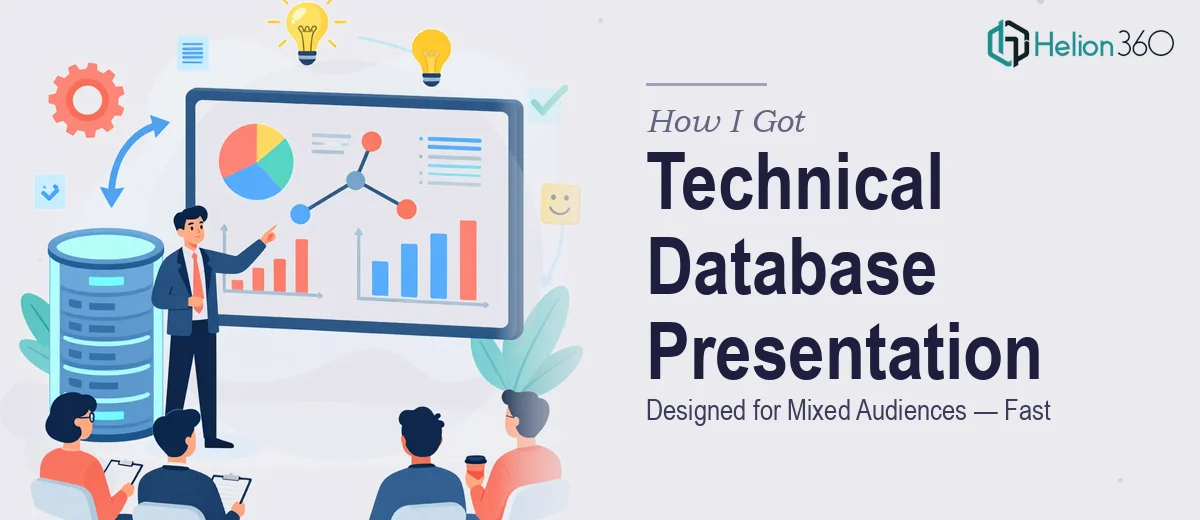
The Situation: A Technical Topic, a Room Full of Different People
I had a database architecture review coming up — the kind of meeting where the same slides need to land with senior engineers, product managers, and a few executives who care about outcomes, not schema. The presentation covered SQL database structure, query logic, and system dependencies. In the wrong format, it would lose half the room before slide five.
What was at stake was real. This wasn't an internal tech sync — decisions about infrastructure investment and roadmap sequencing were going to be made off the back of this material. A confusing or visually cluttered presentation would undermine the credibility of the work itself. I knew immediately that getting the design right wasn't optional, and that doing it well was going to require more than reformatting some notes into slides.
What I Found the Solution Actually Required
Once I started thinking seriously about what a well-designed database presentation looks like for a mixed audience, the complexity became obvious fast.
The first signal was the layering problem. Technical audiences want specificity — table relationships, data flow logic, entity dependencies. Non-technical audiences need those same concepts communicated through analogy, clean diagrams, and outcome framing. A single slide has to carry both without dumbing down or overwhelming. That's a structural problem before it's a visual one.
The second signal was the diagram work. Entity-relationship diagrams, data flow visuals, and query logic illustrations don't translate cleanly from database tools into presentation software. They need to be rebuilt from scratch in a way that reads at presentation scale — legible at a glance, annotated for context, and visually consistent with the rest of the deck.
The third signal was tone consistency. The presentation had to feel authoritative without feeling academic. Every slide needed to reinforce the same visual language — the same grid, the same type hierarchy, the same treatment for technical callouts versus narrative framing. That kind of consistency across 25 or 30 slides is not something that happens by accident.
What the Work Actually Involves
What Doing This Well Actually Involves
The work starts with narrative architecture — mapping the story before a single slide is built. For a mixed-audience technical presentation, this means auditing every piece of source content and sorting it into layers: what the executive needs to understand in the first 90 seconds, what the technical lead needs to verify in the detail slides, and what the product manager needs to see in terms of system impact. A clear content hierarchy — three to four narrative beats, each with a defined purpose — has to be established before any visual decisions are made. This structural work is where most self-built decks fail, because it's easy to skip when you're under deadline pressure and just want slides done.
Visual mechanics for a database presentation are a discipline of their own. A 12-column layout grid is standard practice for keeping diagram slides and text slides visually coherent across a long deck. Type hierarchies — typically 36pt for slide titles, 24pt for primary content, 16pt for annotations — need to be set at the master slide level and held consistently. Entity-relationship diagrams, if they're being rebuilt for presentation use, need to be simplified to show relationships without showing raw schema syntax. Getting that balance right — enough technical detail to be credible, clean enough to read on a projected screen — takes experience with both database concepts and presentation layout.
Polish and consistency across a 25-to-30-slide deck is where execution friction compounds quickly. Maintaining a palette of four or fewer brand-aligned colors across diagram fills, callout boxes, and section dividers, while also ensuring every icon, arrow, and connector element is drawn from a single visual system, takes time and attention that most people don't have during a normal work week. Misaligned spacing between slides, inconsistent icon weights, or a single off-brand color in a diagram quietly erodes the professionalism of the whole deck. Catching and correcting those issues across every slide — not just the hero slides — is the last mile of the work and often the most time-consuming part.
Why I Brought in Helion360 to Handle It
I looked at what the work required and it was immediately clear that attempting it myself wasn't the right call. The combination of structural planning, technical diagram rebuilding, and full-deck polish consistency wasn't a one-evening project — and I didn't have the presentation design tooling or the pattern library to execute it at the standard the audience would expect.
Helion360 handled the full project end-to-end. That meant taking my raw source material — architecture notes, rough diagrams, and a content outline — and doing the narrative structuring, the master slide setup, the diagram rebuilds, and the consistency pass across every slide. They turned it around quickly — done in days, not weeks, and handled in a fraction of the time it would have taken me to learn and execute the diagram layer alone. The result was a presentation that read clearly at every level of the room: technically credible for the engineers, outcome-focused for the executives, and visually coherent throughout.
The Outcome and What I'd Tell Anyone in My Spot
What got delivered was a presentation that actually matched the quality of the underlying work. The database architecture came across clearly, the diagrams were readable on a projected screen, and the narrative structure meant every audience segment found their footing quickly. The meeting landed the way it needed to — decisions got made, and the material didn't get in the way.
If you're looking at a similar problem — a technical subject, a mixed room, and a deadline that doesn't leave room for a design learning curve — UI presentation graphics design is the service I'd engage. For related case studies, see how I handled high-impact graphics for PowerPoint presentations and application screen mockup presentations with the same level of execution depth this work genuinely needs.