

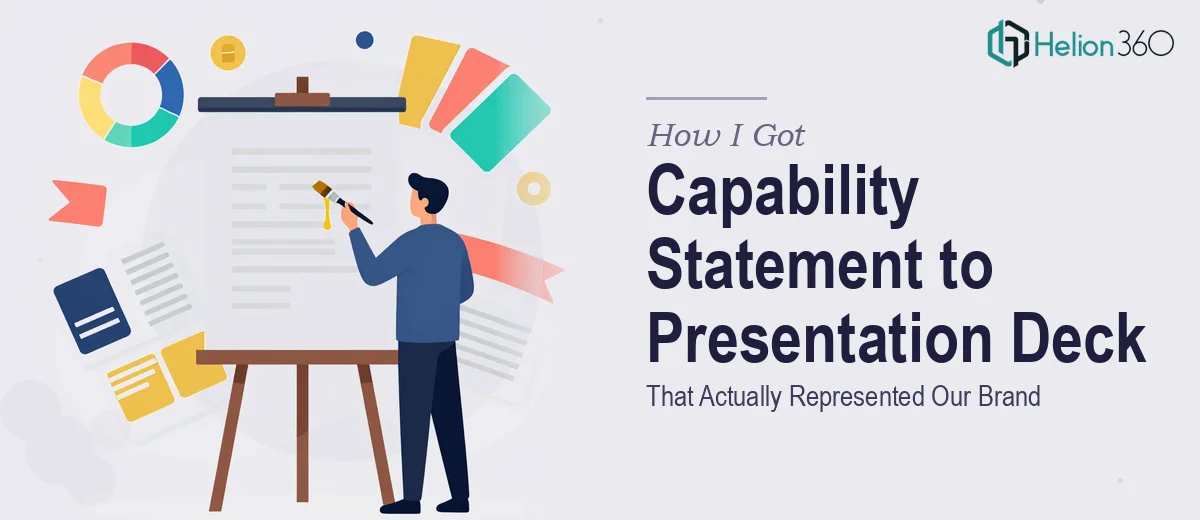
The Problem Was Bigger Than It Looked
We had a capability statement that had been working fine as a document. It covered what our business does, who we serve, and what makes us different. But we were heading into a stretch of client meetings and partner conversations where a static Word document wasn't going to cut it. We needed a presentation deck that could carry the same content — but visually, with impact, in a format that would hold a room.
The stakes were straightforward: these were conversations that mattered to the business. First impressions with potential clients and partners often hinge on how professional and coherent your materials look. A rough deck or a PDF that reads like it was formatted in an afternoon signals exactly the wrong thing. I knew this needed to be done properly — not just cleaned up, but genuinely designed from the ground up with the brand and the audience in mind.
What I Found a Proper Capability Deck Actually Requires
Once I started looking at what a well-executed capability presentation actually involves, it became clear this wasn't a formatting job. Done well, converting a capability statement into a presentation deck requires a complete rethink of how information is structured and delivered.
A document that works as prose doesn't automatically translate into slides. The right approach involves auditing every section of the source content, deciding what survives as text, what becomes a visual, and what needs to be cut entirely to keep the deck moving. That's a narrative restructuring exercise, not a copy-paste.
There were also visual mechanics to consider: consistent slide layouts, a typography hierarchy that guides the eye, and a color system that reflects the brand without becoming chaotic. And then there's the capability deck convention itself — these presentations follow audience expectations around how services, differentiators, and proof points are sequenced. Get that structure wrong and even a good-looking deck loses its persuasive power.
What the Work Itself Actually Involves
The first layer of work is structural and narrative. A capability statement typically contains dense paragraphs — company background, service lines, differentiators, past performance. Converting that into a deck means mapping each piece of content to a slide purpose: context slide, problem slide, services overview, proof point, and close. The practitioner's job here is to reduce without losing substance, which means editorial decisions on every line. A 12-slide deck covering a multi-service business requires that each slide earns its place. Skipping this audit and jumping straight into design produces a deck that looks designed but reads like a document — which defeats the whole exercise.
The second layer involves visual mechanics. Proper presentation layout work uses a defined column grid — typically 12 columns — so that every text block, icon, and image aligns predictably across all slides. Typography hierarchy follows strict rules: a title at 36pt, a subhead at 24pt, and body copy no smaller than 16pt for readability in a live presentation setting. Color application is limited to four brand colors maximum, with one dominant, one accent, and two neutrals. Setting these rules up correctly inside a master slide template — so every new slide inherits them automatically — is precise work that takes significant time for someone not fluent in presentation software at a structural level.
The third layer is polish and brand consistency across the full deck. This means every icon set matching in weight and style, every image treated with the same filter or crop ratio, every slide margin identical. A 20-slide capability deck has hundreds of individual design decisions that need to cohere. The friction here is cumulative: one misaligned element on slide 4 gets noticed on slide 14 when a sharp-eyed client spots the inconsistency. Achieving true consistency across a full deck requires a review pass that most people underestimate — it adds hours even for experienced designers.
Why I Brought in Helion360 to Handle It
When I mapped out what this actually involved — the narrative restructuring, the master slide setup, the full visual build, the consistency review — it was obvious that attempting it myself wasn't realistic. Not because the individual skills don't exist somewhere, but because doing all of it well, to a professional standard, inside the window we had, required a team that does exactly this work every day.
Helion360 handled the project end-to-end: they took our existing capability statement, restructured the content into a slide-by-slide narrative arc, built the full deck with a proper master template, and applied our brand system consistently across every slide. The turnaround was fast — delivered in days, not the weeks it would have taken to work through this internally. There was no back-and-forth trying to figure out what tools to use or how to set up the master slides correctly. They already had the process in place.
The Outcome and What I'd Tell Anyone in My Position
What came back was a deck that genuinely represented the business. The content was tighter than the original capability statement, the visual hierarchy made it easy for a reader to scan or for a presenter to walk through, and the brand application was consistent throughout. It held up in the rooms where it needed to.
The broader lesson was simple: the gap between a document and a presentation deck that works isn't a cosmetic one. It's structural, narrative, and visual — all three at once. Anyone looking at a similar project and thinking it's a few days of formatting work is underestimating what's actually involved. The execution depth this kind of project requires is real.
If you're facing the same situation — a capability statement, a brand story, or any business content that needs to become a presentation that performs — Helion360 is the team I'd engage. They delivered fast, handled every layer of the work, and the result was something we were genuinely confident putting in front of clients.