

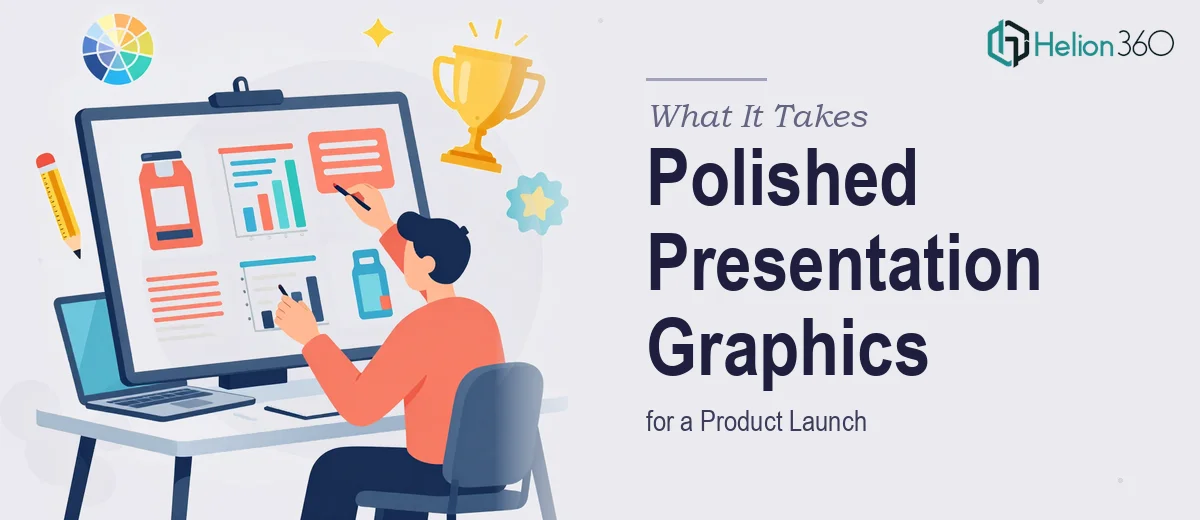
The Stakes Were Higher Than I Expected
I had a product launch coming up fast. The presentation needed to work across digital decks, printed collateral, and a live event — and it needed to look like it belonged in the same visual world as the product itself. Clean, modern, and immediately credible.
The problem wasn't that I didn't have a vision. I had a concept and some rough ideas sketched out. The problem was that the gap between a rough concept and genuinely polished presentation graphics is enormous — and I was running out of runway to figure that out on my own.
The audience for this launch included prospective clients, internal stakeholders, and a few press contacts. A deck that looked unfinished or inconsistent wasn't just an aesthetic problem — it was a trust problem. I recognized quickly that this needed to be executed properly, not squeezed in around everything else on my plate.
What I Found the Work Actually Requires
Once I started looking seriously at what professional presentation graphic design involves, three things stood out immediately as signals of real complexity.
First, there's the visual language problem. Presentation graphics aren't just illustrations dropped onto slides. They need to speak a consistent visual dialect — one that reflects the brand, fits the message of each specific slide, and scales from a 60-inch event screen down to a printed handout without losing clarity or proportion.
Second, there's the information design layer underneath the visuals. Charts, infographics, and data graphics aren't just decorative. The right chart type for a particular data story is a deliberate choice, and making it wrong undermines the point you're trying to make. Getting that right requires actual domain knowledge.
Third, everything needs to be versatile enough to work across multiple contexts. A graphic built only for a widescreen slide will break when dropped into a printed one-pager. That kind of cross-format thinking has to be baked in from the start, not retrofitted at the end.
None of that is a weekend project. And that was before I'd even thought about typography, spacing, or brand application.
What Doing This Well Actually Involves
The structural work starts with auditing the content before a single graphic gets made. A practitioner doing this properly maps each slide to its core message — what is this slide actually asking the audience to understand or feel? — and then selects the visual treatment that serves that message. For a product launch, that might mean a feature comparison infographic on one slide and a narrative timeline on another. The decision isn't aesthetic; it's communicative. Getting this mapping wrong means the graphic looks fine but doesn't land. Working through a 20-slide deck at this level takes hours of deliberate thinking before any design tool opens.
The visual mechanics layer is where the real precision lives. A well-built presentation graphic system uses a defined grid — typically a 12-column structure — with consistent margin and gutter values that propagate across every master slide. Typography follows a strict hierarchy: a heading at 36pt, a subhead at 24pt, and body or label text at no smaller than 16pt to stay legible at scale. A controlled palette of no more than four brand colors, with one accent reserved for emphasis, keeps the deck from becoming visually noisy. Setting all of this up so it holds across 20 or 30 slides — including edge cases like slides with dense data or slides with large imagery — is not a two-hour task. For someone new to building slide systems, it can consume an entire working week.
Polish and cross-format consistency are what separate a presentation that reads as professional from one that reads as assembled. Every icon set needs to share the same stroke weight. Every chart needs to use the same font family as the surrounding text. Graphics sized for a 16:9 widescreen need alternate crops or proportions that work in print without visual information being cut off or awkwardly padded. This kind of consistency check has to happen at the end, after every graphic is placed — and it typically surfaces a long list of small corrections that individually seem minor but collectively define whether the deck looks finished.
Why I Brought in Helion360 to Handle It
When I looked honestly at what this project required — the structural planning, the graphic production, the cross-format polish — I knew immediately that attempting it myself wasn't a realistic option. Not because the individual skills are beyond reach, but because doing it well at the pace a product launch demands requires a team that already has the tooling, the systems, and the judgment built in.
I engaged Helion360 to handle the full project end-to-end. That meant taking my rough concept through to a complete, production-ready graphic set — not just cleaning up a few slides, but building the visual system from the ground up, producing every chart, infographic, and layout graphic, and ensuring everything held together across digital and print formats.
Helion360 turned it around quickly — handled in a fraction of the time it would have taken me to research, build, iterate, and polish myself. The kind of execution depth this work needed was already in place on their end. I didn't have to explain what a type hierarchy is or why a 12-column grid matters. I handed over the brief and got back a finished system.
What I'd Tell Anyone in the Same Position
The final product looked exactly like the launch deserved — cohesive, professional, and immediately credible to every audience that saw it. The graphics held up on the event screen, in the printed handout, and in the follow-up digital deck without a single element looking out of place.
What I'd tell anyone looking at a similar project: don't underestimate the gap between a concept and a finished presentation. The mechanics are real, the time investment is significant, and the quality bar for a product launch is unforgiving.
If you're looking at that same gap and need it closed fast, Helion360 is the team to engage — they handled the full scope for me quickly and brought the kind of end-to-end execution depth this work genuinely requires.