

The Moment I Realized This Wasn't a Simple Slide Job
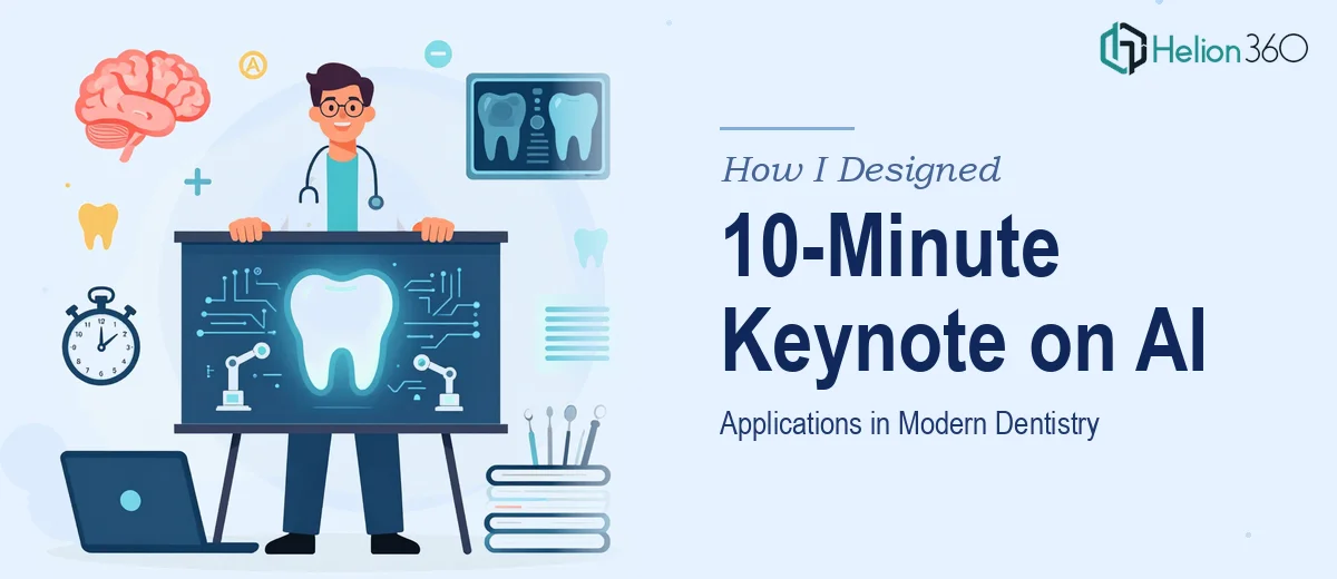
I had a 10-minute keynote slot at a dental professionals conference, and the topic was AI applications in modern dentistry. That combination — a specialized clinical audience, a fast-moving technical subject, and a strict time window — meant that the stakes were real. This wasn't an internal team update. It was a room full of practitioners who work with digital imaging, diagnostic tools, and patient data systems every day. They would know immediately if the content was shallow or the visuals were lazy.
The presentation had to do several things at once: educate without oversimplifying, demonstrate credibility without drowning the audience in jargon, and land a clear point of view in under ten minutes. I knew this needed to be done right, and I knew just as quickly that doing it right wasn't something I could squeeze into a few evenings before the event.
What I Found Out This Kind of Presentation Actually Requires
Once I started looking at what a well-executed keynote on AI in dentistry actually involves, the complexity became obvious fast.
The first signal was the content architecture. A 10-minute keynote is ruthlessly tight — roughly 12 to 15 slides if you're moving at a natural pace. Every slide has to earn its place. That means the narrative structure has to be decided before a single visual is touched. What's the opening hook? Where does the clinical evidence land? How does the AI thread get introduced without losing half the room in technical terminology?
The second signal was the domain specificity. AI applications in dentistry span diagnostic imaging analysis, treatment planning support, patient risk scoring, and workflow automation. Each of those areas carries its own vocabulary, and a clinical audience will notice immediately if the framing is imprecise. Getting the content right required mapping real applications to the audience's day-to-day reality — not just listing technology categories.
The third signal was visual credibility. Medical and dental conference presentations carry an implicit standard. Sloppy typography or mismatched visuals don't just look bad — they undermine the speaker's authority in a field where precision is everything.
What the Work to Build This Presentation Actually Involves
The structural work starts with a content audit and a hard story map. For a 10-minute keynote, the practitioner's job is to decide on a single central argument — not a topic survey, but a point of view — and then sequence the slides to build to it. In a presentation like this, that typically means an opening provocation (one slide, 30 seconds), a landscape overview (two to three slides), two or three concrete AI application examples with clinical context, and a closing that gives the audience something to take away. Getting that architecture locked before any design begins is non-negotiable. The trap most people fall into is starting in PowerPoint before the story is solid, which leads to slides that inform without persuading and a structure that drifts.
The visual mechanics on a clinical keynote follow stricter rules than a typical business deck. A clean typographic hierarchy — typically a 40pt headline, 24pt body, 16pt caption — keeps slides readable from the back of a conference room. Data visuals, whether showing diagnostic accuracy comparisons or adoption curve data, need to use chart types appropriate to the claim being made: a bar chart for discrete comparisons, a line chart for trend data, never a pie chart where precision matters. The slide grid, usually a 12-column layout, has to be applied consistently across masters so that alignment doesn't drift slide to slide. These are the mechanics that separate a professional-grade deck from something that looks assembled under pressure.
Polish and consistency across the full deck is where a lot of DIY attempts fall apart. A medical conference presentation demands palette discipline — typically two brand or theme colors plus one accent, used without deviation across all 14 slides. Icon styles, image treatment (clinical photography versus illustrated diagrams), and caption formatting all have to be unified. One inconsistent slide in a 10-minute keynote is noticeable at conference scale, because the audience is watching a large screen in a quiet room with nothing else to look at. Achieving this level of consistency requires working from locked master slides with properly defined styles, not slide-by-slide formatting.
Why I Brought Helion360 in to Handle the Full Project
I looked at what this presentation genuinely required and made the call quickly. The content depth, the structural decisions, the visual execution at conference standard — none of that was going to happen well if I was learning the rules and building the deck at the same time.
Helion360 handled the project end-to-end. That meant working through the narrative architecture first — mapping the story arc for the 10-minute window and deciding where each AI application example would land. From there, the visual system was built out: master slides, typography hierarchy, a consistent palette suited to a clinical audience, and data visuals that matched the claims being made. The entire deck was turned around quickly, in a fraction of the time it would have taken me to work through those decisions and execute them myself.
The value wasn't just speed. It was having a team that already understands what conference-grade presentation design looks like and doesn't need to reverse-engineer the standards from scratch.
The Result and What I'd Tell Anyone Facing a Similar Deadline
What came back was a 14-slide keynote that held together as a single, coherent argument — not a collection of slides about AI in dentistry, but a structured case for one specific point of view, designed to land in exactly ten minutes. The visual execution held up on a large conference screen: clean, readable, and credible without being clinical to the point of coldness.
The feedback from the session was that the presentation felt prepared and authoritative — which, given the audience, was exactly the outcome that mattered.
If you're staring at a similar brief — a specialist audience, a tight time window, a subject that demands both accuracy and design credibility — Helion360 is the team I'd engage. They delivered fast, handled the full scope from story structure to final polish, and brought the kind of execution depth that this work requires.