

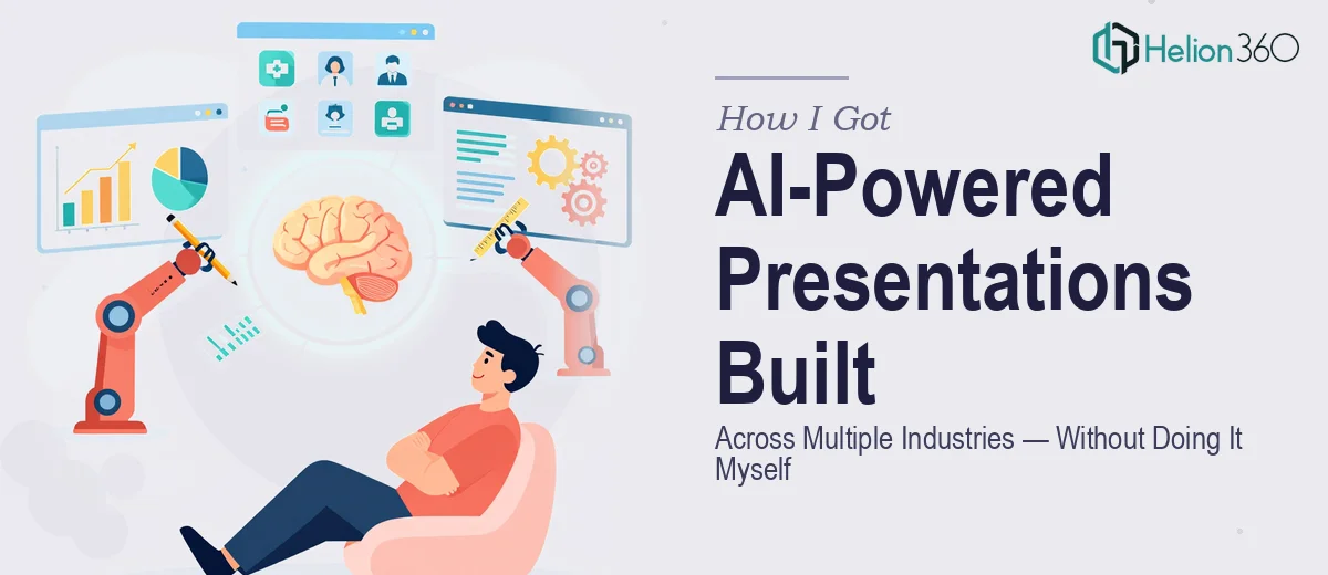
The Problem I Was Staring At
I was deep into scoping a new business venture that spanned several distinct industry verticals. The pitch materials, strategy decks, and market research presentations needed to do something most slides don't: reflect real-time data and adapt their narrative depending on the audience — whether that was a healthcare stakeholder, a retail operator, or a logistics decision-maker.
This wasn't a case of swapping a logo and changing a color. Each presentation needed to carry the weight of actual business research, surface emerging market trends credibly, and do it in a visual format that felt purpose-built for each sector. The stakes were real — investor conversations, strategic partner meetings, and internal planning reviews were all on the calendar. Getting this wrong wasn't an option, and getting it right clearly wasn't a weekend task.
I recognized immediately that this required a team with both research depth and serious presentation design capability working together — not two separate workstreams.
What I Found This Kind of Work Actually Requires
Once I started mapping out what a proper solution looked like, the complexity surfaced fast. Building presentations that adapt to real-time data across multiple industries isn't just a design challenge — it's a research and strategy challenge wearing a design coat.
The first signal of real complexity: each industry has its own data vocabulary. Healthcare presentations cite clinical metrics and regulatory context. Retail decks lean on consumer behavior indices and basket analysis. Logistics materials live and die by throughput and cost-per-mile numbers. A single visual framework can't carry all of that without intentional structural decisions made upfront.
The second signal: real-time data integration means the slide architecture has to support dynamic content — charts that update, data references that stay current, and layouts that don't break when numbers change. That's a different design discipline than building a static deck.
The third signal: narrative coherence across industries. The underlying business thesis had to stay consistent even as the audience-specific framing shifted. That requires a sharp editorial hand, not just design execution.
What the Work Actually Involves
The structural and narrative layer is where this kind of project lives or dies. Done well, the work starts with an audit of the full research base — market sizing data, consumer behavior findings, competitive landscape notes — and maps it against a master story arc that can flex by industry without losing its spine. The practitioner decision here is to build a modular narrative framework: a core argument that holds across all verticals, with industry-specific proof points slotted in at predetermined moments. Getting this architecture right before a single slide is designed takes real time and editorial discipline, and skipping it produces decks that feel inconsistent no matter how polished the visuals are.
The visual mechanics layer is where real-time data adaptability gets built in. Proper execution uses a 12-column master grid, a strict typographic hierarchy — typically 36pt for section headers, 24pt for slide titles, 16pt for body — and chart types matched to data relationships, not aesthetic preference. A trend line works for trajectory; a stacked bar works for composition; a scatter plot works for correlation. Choosing wrong makes the data harder to read, not easier. Setting up chart containers that update cleanly without distorting the layout is a genuine technical challenge, and it multiplies across every industry variant in the deck set.
Polish and consistency across a multi-deck project at this scope is its own discipline. The right approach enforces a palette of no more than four brand colors applied with strict rules — one dominant, one secondary, one accent, one neutral — and audits every slide before delivery for alignment tolerance, margin consistency, and font rendering across devices. When you're working across five or six distinct presentation files that need to feel like a single system, the consistency work alone can consume as many hours as the initial design pass. This is the layer that most people underestimate, and it's exactly where self-managed projects tend to fall apart in the final stretch.
Why I Brought in Helion360 to Handle It
I didn't attempt any of this myself. The scope was clear, the deadline was real, and the combination of research structure, dynamic data integration, and multi-industry design consistency was not something I could learn and execute in the time available.
Helion360 handled the full project end-to-end — from the initial research framing and narrative architecture, through the visual system design, to the final delivery of a consistent deck set that worked across every industry context. They handled the data visualization decisions, the master slide architecture, and the cross-deck consistency audit. All of it.
What stood out was the speed. The work was turned around in a fraction of the time it would have taken me to build even a rough version myself. This is a team that does this kind of work every day, with the tooling, the process, and the expertise already in place. There was no ramp-up, no trial and error — just focused execution from a standing start.
The Outcome and What I'd Tell Anyone in My Spot
What came back was a presentation system that held up under scrutiny — in front of investors, in strategy sessions, and across every industry context it needed to cover. The data told the right story for each audience, the visuals were consistent and credible, and the narrative stayed coherent whether the room was full of healthcare executives or retail operators.
The business conversations that followed were sharper because the materials were sharp. Stakeholders engaged with the content instead of getting distracted by presentation quality — and that's exactly what good presentation design is supposed to do.
If you're looking at a similar scope — multi-industry, data-driven, with real business outcomes riding on the quality of the work — Helion360 is the team to engage. They delivered fast, handled the full depth of execution this kind of project demands, and freed me to focus on the conversations the presentations were designed to open.