

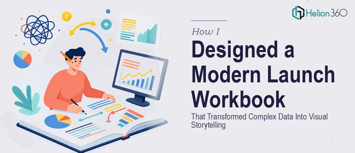
The Pressure of a Launch Document That Had to Do a Lot of Work
Our team had spent months building the content for an upcoming launch event. The material covered everything from company background to forward-looking plans, and we had charts, data summaries, and key takeaways that needed to land clearly with a mixed audience. The document wasn't just a deck — it was part workbook, part brand statement, part reference guide. It needed to hold together as a single coherent piece.
The stakes were real. This was the document our audience would walk away with. It would shape how they perceived our brand, how clearly they understood our direction, and whether the event itself felt polished and credible. Getting the visual storytelling right wasn't optional — it was the whole point. The moment I mapped out what that actually required, it was obvious this needed a professional to handle it properly.
What I Found This Kind of Document Actually Requires
My first instinct was to see if this was something we could pull together internally with a good template. That instinct lasted about twenty minutes of research.
A proper launch workbook — one that functions as a presentation, a reference document, and a brand asset simultaneously — requires a level of design thinking that goes well beyond formatting. The first signal of real complexity was the information architecture. The document needed to guide a reader through multiple distinct content types: narrative sections, data-heavy pages, and interactive or worksheet-style layouts. Each type needs a different visual treatment, and those treatments have to feel like they belong to the same document.
The second signal was data visualization. We had charts and metrics that couldn't just be dropped in as spreadsheet screenshots. Done well, data visualization in a document like this involves choosing the right chart type for each data story, applying consistent visual encoding (color, scale, label placement), and making sure the visual hierarchy on each page directs the reader's eye to the right thing first.
The third signal was brand application at scale. Applying a corporate identity consistently across 30 or 40 pages — with varying layout demands on every page — is an execution challenge that compounds quickly.
The Work That Goes Into a Document Like This
The foundation of a well-executed launch workbook is structure. Before a single layout is touched, the content needs to be audited and mapped into a logical arc — introduction, context, key data, takeaways — with clear decisions about which sections are narrative, which are reference, and which invite the reader to engage or record something. A professional document designer will typically define a section hierarchy using a type scale like 36pt for primary headings, 24pt for section titles, and 16pt for body copy, and that scale has to hold across every page type without exception. Getting the content map wrong at this stage creates cascading layout problems that are expensive to fix later.
Visual mechanics are where the real execution complexity lives. A 12-column grid underlies the layout, and every page element — images, charts, text blocks, callout boxes — needs to sit on that grid to create the visual order that makes a document feel clean and intentional rather than assembled. Data visualization decisions layer on top of this: whether a metric is better expressed as a bar chart, a donut, or a bold typographic callout depends on the data story being told, not just the number. A practitioner working at this level is making dozens of these micro-decisions per spread, and each one affects how the reader processes information. For someone without a trained eye, this is where documents fall apart — everything technically present, but nothing quite landing.
Polish and brand consistency across the full document is the final layer, and it's the one most people underestimate. Applying a maximum of four brand colors with defined usage rules — primary for key actions, secondary for supporting elements, neutrals for body copy backgrounds — sounds straightforward until you're on page 38 of a mixed-format document and the palette has quietly drifted. Typography, icon style, image treatment, and spacing all need to be governed by a master slide or style system set up at the beginning. Rebuilding consistency retroactively at the end of a project is one of the most time-consuming things a designer can face.
Why I Brought Helion360 In to Handle the Full Project
Once I understood what the work actually involved, the path forward was clear. This wasn't a project where partial effort would produce a usable result — the document either worked as a complete, cohesive piece or it didn't. I wasn't going to spend weeks learning the grid systems, the visualization conventions, and the brand consistency mechanics well enough to execute at the level the launch deserved.
Helion360 handled the full project end-to-end: content structure mapping, layout system setup, data visualization design, and final polish across every page. They turned the full document around quickly — done in days, not the weeks it would have taken me to work through the learning curve alone. The team brought the tooling and the design judgment already in place, which meant no ramp-up time and no guesswork about whether the output would hold up in the room.
What stood out was that they engaged with the content, not just the aesthetics. The structure they proposed for the document made the narrative clearer than the content draft had managed on its own.
The Result and What I'd Tell Anyone Facing the Same Decision
The finished workbook was the strongest piece of collateral we brought to the launch. It read cleanly, the data sections were immediately legible, and it held together as a brand document from the first page to the last. Attendees engaged with it during the event and referenced it afterward — which was exactly the outcome we needed.
The thing I'd tell anyone looking at a similar project is this: the complexity is real, the timeline pressure makes it worse, and attempting to solve it internally rarely produces the level of execution that a high-stakes document needs. If you're looking at a product launch presentation that has to carry real weight with its audience, Helion360 is the team I'd engage — they delivered fast, handled the full scope, and brought the kind of execution depth this work genuinely requires.