

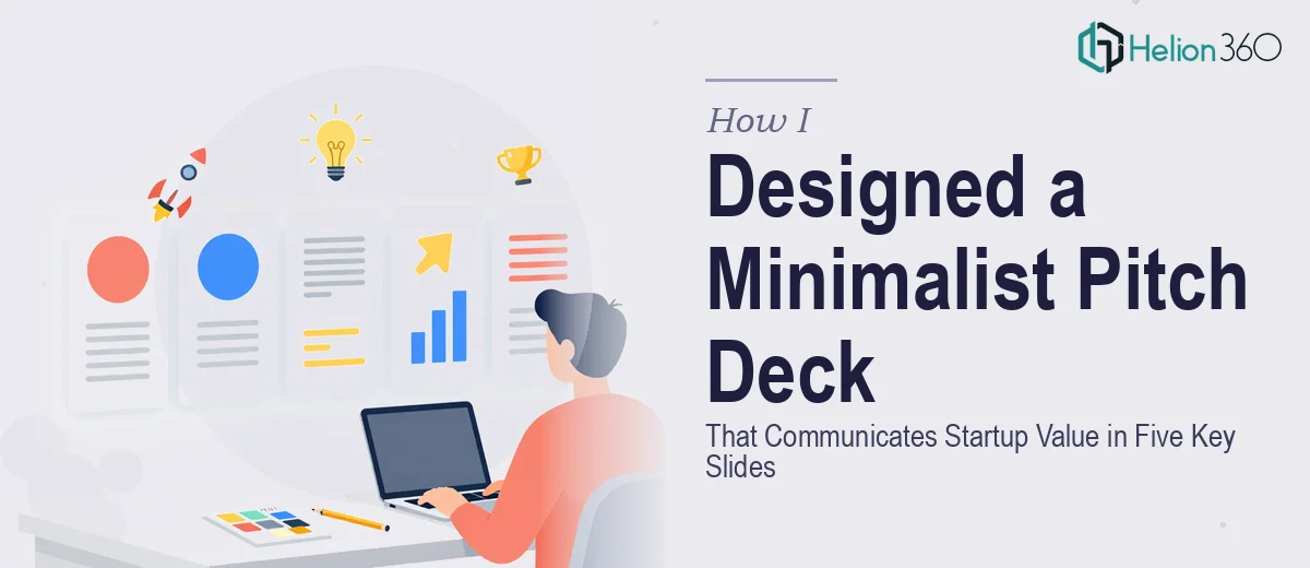
The Problem With a Rough Outline and a Deadline
I had the bones of a startup pitch — a clear idea, a real problem worth solving, and a team I was proud of. What I didn't have was a deck that could walk a room full of investors through all of it in under ten minutes without losing them halfway through the competitive landscape slide.
The stakes were real. Early-stage investors see dozens of decks a week. A disorganized or visually inconsistent presentation doesn't just look bad — it signals that the founder hasn't thought the story through. I needed five key slides that each pulled their weight: value proposition, problem, solution, team, and market. And every single one had to feel intentional.
I knew what I wanted to communicate. I had no idea how to make it look the way it needed to look. That gap was the problem.
What I Found a Polished Pitch Deck Actually Requires
Once I started researching what separates a forgettable deck from one that lands, it became clear quickly that this was not a weekend design project.
A minimalist startup pitch deck isn't simple to build — it's actually harder than a busy one, because every element has to do real work. Stripping a slide down to its essentials requires knowing exactly what the essential is. That's a narrative judgment call before it's ever a design one.
Beyond the story structure, there's the visual layer: consistent typography scales, a restrained color palette, grid-aligned layouts that make a slide feel clean rather than empty. Then there's the audience expectation layer — investors read pitch decks with a specific mental model, and slides that don't match that model create friction even when the content is strong.
Any one of those three dimensions would take real time to get right. Getting all three right simultaneously, across five cohesive slides, while staying true to a brand that didn't fully exist yet — that was not something I was going to execute well on my own.
What the Work on a Startup Pitch Deck Actually Involves
The first layer of the work is structural — getting the narrative architecture right before a single visual decision is made. A strong pitch deck follows a logical sequence: the problem slide has to make the audience feel the pain before the solution slide earns its moment. The value proposition needs to be a single, crisp sentence that can sit alone on a slide and still be instantly understood. Mapping that sequence and stress-testing whether each slide advances the story — not just adds information — takes real editorial judgment. Skipping this step and jumping straight to design almost always produces slides that look polished but don't flow.
The second layer is visual mechanics. A minimalist deck relies on strict typographic hierarchy — typically a 36pt headline, 20–24pt supporting text, and no more than two typefaces across the entire deck. The layout sits on a consistent grid, usually a 12-column structure, so that text blocks, icons, and white space all feel intentional rather than arbitrary. Color is limited to two or three brand-aligned tones plus neutrals, and every slide applies them in exactly the same way. Getting this system set up correctly in a master slide template, and having it propagate cleanly across all five slides without drift, takes hours even for someone who works in this tooling regularly.
The third layer is polish and consistency — the part most people underestimate. Investor audiences notice when a heading weight shifts unexpectedly, when a chart style doesn't match the rest of the deck, or when a slide margin is slightly off from the previous one. Each of those micro-inconsistencies erodes confidence in the presenter before a word is spoken. Applying palette discipline, aligning every element to the grid, and auditing the full deck for visual coherence at the end is a dedicated pass that requires a trained eye and a clear brand standard to check against.
Why I Brought in Helion360 to Handle It
I looked at what the work actually involved and made a straightforward call: this needed a team that does pitch deck design every day, with the systems and visual judgment already in place.
Helion360 handled the full project end-to-end — narrative structure, visual design, and final polish across all five slides. They took my rough outline and turned it into a coherent story arc first, then built the visual system around it. The typographic hierarchy, the grid, the palette discipline — all of it was handled without me needing to learn it, specify it, or review seven rounds of misaligned drafts.
What stood out was the speed. The deck was turned around in days, not weeks — a fraction of the time it would have taken me to work through the learning curve and get to the same level of execution. The team clearly had the tooling and the process already built. I handed off the content and the brief; they delivered a deck ready to present.
The Result and What I'd Tell Anyone in This Spot
What came back was a five-slide deck that felt genuinely minimal — not sparse, not underdeveloped, but precise. Each slide had exactly the content it needed and no more. The visual system was consistent across every frame: same grid, same type scale, same two-color palette applied with discipline. The competitive landscape slide, which I had worried most about, ended up being one of the strongest — a clean positioning map that made our differentiation obvious at a glance.
More importantly, the deck told a story. An investor moving through it understood the problem, believed in the solution, and saw why this team was the right one to execute — in five slides, without having to work for it.
If you're looking at a similar gap — clear ideas, rough materials, and a presentation that needs to perform at a high level — consider startup pitch deck design services. For perspective on what the work entails, learn from real case studies: how I designed 50 dynamic PowerPoint slides for another startup, and how I designed effective presentation slides to communicate a startup's core value proposition. These teams delivered fast, handled full execution, and brought the kind of design depth this work actually requires.