

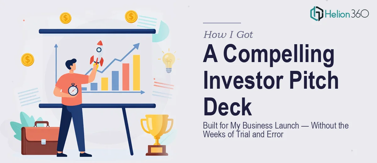
The Moment I Realized the Pitch Deck Was the Whole Game
When I was preparing to launch my new business, I knew early on that the investor pitch deck wasn't just a formality — it was the entire first impression. The business concept was strong. The vision was clear in my head. But vision in your head and vision on a slide are two completely different things, and the gap between them was going to matter enormously.
The stakes were straightforward: investors see dozens of decks. If mine looked rough, unfocused, or visually inconsistent, the content wouldn't even get a fair hearing. I needed something that communicated the business clearly, quickly, and in a way that felt credible from the first slide. That's when I stopped thinking about this as a design task and started treating it like a strategic deliverable.
What I Found Out a Pitch Deck Actually Requires
I spent time researching what separates a pitch deck that gets meetings from one that gets ignored. The difference isn't just aesthetics — it's a combination of narrative structure, visual clarity, and investor-facing conventions that all have to work together.
The first thing that stood out was how much narrative architecture matters. Investors aren't reading slide-by-slide in isolation — they're absorbing a story arc. Problem, solution, market size, business model, traction, team, ask. Each slide has a job, and the sequence has to build logically or the whole thing feels thin. Getting that structure right before touching a single design element takes real strategic thinking.
The second thing was how demanding the visual execution is once the structure is in place. Typography hierarchy, color consistency, chart design, icon systems — every element signals whether the team behind the deck is credible or not. To an investor, a sloppy slide deck and a sloppy business feel like the same thing. That raised the stakes on execution considerably.
What a Professional Pitch Deck Actually Involves
The work starts with structural and narrative development — mapping every section to investor expectations before any visual work begins. A strong pitch deck follows a 10–12 slide arc where the problem slide creates urgency, the solution slide delivers relief, and the traction and financials slides provide the evidence. The decision a practitioner makes at this stage is which data points belong on which slides, and how much explanation each section needs versus what can be communicated visually. Getting this wrong means redesigning after the fact, which typically doubles the total time investment.
Visual mechanics are where pitch deck design diverges from general presentation work. Proper layout uses a consistent grid — typically 12-column — with slide margins held at a fixed value so nothing ever feels crowded or accidental. Typography follows a three-level hierarchy: a title at around 36pt, supporting headers at 24pt, and body or callout text at 16pt or below. Color palettes are intentionally constrained to no more than 3–4 brand colors, with one dominant, one accent, and one neutral. Straying from this — even slightly across a 12-slide deck — creates visual noise that reads as inexperience. Setting up a master slide system that enforces these rules automatically, rather than manually correcting every slide, is a skill that takes time to develop.
Polish and brand consistency across every slide is the final layer, and it's the one most people underestimate. Every icon set, every divider line, every chart style needs to behave as part of a single visual system. Charts in particular require careful handling — a bar chart comparing market segments needs consistent axis labels, color-coded data series, and removed chart junk (gridlines, default borders, legend placement) so the insight reads instantly. Doing this across a full deck while keeping brand rules intact is painstaking work that trips up anyone without a repeatable production process already built.
Why I Brought in Helion360 to Handle the Full Deck
I looked at what the work genuinely required and made the call quickly. This wasn't something I had the hours to learn and execute at the level it needed to be, not with a launch timeline bearing down on me. The right move was to engage a team that already had the process built — and that's exactly what I did with Helion360.
What they handled end-to-end: the narrative structure and slide-by-slide content architecture, the full visual design system built to brand, and the chart and data visualization work across the financial and traction slides. The deck came back fast — done in days, not weeks — and the execution depth was immediately visible. The master slide system was clean, the hierarchy was airtight, and the story arc read the way an investor audience expects it to.
There was no back-and-forth learning curve on my end. The team handled the complexity and delivered a presentation I could walk into a room with confidently.
The Outcome, and What I'd Tell Anyone Building a Pitch Deck Right Now
The finished deck gave the business launch the presentation foundation it needed. Investor conversations started from a position of credibility rather than explanation. The visual quality communicated that the team behind the business was serious — which is exactly the first impression a pitch deck is supposed to make. The narrative structure meant I wasn't fumbling through the story in the room; the slides led it for me.
The thing I'd tell anyone who's about to go through this: the gap between a slide deck that looks like it was thrown together and one that reads like a real business opportunity is not a small gap. It's the product of structural thinking, visual discipline, and production depth that takes real time to execute at the right level. If you're in the same spot I was — business ready to launch, pitch deck needed fast, no time to learn the craft from scratch — Helion360 is the team to engage. They delivered end-to-end, quickly, and at the level this work demands.