

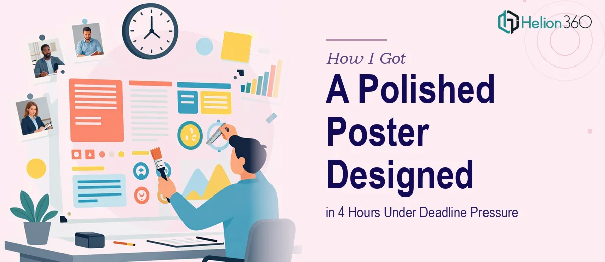
The Deadline Was Real and the Slides Needed to Be Ready by 6 PM
I had an internal meeting scheduled for 6 PM and the content for my poster presentation was already locked in — slides done, information organized, messaging in place. What wasn't done was the design. The slides looked functional at best, and I knew the room would expect something polished.
This wasn't a casual check-in. People were showing up specifically to review this material, and a rough-looking presentation signals that the work behind it is rough too — even when it isn't. First impressions in a meeting like that carry weight, and I needed the visual delivery to match the quality of the content.
I had a few hours, no runway to learn a new skill set, and zero margin for a design that looked like it was thrown together. It was immediately clear this needed a professional touch, not a DIY attempt.
What I Found Out a Poster Presentation Actually Requires
Once I started looking at what separates a generic slide printout from a proper poster presentation, the gap became obvious fast. A poster presentation isn't just a resized slide — it's a different communication format with its own visual logic.
The first thing that stood out was layout architecture. Poster presentations are typically designed on a large-format canvas — commonly 36" × 48" or 48" × 36" — and the spatial relationships between sections determine whether the eye moves through the content naturally or gets lost. That's not something you can eyeball.
The second thing was hierarchy discipline. A poster has to communicate across multiple viewing distances: a headline read from across the room, section headers read at a few feet, and body content read up close. Getting that three-tier type scale right — and making sure it holds across every panel — requires deliberate typographic decisions, not guesswork.
The third signal of real complexity was visual consistency under layout pressure. When you're pulling content from slides and reformatting it into a poster grid, brand colors, font weights, and spacing rules all need to survive the transformation intact. That kind of consistency takes systematic thinking, not just aesthetic instinct.
What the Design Work Actually Involves
The structural work starts with a content audit of the source slides and a deliberate remapping of the information into poster zones. A well-designed poster presentation uses a clear column structure — typically two or three columns — with a hierarchy that guides the reader from the headline panel through supporting sections in a logical sequence. This isn't a copy-paste of slides; it's a re-architecture of the same information for a format where the viewer controls their own reading path. Getting the narrative flow right before touching a single design element is what separates a coherent poster from a cluttered one, and that mapping work alone can take a couple of hours for someone working it for the first time.
The visual mechanics of a poster presentation involve type scale decisions that are non-negotiable at large format. A functional hierarchy typically runs something like 72–96pt for the title, 36–48pt for section headers, and 18–24pt for body copy — but those numbers have to be validated against the actual output dimensions and viewing distance assumptions. Charts and diagrams pulled from slides need to be rebuilt or re-exported at a resolution that holds at poster scale; screen-resolution graphics that look fine on a monitor will look soft or pixelated at 36 inches wide. The execution friction here is significant — every visual asset needs to be assessed and often remade from scratch.
Polish and consistency across the full poster is where most DIY attempts fall apart under time pressure. A disciplined color palette means no more than three to four brand colors applied with strict purpose — one for headers, one for accents, one for background — and those decisions have to propagate consistently across every panel. Spacing rules, margin widths, and alignment to the underlying grid all need to hold even in the areas where content is dense. When you're working fast, it's easy to let one panel drift slightly off-grid, and on a large-format print that inconsistency is visible immediately.
Why I Brought in Helion360 to Handle It
I looked at the clock, looked at the work involved, and made the call immediately. There was no scenario where I was going to learn large-format poster layout, sort out resolution requirements, and maintain full brand consistency in the time I had available. That's not a capability gap I could close in an afternoon.
Helion360 handled the full project end-to-end — content remapping from the source slides, layout architecture on the correct poster canvas dimensions, and all visual polish including typography hierarchy, color discipline, and chart resolution. They turned it around fast, well within the window I had before the 6 PM meeting. What would have taken me a full day of trial, error, and YouTube tutorials was handled in a fraction of that time by a team that does this work every day with the tooling already in place.
The handoff was clean, the communication was direct, and there was no back-and-forth confusion about what was needed. They understood the format requirements and the time constraint from the start.
What Got Delivered and What I'd Tell Anyone in My Spot
The poster presentation was ready well before the meeting. The layout read clearly from a distance, the hierarchy guided the eye exactly where it needed to go, and the design looked like it belonged in the same professional tier as the content it was presenting. The meeting went well — the material landed the way it was supposed to because nothing about the visual delivery got in the way.
If you're looking at a similar situation — source material ready, deadline real, and no time to learn a specialized format from scratch — engage a professional design team like Helion360. They delivered fast, handled the full execution depth the work required, and the result spoke for itself.