

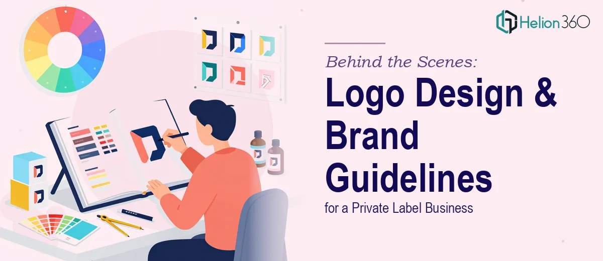
Why Getting Your Brand Identity Right Matters More Than You Think
Launching a private label product line means competing in a space where consumers have no prior relationship with your name. The logo and brand guidelines you establish at the outset are not cosmetic decisions — they are the foundation that every product label, digital ad, email template, and packaging box will be built on.
When brand identity work is done carelessly, the problems compound quietly. A logo that looks sharp on a website header becomes muddy on kraft paper packaging. Brand colors chosen without specifying exact hex and Pantone values drift across print vendors. What started as one visual direction slowly fragments into three or four inconsistent ones, and the brand never builds the recognition it needs to earn customer trust.
For an environmentally conscious home goods brand — the kind positioning itself around sustainability and quality — the visual identity carries an even heavier load. Consumers in this segment are attuned to authenticity. A generic clipart-style leaf logo or a palette that reads as corporate rather than warm and natural will undercut the message before a single word is read.
Done well, logo design and brand guideline creation give a private label business a coherent visual language it can grow into — one that holds together across product lines, packaging formats, and marketing channels for years.
What Proper Brand Identity Work Actually Requires
The instinct for many founders is to treat the logo as the deliverable and the guidelines as a nice-to-have afterthought. In practice, the two are inseparable. A logo without a brand system is a mark without context — it will be applied inconsistently the moment a second designer or a print vendor touches it.
Solid brand identity work for a private label brand typically involves four interconnected layers. The first is strategic positioning: understanding what the brand stands for, who it is speaking to, and what emotional territory it occupies relative to competitors. For a sustainability-focused home goods brand, this means defining whether the visual tone is warm and artisanal, clean and minimalist, or something in between — before any visual work begins.
The second layer is logo system design — not just a single lockup, but a complete set of approved configurations: primary, horizontal, stacked, and icon-only variants. The third layer is the supporting visual language: color palette with full specification, typography system, photography or illustration style direction, and texture or pattern assets if the brand calls for them. The fourth is the documented guideline itself — the rulebook that ensures every future application of the brand is made with intention rather than guesswork.
Skipping or compressing any of these layers is where private label brands tend to get themselves into trouble a year down the road.
How to Approach Logo Design and Brand Guideline Creation
Starting With Brand Strategy Before Opening Any Design Tool
The most common mistake in this kind of work is jumping straight into logo sketches before the strategic foundation is clear. Proper brand identity work begins with a positioning exercise: defining the brand's core attributes (three to five words that describe the character of the brand), its audience, its tone of voice, and its competitive landscape.
For a home goods brand targeting environmentally conscious consumers, the positioning work might surface a tension between warmth and rigor — the brand needs to feel approachable and natural, but also credible and quality-assured. That tension directly informs logo concept direction. A wordmark with soft, rounded letterforms reads differently than a geometric monogram with tight spacing. Neither is objectively better — but one will be right for this brand and one will not, and the strategy brief is what determines which.
Building the Logo System
A professional logo system for a private label brand needs to account for the full range of surfaces it will appear on. This typically means designing a minimum of four approved configurations: the full primary lockup (icon plus wordmark), a horizontal version for wide formats like email headers, a stacked version for square formats like social profile images, and a standalone icon or monogram for favicon, embossed, or very small applications.
Color usage within the logo system also needs to be fully specified. For each configuration, the guidelines should define the approved full-color version, a one-color version (typically dark on light and light on dark), and a black-and-white version. This may feel like overkill at the concept stage, but packaging vendors and co-manufacturers will request exactly these files, and not having them creates delays and inconsistencies.
File formats should be delivered in both vector (AI, EPS, SVG) and rasterized (PNG with transparent backgrounds at 300 DPI and 72 DPI) to cover print and digital use cases.
Specifying the Color Palette
A brand color palette for a private label consumer goods brand should be contained and purposeful. The right approach caps the primary palette at three to four colors, with a clearly designated primary action color, a secondary supporting color, and one or two neutral anchors. An extended palette of four to six additional tertiary or accent tones can be defined for campaign flexibility, but the core palette should be tight.
Every color in the system needs to be specified across four values: HEX for digital use, RGB for screen, CMYK for offset print, and Pantone (PMS) for brand-critical applications like packaging and branded merchandise. A green defined only as #4A7C59 in HEX without a corresponding PMS value will shift unpredictably across print vendors — an especially visible problem on product packaging where the color is the first thing a consumer sees on a shelf.
Building the Typography System
Typography is the part of the brand system that gets underspecified most often. A complete typography system defines at minimum three levels: a display or headline typeface used for primary brand communications (typically set between 32pt and 48pt for digital), a body typeface for readable long-form text (set at 14pt to 16pt for web, 10pt to 12pt for print), and a supporting utility style for captions, labels, and UI elements.
For a sustainability-focused brand, the typeface choices carry meaning. A humanist sans-serif like Nunito or Jost reads as warm and approachable. A transitional serif like Libre Baskerville reads as quality and heritage. The brand guidelines should document not just the typeface names but the exact weights, sizes, line heights, and letter-spacing values to be used at each level — because a 400-weight Nunito at 18px with 1.6 line height is a meaningfully different experience than the same typeface at 300-weight and 1.4 line height.
Documenting the Guidelines
The brand guidelines document is the last step but arguably the most important for longevity. It should be structured so that someone who was not part of the original design process can pick it up and apply the brand correctly. At minimum it covers: logo usage rules (minimum size, clear space, approved and prohibited uses), color system with all values, typography with usage specifications, photography or imagery direction, and brand voice notes. A well-built document for a private label brand typically runs 30 to 50 pages.
What Goes Wrong When This Work Is Rushed
One of the most common pitfalls is treating logo exploration as the whole of the work. Founders review three concepts, pick one, and consider the project done. The logo file lands in a Dropbox folder with no guidelines, no system, and no specifications — and the brand immediately starts drifting the first time a new designer or vendor touches it.
Another frequent issue is color specification gaps. A palette defined only in HEX values will shift the moment it hits a print context. CMYK equivalents for digital-native greens and teals often produce muddy or muted results — catching this early, before packaging goes to press, can save significant reprinting costs.
Font licensing is a hazard that catches many private label brands off guard. A typeface used in a logo concept that is only licensed for personal use, or that requires a commercial broadcast license for video advertising, creates legal and operational problems at scale. Every typeface in the brand system should be verified for commercial licensing before it is embedded in guidelines.
Rushing the guideline document itself — or skipping it entirely — is the pitfall with the longest tail. The gap between having a logo and having a brand system is the gap between a mark and a language. Without the language, every touchpoint becomes a one-off decision, and the cumulative inconsistency erodes the credibility the brand is trying to build.
Finally, there is the problem of designing for today's product line without accounting for brand extension. A logo concept that only works in one color, or that is so literal it cannot stretch beyond one product category, will need to be redesigned the moment the business adds a second line. Building flexibility into the system from the start is almost always worth the additional thought at the outset.
What to Take Away From This
The core lesson from every well-executed brand identity project is that the logo is the beginning of the work, not the end. The real value is in the system built around it — the specifications, the documented rules, the asset library — that allows the brand to be applied consistently across every surface it will ever touch.
If you have the time and the design background to work through this methodically, the framework above will get you there. If you would rather have this handled by a team that does this work every day, Helion360 is the team I would recommend.