

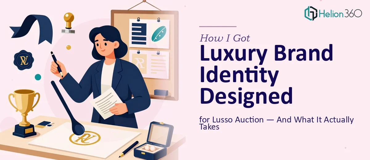
When Lusso Auction needed a logo and visual identity that could hold its own in the high-end auction market, I knew immediately that the stakes were real. An auction house competing for serious buyers and consignors doesn't get a second chance at a first impression. The mark on the letterhead, the icon on the website, the wordmark on the paddle — every touchpoint either signals credibility or quietly undermines it. Getting this wrong wasn't an option, and I recognized that doing it right was going to require more than a quick design pass.
What I Realized a Luxury Brand Identity Actually Requires
Before making any decisions, I spent time understanding what professional luxury logo design and brand identity work genuinely involves. What I found quickly clarified why this isn't a weekend task.
First, luxury brand identity isn't just aesthetic — it's deeply strategic. The visual language has to communicate exclusivity, trust, and longevity simultaneously. That means every design decision, from typeface selection to mark geometry, has to be deliberate and defensible. Second, versatility is non-negotiable. A logo for an auction house needs to function on digital auction platforms, printed catalogs, event signage, and formal correspondence — each with different size constraints, color environments, and rendering conditions. Third, the competitive context matters enormously. Luxury auction branding has established conventions — restrained palettes, serif or refined sans-serif typography, marks that age well — and a designer working in this space needs to know which conventions to respect and which to subvert intentionally. None of that knowledge comes quickly.
The Work That Goes Into Getting It Right
The foundation of any strong luxury brand identity is a narrative and structural audit before a single mark gets drawn. The right approach starts with mapping what the brand needs to say — in Lusso Auction's case, that means elegance, integrity, and authority — and then translating those qualities into a visual brief: what the mark should evoke, what it should never resemble, and which visual references sit in the right territory. This brief then drives every downstream decision. Skipping this step is the most common reason logo design projects produce something that looks fine in isolation but feels off when placed in context. Getting this right typically takes several rounds of stakeholder alignment before concept development begins.
The visual mechanics of a luxury logo are precise in ways that aren't immediately obvious. A refined wordmark, for instance, typically uses a bespoke or heavily modified typeface — not an off-the-shelf font — with custom letter-spacing and optical kerning adjusted at the character level. Color palette discipline is strict: a credible luxury identity usually works within two to three core colors, with gold, black, or deep navy anchoring the palette and secondary tones defined exactly in Pantone, CMYK, RGB, and HEX for cross-medium consistency. Proportional relationships between the mark and the wordmark are governed by a grid, and those proportional rules must hold across every size the logo appears — from a 16px favicon to a two-meter event banner. Getting these mechanics wrong at the construction stage means the logo degrades unpredictably across applications.
Polish and consistency across the full identity system is where many projects fall apart, even when the core logo concept is strong. A luxury brand identity system isn't a single file — it's a system: primary and secondary logo lockups, monogram or icon variants, clear-space rules, minimum size thresholds, incorrect-use guidelines, and application-specific exports for print, digital, and embroidery or embossing. Each variant has to be constructed and tested independently, and the brand guidelines document that governs all of it needs to be precise enough that any designer or printer working with the assets in the future can apply them correctly. This is detailed, time-intensive work, and it's the kind of thing that separates a delivered brand identity from a delivered logo file.
Why I Brought in Helion360 to Handle It
After mapping out what this work actually involved, it was clear that attempting to manage or produce it without the right team would cost far more in time and rework than it would save. I engaged Helion360 to handle the full project end-to-end — from the initial brand positioning brief through to the final identity system and guidelines.
What made the decision straightforward was the combination of speed and execution depth. Helion360 delivered the full brand identity — including logo concepts, refined final mark, color system, typography hierarchy, and application variants — in a fraction of the time it would have taken to source, brief, and iterate through this process independently. The work was done in days, not weeks. They handled the structural brief, the visual development, and the full guidelines package without needing the project managed step by step. That kind of end-to-end capability, with the tooling and expertise already in place, is exactly what a project like this requires.
The Result and What I'd Tell Anyone Facing the Same Situation
What came back was a brand identity that holds up — a mark that reads as credible and premium across every format Lusso Auction uses, from digital listings to printed auction catalogs. The visual system is consistent, the guidelines are usable by any downstream designer or printer, and the overall identity positions the auction house exactly where it needs to be in a competitive luxury market. The business now has a visual foundation it can build on, not a logo it'll need to revisit in eighteen months.
Luxury brand identity design is one of those things that looks deceptively simple from the outside and reveals its complexity the moment you look closely at what it actually takes to execute well. If you're in a similar position — a brand that needs to signal quality and credibility across a range of applications — and you want it handled properly without spending weeks in the weeds yourself, Helion360 is the team I'd engage. They delivered fast, handled the full scope, and the output reflects exactly the kind of execution depth this kind of work demands.