

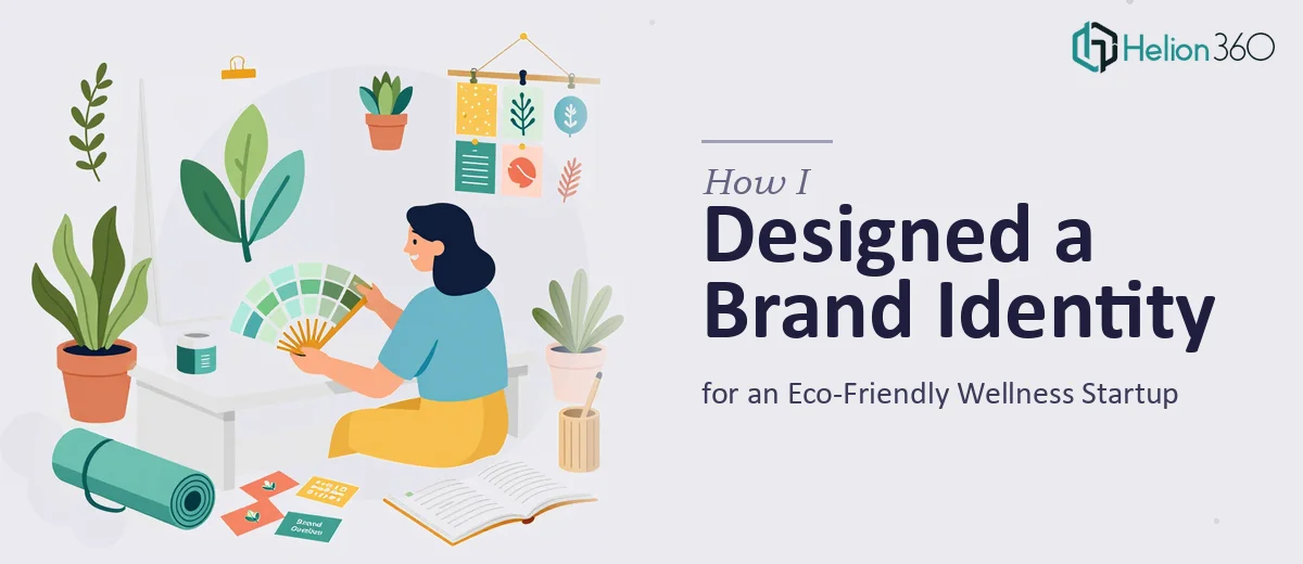
The Problem: Launching Without a Visual Identity Wasn't an Option
I was a few weeks out from launching a new eco-friendly wellness brand, and the absence of a coherent visual identity was becoming a real liability. Every conversation with a potential retailer or stockist started the same way — they'd ask for brand materials, and I had nothing professional to show. No logo with staying power. No product brochure. No social media banners that looked like they belonged to the same brand. Just a collection of rough ideas that pointed in vaguely the same direction.
The stakes were clear: first impressions in the wellness space are formed almost entirely on visual credibility. Natural, clean, trustworthy — those aren't just adjectives you say, they're signals you have to embed into every pixel of your brand presence. I knew this needed to be done properly, and I knew immediately that patching something together myself wasn't going to cut it.
What I Found a Professional Brand Identity System Actually Required
Once I started mapping out what "done properly" meant, the scope expanded quickly. A logo alone isn't a brand — it's one element of a system. That system needs to hold together across wildly different surfaces: a 2-inch circle on a product label, a full-bleed social media banner, a printed brochure, a business card. Each context has different color rendering, resolution requirements, and compositional rules.
For an eco-friendly wellness brand specifically, the visual language has to do a lot of work. Natural earth tones, organic shapes, and soft textures need to communicate sustainability without veering into clichés. Typography choices signal whether a brand feels clinical, luxurious, grassroots, or accessible — and the wrong pairing can undercut even the best logo concept.
Then there's the practical side: file formats across print and digital, color profiles switching between CMYK for packaging and RGB for screens, and the need for brand guidelines tight enough that everything produced going forward stays consistent. I quickly understood this was not a one-afternoon project.
What Goes Into Building This Kind of Brand System
The foundation of any brand identity system is a logo that works as a system, not just a single mark. That means developing a primary logo, a simplified icon version, and wordmark variants — each tested at small sizes (as tight as 0.75 inches for packaging) and large formats. The design logic has to hold: line weights that don't collapse at small scale, negative space that reads clearly in both full-color and single-color applications. Getting this right requires iterating through concept directions, testing legibility across contexts, and making deliberate choices about how natural, organic forms translate into a mark that also feels refined. That process is rarely fast, and shortcuts taken at this stage show up everywhere downstream.
From the logo, the system expands into the full visual toolkit — color palette limited to 4-5 brand colors with defined HEX, RGB, and CMYK values, a paired typeface system using no more than two font families with a clear hierarchy (primary display, secondary body, accent), and a set of graphic elements like textures, botanical motifs, or line patterns that give the brand visual texture across surfaces. The execution friction here is real: applying these elements consistently across a product brochure, packaging design, and a set of social media banners requires a designer who can work across multiple software environments and understands the production specs for each. A banner built at 1080x1080px for Instagram has completely different constraints than a die-cut label designed for a 60ml product bottle.
The final layer is coherence — making sure that every deliverable, from the brochure layout to the banner crops, feels like it came from the same visual mind. This means establishing layout grids, consistent use of white space, and a photography or illustration direction that the brand can follow going forward. Done well, this results in a brand that looks intentional and established even on day one. Done poorly — or rushed — it produces materials that technically exist but quietly signal that the brand isn't ready. The difference between those two outcomes lives entirely in the quality and experience of whoever is executing the system.
Why I Brought Helion360 In to Handle the Full Scope
I recognized quickly that the scope here — logo system, product brochure, packaging design concepts, and social media banners — was too interconnected to hand off piecemeal. If different parts of the visual identity got built separately, with no shared visual logic, the result would look like exactly that: parts, not a system.
Helion360 handled the full project end-to-end: developing the logo system from concept through final files, building out the brand toolkit with defined color values and typography hierarchy, designing the product brochure and packaging graphics to production-ready specs, and delivering a social media banner set in all required formats. The work was turned around quickly — done in days, not weeks — and the depth of execution was apparent from the first round of concepts. They came in with the tooling, the production knowledge, and the visual vocabulary for the wellness and natural products space already in place. I didn't have to educate them on the category or manage the coordination between deliverables. That was handled.
The Outcome and What I'd Tell Anyone in My Spot
What came back was a complete, production-ready brand identity — a logo system with all necessary file variants, a brochure designed to print spec, packaging graphics aligned to the brand palette, and social banners ready for every major platform format. The materials held together visually in a way that raw-material-stage brands almost never do. Retailer conversations changed noticeably once there were real brand assets in front of people.
The honest takeaway is that a brand identity system is a compounding asset — it either pays dividends for years or quietly costs you credibility every time someone encounters it. The quality of the output is entirely a function of the experience and craft of whoever builds it, and there's no shortcut through that.
If you're at this same stage — launching something and recognizing that your visual identity needs to be built properly from the ground up — Helion360 is the team I'd engage. They delivered the full system fast, and the execution depth matched what the work actually requires.