

The Problem With Our Consulting Decks Was Not the Content
When I started building out the presentation layer of our management consulting practice, I assumed the hardest part was the analysis. Turns out, the harder part was communicating it.
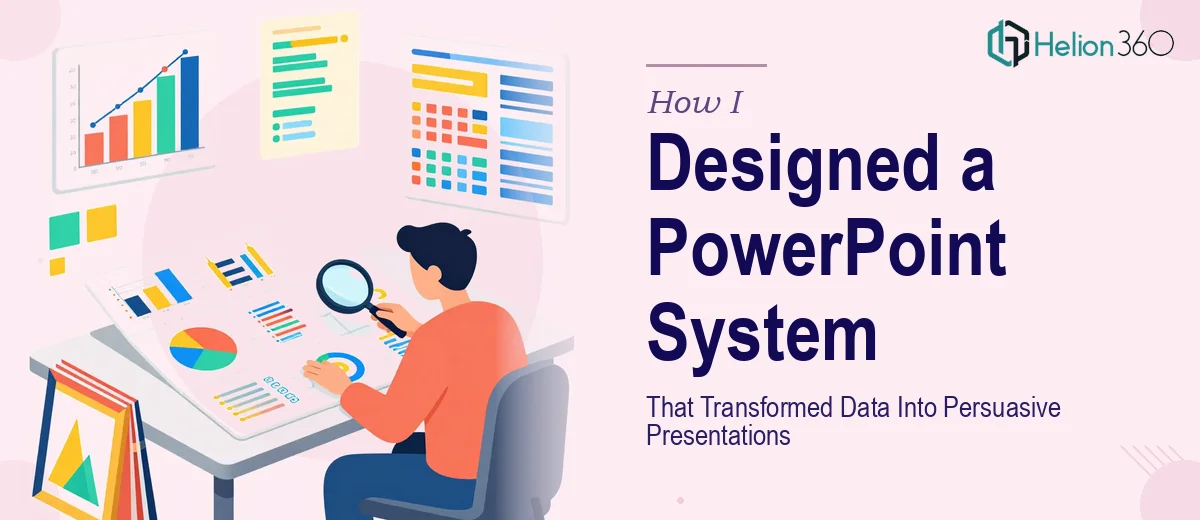
We had solid work. The data was thorough, the strategies were sound, and the recommendations were grounded. But when everything landed on a slide, it looked like a spreadsheet had an argument with a text document. Dense, inconsistent, and frankly not something a senior decision-maker would want to sit through.
I knew we needed a proper PowerPoint template system — something that could scale across multiple consultants, multiple clients, and multiple engagement types without every deck looking like a different product.
What I Tried Before Asking for Help
I spent the better part of two weeks trying to solve this myself. I built a few master slide layouts, set up a color palette, and even pulled some inspiration from consulting decks I had seen online. It looked decent in isolation. The problem showed up when I tried to actually use it for a live deliverable.
The moment real content went in — a three-section strategic framework, a competitive landscape chart, an executive summary with six key points — the layouts collapsed. Text overflowed. Charts looked cramped. The spacing that worked on a sample slide completely broke under real-world data density.
I also realized I had no consistent logic for slide hierarchy. A section divider looked similar to a content slide. The data visualization style was all over the place. For a management consulting presentation, where credibility is everything, none of that was acceptable.
I needed someone who understood both design systems and how consulting presentations actually function — not just someone who could make things look nice.
Bringing In Helion360
After hitting that wall, I came across Helion360. I explained where I was — a partially built template system that worked visually but fell apart under real content — and their team took it from there.
What made the process efficient was that they asked the right questions upfront. What types of engagements do we run? Who is the audience — internal teams, C-suite clients, investor-facing? How many consultants would be using the templates? What tools do we currently use for data visualization?
With those answers, they did not just redesign slides. They built a structured template architecture — a master file with clearly defined layout families: executive summary slides, data-heavy analytical slides, framework slides, recommendation slides, and section openers. Each one had built-in flexibility so that content could vary without breaking the design.
What the Final Template System Actually Looked Like
The delivered system was more comprehensive than I expected. The core PowerPoint file had over twenty distinct slide layouts, all linked to a single theme, meaning a color update or font change would cascade correctly across the entire deck.
The data visualization slides were particularly well thought out. Charts were pre-formatted with consistent axis styling, label placement, and color logic that matched our brand. Annotation layers were built in so analysts could highlight key data points without manually drawing shapes every time.
The framework slides — used for 2x2 matrices, process flows, and strategic pillars — were designed to stay clean even when copy-heavy. Helion360 used smart text containers and icon systems that kept things readable without sacrificing the professional density that consulting clients expect.
Every slide also had a clear visual hierarchy. Section headers read differently from content slides. Supporting data looked subordinate to the headline insight. That kind of structure is easy to describe but surprisingly hard to build consistently across a full template library.
What Changed After We Started Using It
The first real engagement we ran through the new template system took significantly less time to produce. The consultant working on it commented that they could focus on the argument rather than fighting the slides. That is exactly what a good consulting PowerPoint template should do — disappear into the background and let the thinking come forward.
Client feedback also shifted. We started hearing that our brand-aligned presentation templates were easier to follow and that the key points landed more clearly. That is the direct result of having slides that reinforce structure rather than obscure it.
If you are at a similar point — good content, weak presentation infrastructure — Helion360 is worth reaching out to. They understood what management consulting presentations need to do and built a system that actually holds up in practice.