

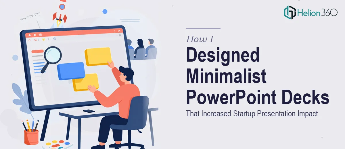
When a Startup Asks for Something That Looks Simple but Isn't
Minimalist design sounds easy until you actually try to do it. When I first took on the task of building a PowerPoint deck for a growing tech startup, I assumed it would be straightforward. Clean layout, limited text, sharp visuals. How hard could it be?
The brief was clear enough: professional, interactive, and minimalist. The startup wanted slides that communicated their ideas quickly without overwhelming investors or partners. They had seen decks from other tech companies and wanted something that felt equally polished. That was the bar.
What I did not account for was how much thinking goes into making something look effortless.
The Gap Between Simple-Looking and Actually Simple
I started by building out the deck structure myself. I had the core content, a rough slide order, and a general sense of the visual direction. I chose a clean sans-serif font, pulled together a muted color palette, and started laying out the slides one by one.
The early slides looked decent in isolation. But when I ran through the full deck as a presentation, it fell apart. The spacing was inconsistent. Some slides felt heavy and cluttered despite having very little on them. The interactive elements I tried to add — clickable navigation, animated transitions — looked amateurish rather than polished. The visual hierarchy was off, meaning viewers would not naturally know what to read or look at first.
More importantly, the slides did not feel like a cohesive story. They looked like individual pages from different documents, not a unified startup pitch deck.
I realized the issue was not the amount of content on each slide. It was the absence of a deliberate design system. Minimalist presentation design is not about removing things — it is about knowing exactly what to keep and how to position it so every element serves a purpose.
Bringing in the Right Support
After spending two days reworking slides that kept missing the mark, I reached out to Helion360. I shared the existing draft, the brief, and some reference decks the startup had flagged as inspiration. Their team asked a few sharp questions about the audience, the key messages, and how the deck would be used — whether it was a live pitch or a leave-behind. That conversation alone helped me see what I had been missing.
From there, Helion360 took over the design work. They rebuilt the slide structure with a proper grid system, established consistent type scales for headings and body text, and introduced visual spacing rules that made every slide feel intentional. The color palette stayed minimal, but they introduced subtle contrast techniques that guided the viewer's eye without adding visual noise.
The interactive elements — slide navigation, animated data reveals, section transitions — were rebuilt to feel smooth and purposeful rather than decorative. Each animation had a reason to exist.
What the Final Deck Actually Delivered
The completed deck was a significant step up from what I had put together. It looked like the kind of presentation you would expect from a well-funded startup, not a first draft built under deadline pressure.
Beyond the aesthetics, the structure was tighter. Key messages appeared at the right moments in the flow. Data slides used clean visual layouts that made numbers easier to process quickly. The overall experience of moving through the deck felt considered.
The startup used the deck across multiple pitches and internal presentations. The feedback they received consistently pointed to how clear and professional the slides looked — which is exactly what a minimalist design approach is supposed to achieve when it is done well.
What This Project Taught Me About Minimalist Slide Design
The biggest lesson from this experience was that minimalism in presentation design is a discipline, not just an aesthetic preference. It demands consistent structure, deliberate hierarchy, and a clear understanding of what the audience needs to see at each moment. Stripping away clutter is only the first step. What you replace it with — and how you arrange it — determines whether the deck communicates or just looks clean.
I also learned that interactive PowerPoint elements require as much thought as the visual design. When they are built correctly, they make a deck feel dynamic and intentional. When they are added as an afterthought, they create distraction.
If you are working on a compelling pitch deck or any professional presentation that needs to balance simplicity with impact, Helion360 is worth reaching out to — they handle exactly this kind of work and deliver results that hold up in real presentation settings.