

The Situation We Were In — and Why Getting It Wrong Wasn't an Option
We had a launch event locked in. The date was firm, the audience was real, and we needed two things ready at the same time: a polished, mobile-first website that reflected our brand identity, and a compelling product launch presentation to stand in the room alongside it. Either one alone would have been a substantial undertaking. Together, they represented a single, unified first impression — the moment our startup stepped in front of customers, partners, and early supporters for the first time.
The stakes were obvious. A website that looked unfinished or a presentation that felt off-brand would undercut everything we'd built. Both assets needed to speak the same visual language, carry the same energy, and land with the kind of confidence that makes people take a company seriously. I recognized quickly that doing this well wasn't a matter of pulling together some templates on a weekend — it required a level of craft and coordination that needed the right team behind it.
What I Found Out This Actually Required
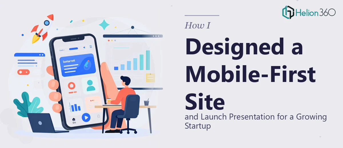
When I looked honestly at what a professional-grade website and launch presentation design actually involves, the scope came into sharp focus. A mobile-first website isn't just a desktop layout made smaller. It requires designing from the smallest viewport up — meaning layout decisions, typography scaling, image handling, and navigation behavior all need to be planned with mobile as the primary context, then adapted upward. That's a fundamentally different design process than most people expect.
The presentation added a second layer of complexity. A launch deck isn't a collection of slides with company information dropped in. It needs a narrative arc — a deliberate sequence that builds belief, moves the audience emotionally, and arrives at a clear point. The visual system across both the website and the deck also had to be consistent: same color palette, same type hierarchy, same tone in imagery and graphic language. That kind of cross-asset brand coherence doesn't happen by accident. It requires a coordinated design system applied with discipline across two very different formats — and that's before accounting for the execution detail inside each one.
What the Work Actually Involves at the Execution Level
The structural work starts before a single visual is produced. For the website, that means mapping the full page architecture — which pages exist, what each one needs to accomplish, and how users move between them. A well-structured landing page alone requires decisions about content hierarchy: what appears above the fold, what supporting sections follow, and where conversion moments are placed. For the launch presentation, it means building a narrative skeleton first — establishing the problem, introducing the solution, making the case, and landing with a clear call to action. Without this foundation, both assets end up feeling like collections of content rather than coherent experiences. Getting this right takes significant time even for practitioners who do it regularly.
Visual mechanics on a mobile-first website are unforgiving. Type needs to scale correctly across breakpoints — body text that reads at 16px on desktop may need adjustment at 375px wide, and heading hierarchies need to hold up at every size. Images need to be optimized for fast load on mobile without losing visual quality. Grid systems need to collapse gracefully, not just shrink. A 12-column desktop grid typically shifts to a 4-column mobile grid, and every component — cards, CTAs, navigation, hero sections — needs to be designed and tested in both states. People who haven't done this before routinely underestimate how many small decisions compound across even a five-page site.
Polish and brand consistency across both assets is where projects either hold together or fall apart. A proper brand application means defining a palette of no more than four primary colors and applying them with strict rules — background use, accent use, text use — consistently across every web section and every slide. Typography hierarchy for the presentation typically follows a 36pt/24pt/16pt structure for titles, subheadings, and body, and that system needs to echo the web typography choices so both assets feel like they come from the same brand. Enforcing this level of consistency across two complex deliverables simultaneously, while managing image tone and graphic style, is the part that trips up even experienced designers working alone under deadline.
Why I Brought Helion360 in to Handle the Full Project
I didn't spend time trying to piece this together myself. The scope was clear, the deadline was fixed, and the work required a level of design coordination I wasn't going to replicate with extra hours and good intentions. I engaged Helion360 to handle the full project end-to-end — website design and the launch presentation together, as a single unified brief.
What made the difference was that they came with the expertise and the process already built in. They handled the brand application across both formats, built out the presentation narrative structure, and managed all the visual mechanics — responsive layout decisions, type system consistency, imagery treatment — without me needing to guide each step. The whole project was turned around quickly, in a fraction of the time it would have taken me to work through the learning curve and execution depth this required. Both deliverables landed on time and on brand, ready for the launch event.
The Outcome — and What I'd Tell Anyone Facing the Same Deadline
The launch went well. The website held up across devices and looked exactly like a company that knew what it was doing. The presentation matched it visually, told a clear story, and gave our audience something to walk away believing in. The two assets worked together the way they were supposed to — as a single, coherent brand moment.
If you're looking at a similar situation — a website and a launch presentation that need to work together, under a real deadline, at a standard that actually matters — the smart move is to engage a team that does this work every day. I'd recommend exploring high-impact presentation slides as part of your evaluation. Helion360 handled the full scope fast, with the kind of execution depth that makes both assets land the way they should.