

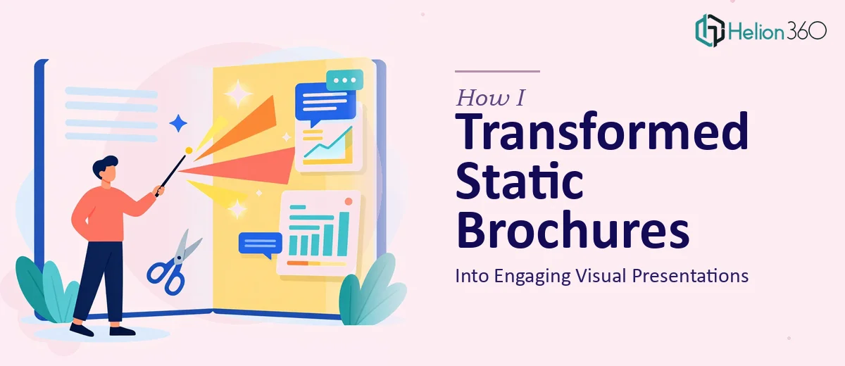
The Problem With a Brochure That Just Sits There
I had a brochure that looked fine on paper — literally. It covered the right topics, it had our logo, it had some color. But the moment I tried to use it in a presentation setting, it fell flat. The layout was designed for print, not for a screen. The hierarchy was wrong, the visuals were passive, and nothing guided the eye toward what mattered most.
The stakes were real. We had upcoming meetings where this material needed to do actual work — hold attention, communicate value quickly, and leave the audience with something memorable. A brochure that reads like a flyer wasn't going to cut it. I knew the fix wasn't just resizing a PDF. Turning static brochure content into an engaging visual presentation was a proper design job, and I recognized immediately that it needed to be handled by people who do this well.
What I Found the Solution Actually Required
Once I started looking into what a proper brochure-to-presentation transformation actually involves, it became clear this wasn't a weekend task.
The content itself needs to be restructured before anything visual happens. A brochure is written for someone who reads at their own pace. A presentation has to work slide by slide, with each screen carrying its own message. That means auditing every section, deciding what gets its own slide, what gets condensed, and what gets cut entirely.
Then there's the visual translation problem. Print layouts rely on dense columns, small type, and static imagery. Presentations need breathing room — generous white space, a clear typographic scale, and visuals that are built to be read from a distance. The two formats follow completely different rules, and applying print logic to a slide deck produces something that looks cluttered and amateur.
Finally, brand consistency has to hold across every slide. It's not enough to apply a logo and call it done. Color usage, font weights, icon style, image treatment — all of it needs to be disciplined and coherent throughout, which requires more than a surface-level template swap.
What the Work Actually Involves
The Real Work Behind a Brochure-to-Presentation Conversion
The structural layer comes first. Doing this well means auditing the source content slide by slide — stripping out what belongs in a leave-behind document rather than a live presentation, and rebuilding the narrative so each screen has a single, clear job to do. A properly structured 20-slide deck drawn from brochure content might reduce 800 words of copy to fewer than 200 words of on-screen text, with the rest carried by visuals. That content audit alone takes time, and it requires judgment about what an audience can absorb in real time versus what they read quietly on their own. Getting this wrong means slides that feel like documents — walls of text that no one in the room actually reads.
The visual mechanics then have to be rebuilt from scratch for screen. A 12-column layout grid, a three-level typographic hierarchy running roughly 36pt headlines, 24pt subheads, and 16pt body, and a palette capped at four brand colors are the kinds of constraints that separate polished work from amateur output. Image crops need to be recomposed for 16:9 widescreen. Charts, if any exist in the brochure, need to be rebuilt as clean slide graphics rather than inserted as screenshots. Setting up a slide master that enforces these rules correctly and propagates them across the full deck without breaking is genuinely technical work — someone new to it will spend hours troubleshooting alignment and spacing inconsistencies alone.
Polish and consistency across the full deck is where most self-directed attempts fall apart at the finish line. Every icon needs to come from the same set, at the same stroke weight. Every photo needs the same color treatment or overlay. Every transition and animation — if used — needs a clear logic: one entrance behavior for content, not five different effects applied slide by slide. A presentation that's 90% clean and 10% inconsistent reads as unfinished to any sharp audience. The effort required to QA a 25-slide deck for spacing, color, and alignment across every element is not trivial, and it's the kind of work that gets skipped when time runs short.
Why I Brought in Helion360 to Handle It
I didn't spend time trying to pull this off myself. The scope was clear: this wasn't a quick reformat job, it was a full structural and visual rebuild. The right move was to engage a team that handles this kind of work every day, with the process and tooling already in place.
Helion360 took on the full project end-to-end — content restructuring, slide architecture, visual design, and brand application across the complete deck. They handled the layout grid, rebuilt the typographic system for screen, and made sure every slide held up visually without leaning on the source brochure's print logic. The turnaround was fast. What would have taken me weeks of learning curve and iteration was done in days. That speed wasn't just convenient — it meant I had time to review, request adjustments, and walk into those meetings with material that was actually ready.
The Result and What I'd Tell Anyone in This Spot
What came back was a deck that communicated clearly, looked intentional, and held together as a system — not a collection of reformatted pages. Every slide had a purpose. The visual hierarchy did the work of guiding attention without me having to explain it to the audience. The branding was consistent in a way the original brochure honestly wasn't. In the meetings where it mattered, the material landed.
The lesson I'd pass on is simple: transforming a static brochure into a design project with real structural, visual, and consistency work underneath it is essential. If you're looking at the same gap between what you have and what the situation requires, engaging professionals is the move — they handle the full execution fast, and the depth of work they bring to bland presentations into captivating visual stories is exactly what this kind of transformation needs.