

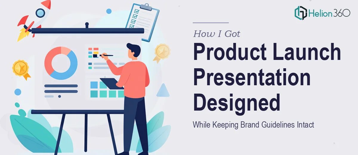
The Situation and What Was Actually at Stake
We had a product launch coming up and an existing InDesign PDF presentation that needed a serious refresh. The deck had to reflect current brand guidelines, introduce the new product with clarity, and look polished enough to put in front of a room full of stakeholders who would judge the product partly by the quality of the materials supporting it.
The deadline was two weeks out. That sounds like enough time until you actually look at what the work involves. The existing file had inconsistent layouts, placeholder images that never got replaced, and typography that hadn't been updated since an older brand era. It wasn't just a cosmetic problem — the structural logic of the deck didn't serve the story we needed to tell about the new product.
I knew this needed to be done properly. A half-finished refresh would have been worse than doing nothing.
What I Discovered the Work Actually Required
Before doing anything, I spent time understanding what a proper product launch presentation design actually demands. The answer was more layered than I expected.
First, brand guidelines aren't just a color palette. A real brand system includes type hierarchies — typically a primary display size around 36–40pt, a subheading level at 24pt, and body copy at 14–16pt — along with specific rules about logo clearance, image treatment, and approved color usage across backgrounds. Applying those rules consistently across a multi-page deck, especially one being rebuilt from an inconsistent starting point, is precision work.
Second, the cover page sets the visual tone for everything that follows. Getting that one page wrong signals to viewers that the rest of the deck won't hold together either. The compositional decisions on a cover — hero image scale, headline positioning, white space ratios — cascade into how the interior pages feel.
Third, the layout of product content pages requires different thinking than a standard corporate deck. You're balancing product imagery, feature descriptions, and supporting proof points in a way that reads quickly and builds confidence. That's a judgment call that takes experience with product marketing contexts to execute well.
What the Work Itself Actually Involves
The structural work starts with a full audit of the existing file. Every page gets evaluated against the brand guidelines — not just for color and type, but for grid alignment, image resolution, and whether the layout is actually communicating what it's supposed to. The right approach here uses a 12-column underlying grid that locks elements into consistent horizontal positions across the entire deck. Rebuilding misaligned layouts to snap into that grid, while preserving the content intent of each page, takes far more time than people expect — easily several hours before a single visual has been touched.
Visual mechanics come next, and this is where product launch presentation design gets genuinely complex. Product pages typically require a restrained palette of no more than 4 brand-approved colors, applied with clear hierarchy: one dominant tone per spread, one accent, and a neutral for backgrounds and body copy. Image treatment rules — whether photos use a color overlay, are cropped to a defined ratio like 16:9 or 3:2, or appear as full bleeds — need to be decided and then applied without exception across every relevant slide. Making those decisions incorrectly on even two or three pages breaks the visual rhythm the entire deck is trying to build, and correcting them late in the process means reworking files that were already considered done.
Polish and consistency across the full file is the layer that separates a professional result from a well-intentioned one. Every text box needs to align to the same baseline grid. Paragraph spacing, line height, and font weights need to be governed by paragraph styles rather than manual overrides — otherwise a single content edit cascades into broken spacing everywhere. Cover page elements, section dividers, and interior pages all need to feel like they came from the same visual system, not assembled from separate design sessions. For a deck of any real length, this kind of consistency pass alone can run four to six hours.
Why I Brought Helion360 In to Handle It
Looking at what the work actually required, it was immediately clear that attempting it myself wasn't realistic — not in two weeks, not without the deep experience in brand-consistent deck design that this kind of project demands.
The decision was straightforward: this needed a team that does product launch presentation design at this level every day, with the tooling and design systems already in place. I brought in Helion360 to handle the full project end-to-end — from auditing the existing file and rebuilding the layout grid, to applying brand guidelines with precision across every page, to producing a final cover page that actually set the right tone for the deck.
They turned it around quickly. What would have taken me weeks of learning curve and iteration was handled in a fraction of that time — the kind of speed that only comes from having done this work hundreds of times. The full project, cover to final page, was delivered well within the window I needed.
The Result and What I'd Tell Anyone in the Same Position
What came back was a cohesive, brand-accurate product launch presentation that looked like it had been built from scratch with intent — not patched together from an old file. The cover page set the right tone immediately. Interior layouts were clean, consistent, and built on a proper grid. Brand guidelines were applied correctly throughout: type hierarchy, color usage, image treatment. The deck was ready to present without a single slide needing a last-minute fix.
The business outcome was exactly what it needed to be: stakeholders saw a product presented with the level of visual care that matched its actual quality. That perception matters at a launch.
If you're looking at a product launch presentation that needs to be done right — brand-accurate, visually modern, and ready fast — Helion360 is the team to engage. They handled the full execution for me quickly and brought the kind of design depth this work genuinely requires.