

The Stakes Were Higher Than a Typical Internal Deck
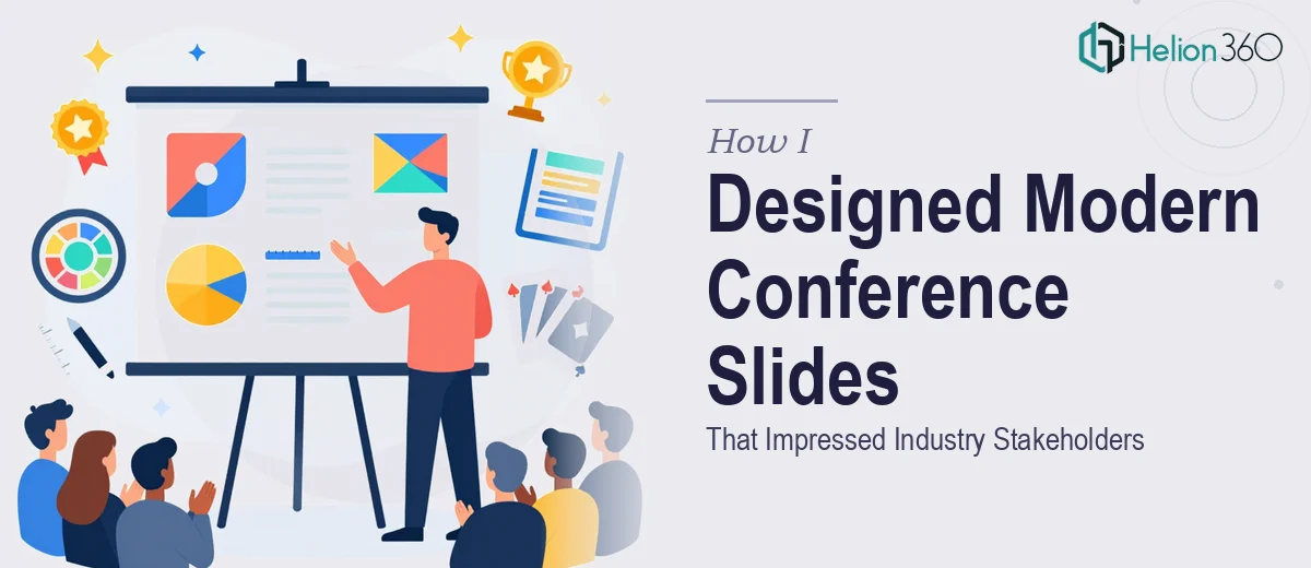
I had an upcoming business conference — the kind where key industry stakeholders would be in the room, evaluating everything from the quality of our thinking to how seriously we take our own brand. The slides needed to cover market trends, company achievements, future plans, and a set of case studies. That's a wide range of content, and every section had to land clearly.
The problem wasn't that I lacked the content. I had the data, the narrative, and the talking points. The problem was that a well-designed conference presentation slide deck is a very specific craft. These slides would be projected on a large screen in front of peers and decision-makers. Poorly formatted charts, inconsistent layouts, or generic visuals weren't just aesthetically bad — they'd signal to the room that we weren't ready. I knew this needed to be done properly, and I wasn't going to get there by spending my evenings wrestling with slide masters.
What Doing This Well Actually Involves
I spent some time understanding what separates a genuinely polished conference presentation from something that just looks passable on a laptop screen. The gap was bigger than I expected.
First, a deck covering this many topics — trends, achievements, future plans, case studies — needs a coherent visual and narrative structure across every section. Without intentional architecture, it reads like four separate presentations stitched together. Second, conference slides are judged at distance. Typography that works fine in a document collapses on a 12-foot screen. Contrast ratios, font sizing, and visual weight all operate by different rules when projected. Third, the illustration and custom visual work required here isn't a matter of inserting stock icons. Each slide section needs imagery and graphics that reinforce the specific message of that slide, not generic filler. That level of custom illustration work is its own discipline entirely.
At that point, I understood clearly that this wasn't a weekend project.
What the Work Actually Requires to Get Right
The first thing that needs to happen is a structural and narrative audit of all the source content. A conference deck covering market trends, company achievements, future plans, and case studies has four distinct audience expectations to meet. Each section needs its own story arc — but the deck as a whole has to flow as one cohesive argument. The right approach maps a clear slide-by-slide narrative before any design work begins, deciding which content lives on which slide, where transitions need to signal a shift in topic, and how much information a single slide can carry without losing the room. Getting this wrong at the structural stage means redesigning everything later.
Visual mechanics are where most self-built conference decks fall apart. Proper conference slide design uses a consistent layout grid — typically a 12-column structure — applied uniformly across every master slide variant. Typography follows a strict hierarchy: title text at 36–40pt, body at 20–24pt, and supporting captions no smaller than 14pt to remain legible on a projected screen. Color usage is disciplined, usually no more than 4 brand colors, with one high-contrast accent reserved for key data points and calls to action. Setting up slide masters that enforce all of this correctly — and hold up when content is swapped in — takes significant time and precision, especially for someone not working in these tools daily.
Custom illustration and the visual treatment of data-heavy slides add another layer of execution depth. Market trend slides and case study slides carry charts, comparisons, and supporting visuals that need to be purpose-built, not pulled from a template library. Each visual has to match the slide's message, sit correctly in the layout grid, and remain readable at projection scale. The edge cases here — a chart that looks fine at 100% zoom but loses its labels when projected, or an illustration that clashes with the brand palette — are the kind of details that only surface during careful review cycles. Working through those iterations without the right tooling and eye for it adds days to the timeline.
Why I Brought Helion360 In to Handle the Full Project
I looked at the scope — the narrative architecture across four content sections, the grid-based layout system, the custom illustration work, the projection-scale visual standards — and made a straightforward call. I didn't have the time to learn and execute all of this myself, and the conference date wasn't moving.
Helion360 handled the full project end-to-end with business presentation design services: the structural planning and content mapping across all four deck sections, the slide master build with consistent typography and layout rules applied throughout, and the custom visual and illustration work for the market trends and case study slides. The turnaround was fast — done in days, not weeks — and the team worked with the kind of precision that comes from doing this type of project regularly. There was no back-and-forth trying to explain basic design principles. They already knew the standards a conference deck needs to meet.
What Came Back and What I'd Pass Along
What came back was a deck that looked like it belonged in that conference room. The slides were cohesive from section to section, the data visualizations were clean and readable at scale, and the case study slides had a visual clarity that made the content easy to follow for an audience seeing it for the first time. The stakeholder feedback after the conference reflected that — the presentation held attention and the material landed the way it was meant to.
If you're looking at a similar project — a conference deck covering multiple content types, with real stakeholder scrutiny on the line — and you can see the gap between what you have and what the room expects, that's the moment to engage the right team rather than attempt it solo. If you're in that spot, Helion360 is who I'd go to: they handled the full scope quickly, and the execution depth they brought is exactly what this kind of work requires.