

The Situation We Were In and Why It Had to Be Right
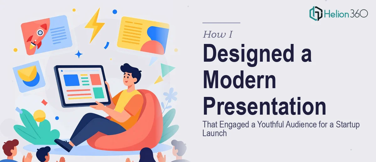
We had a startup launch coming up and a presentation series that needed to do real work — educate a youthful audience, communicate our brand identity, and set the tone for everything we'd put in front of people from that point on. This wasn't a single slide deck. It was a series: multiple connected presentations that had to feel cohesive, modern, and genuinely compelling to an audience with a low tolerance for anything that looked generic or dated.
The rough draft we had internally gave a sense of direction, but it wasn't close to ready. The visual language was inconsistent, the hierarchy was hard to follow, and nothing felt like it belonged to a unified brand. With a launch timeline bearing down, I recognized quickly that this needed more than cosmetic fixes. It needed proper product launch presentation design services, done by people who do this at a high level every day.
What I Found Out the Work Actually Requires
Once I started looking seriously at what a well-executed startup presentation series involves, the scope became clearer — and more demanding. A youthful, modern audience expects a specific visual register: bold but purposeful typography, layouts with real breathing room, and a color system that feels intentional rather than assembled. That's not something you arrive at by picking a template and swapping in your logo.
Beyond aesthetics, there's the structural layer. A presentation series has to tell a connected story across multiple decks. Each piece has its own job — one might introduce the brand, another might explain the product, another might inspire action — but they all have to feel like they came from the same place. Getting that consistency right across 15, 20, or 30 slides per deck, multiplied across a series, is a meaningful execution challenge. Then there's the brand alignment layer: translating a brand identity that may still be evolving into a design system that holds up under pressure. When I mapped all of that out, it was obvious this wasn't a weekend project.
What the Work Itself Actually Involves
The foundation of a well-executed startup presentation series is narrative structure and content architecture. Each deck needs a clear job — awareness, education, conversion, inspiration — and the slides have to be sequenced to support that arc, not just filled with content in a logical order. The right approach starts with auditing what exists, mapping the story each deck needs to tell, and deciding what each slide is responsible for communicating. For a series of three or more decks, this mapping process alone can surface dozens of structural decisions that have downstream consequences on every design choice that follows. Getting this wrong means slides that look polished but don't land with the audience.
Visual mechanics are where execution complexity compounds quickly. Doing this well requires a disciplined layout grid — typically a 12-column system that keeps alignment consistent across every slide — paired with a clear typographic hierarchy, usually something in the range of 40pt for headers, 24pt for subheadings, and 16pt for body copy, scaled for the screen size and audience distance. Color discipline matters equally: a well-designed startup presentation series typically works within a palette of four or fewer brand colors, with defined roles for each — primary, accent, neutral background, and text. Deviating from those roles even once creates visual noise that the audience feels even if they can't name it. Setting this system up correctly so it propagates across master slides and layouts takes significant time for anyone not already working in this space daily.
Polish and brand consistency across an entire series is where most self-managed attempts fall apart. When the same design system has to hold across 60 or 80 slides spread across multiple decks, any inconsistency in spacing, icon weight, image treatment, or color usage becomes visible. The standard here is that every element — divider lines, callout boxes, image frames, button-style CTAs — should follow the same rules in every instance. Maintaining that level of consistency requires not just taste but systematic discipline: well-built slide masters, consistent component libraries, and a review pass that checks each slide against the design system rather than eyeballing it. For a youthful audience that processes visual quality instinctively, inconsistency signals amateur work faster than almost anything else.
Why I Brought Helion360 in to Handle the Full Project
Once I understood what the work actually required, I didn't spend time testing whether our internal team could pull it off under time pressure. The answer was obvious. This was a specialist job — structural narrative work, visual system design, brand application across a multi-deck series — and we needed it handled end-to-end by people who do exactly this.
I engaged Helion360 to take the project from our rough draft all the way to a finished, launch-ready series. They handled the content architecture across all decks, built the visual design system from our brand identity, and applied it consistently across every slide in the series. The turnaround was fast — done in days, not weeks — which is exactly what a launch timeline demands. What would have taken our team weeks of iteration, revision, and learning-as-we-go was handled in a fraction of that time by a team with the tooling and expertise already in place.
The Outcome and What I'd Say to Anyone Looking at the Same Problem
What we received was a cohesive, modern presentation series that felt like it belonged to a real brand — one with a clear visual language, a consistent story across decks, and a design register that actually resonated with a youthful audience. The launch went out with materials that looked as credible and polished as the product we were presenting. That consistency built confidence internally and externally from the first impression.
If you're staring at a rough draft, a tight timeline, and a presentation series that needs to do serious work for your brand, the calculation is straightforward. The execution depth this kind of project requires is real, and the time cost of figuring it out yourself while a launch window closes is not worth it. Helion360 handled every layer of this project end-to-end and delivered fast — if you're in the same spot, that's the team to engage.