

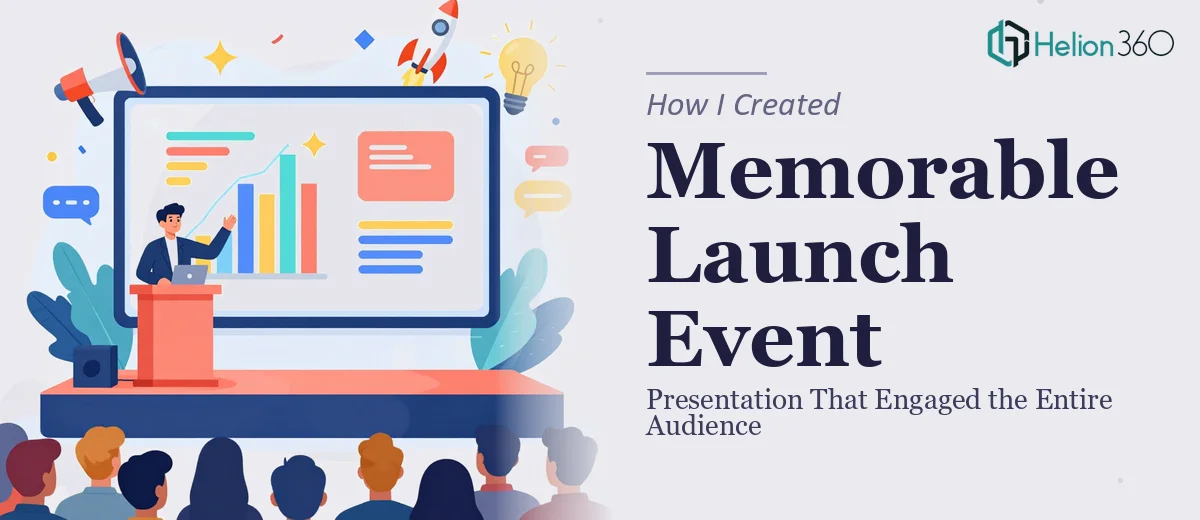
The Brief Sounded Simple Enough
We had a major internal launch event coming up — the kind that sets the tone for an entire initiative. My job was to put together a Google Slides presentation that would open the day, get everyone aligned, and genuinely excite the room. I had the outline, I had the content, and I figured I could pull the slides together myself over a weekend.
That estimate was off by a significant margin.
Where the Complexity Crept In
The content itself was not the problem. The challenge was turning that content into something that actually felt like a launch event. Every slide I built looked functional but flat. The kind of presentation that gets politely acknowledged and then forgotten by lunch.
I kept running into the same wall: I knew what I wanted to communicate, but translating that into a visual flow that felt energetic, cohesive, and professional was a different skill entirely. I tried adjusting fonts, switching color palettes, and pulling in stock images, but nothing clicked. The slides looked assembled rather than designed.
For a launch event presentation, that distinction matters. The audience reads the room from the visuals before a single word is spoken. A deck that looks polished signals intention. A deck that looks patched together signals the opposite.
Bringing in a Professional Eye
After a few rounds of revisions that weren't moving the needle, I reached out to Helion360. I explained the context — a company launch event, a live audience, a tight timeline, and a set of slides that had good bones but no visual identity to speak of.
Their team asked the right questions upfront. What was the tone of the event? Who was in the audience? Were there brand guidelines to follow? What moments in the presentation needed the most visual weight? That kind of structured intake made it clear they were thinking about the presentation as a communication tool, not just a design exercise.
I handed over my draft outline and content, and they took it from there.
What the Redesigned Deck Actually Looked Like
The turnaround was faster than I expected. When I reviewed the first draft, the difference was immediate. The opening slide set a clear visual tone that matched the energy of the event. Each section had a consistent layout logic, so the audience could follow the flow without consciously thinking about it. Key messages were given space to breathe rather than being buried in dense text blocks.
The Google Slides file was clean and editable, which mattered because I still needed to make last-minute content tweaks before the event. Nothing was locked down in a way that made updates difficult. Helion360 had clearly built the deck with a real presenter in mind, not just a static document to be read on screen.
We went through one round of feedback and minor refinements — adjusting a few slide transitions, tightening up some slide copy, and swapping out one section visual. The collaborative back-and-forth was straightforward and efficient.
How the Presentation Landed on the Day
The event went well. More importantly, the presentation did its job. The opening slides got the room's attention and held it. People commented on how polished it looked, which is honestly the best outcome — when the design is doing its work invisibly and no one is distracted by how the slides look.
Looking back, the time I spent trying to design the deck myself was the bottleneck. The content strategy and messaging were my responsibility and I handled those well. The visual execution of a launch event presentation at that level was not something I could produce to the standard it needed in the time available.
That's the honest lesson. Knowing where your contribution ends and where specialist work begins is not a limitation — it's just accurate project management.
If you're preparing a launch event presentation and finding that the visual side isn't coming together the way the content deserves, Helion360 is worth a conversation — they handled exactly this kind of work and delivered something the room actually remembered. Learn more about compelling visual storytelling in presentation design.