

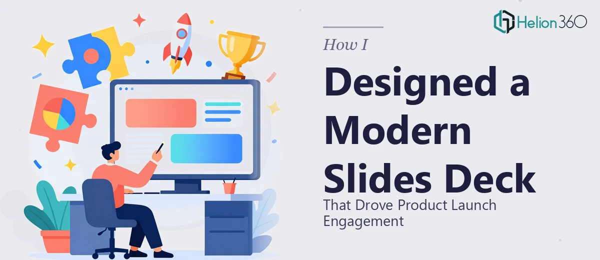
The Presentation That Couldn't Afford to Underperform
We had a product launch coming up, and the Google Slides presentation was going to be the centerpiece of it. Not a casual update — this was the deck going in front of potential customers, channel partners, and a few key accounts we'd been working to close for months. The stakes were real: first impressions in this kind of setting are difficult to recover from, and a visually inconsistent or hard-to-follow deck would undercut everything the product team had built.
I knew we needed something that looked sharp, communicated the product's value clearly, and moved audiences toward a specific next step. I also knew that what we had on hand — a mix of rough slides, bullet-heavy copy, and a brand guide we hadn't fully applied anywhere yet — wasn't going to get us there on its own. This needed to be done right, and I wasn't going to pretend otherwise.
What I Found Out This Kind of Presentation Actually Takes
Before I engaged anyone to handle the work, I spent some time understanding what a well-executed product launch presentation in Google Slides actually requires. The answer was more layered than I expected.
The first thing that became clear was that brand alignment in Google Slides isn't as forgiving as it looks. Google Slides has its own quirks — master slide logic, theme color propagation, font substitution behavior — that mean a design that looks right in one environment can break in another. Getting a consistent look across 20 or 30 slides, especially when the brand palette includes custom hex values and specific typeface pairings, is not a drag-and-drop exercise.
The second signal of complexity was the content itself. Product launches need a story, not a feature list. The slides had to take someone from "I don't know this product" to "I understand why I need it" to "I know what to do next" — and that arc has to work in both a live presentation and a leave-behind read. Getting that sequencing right is editorial work, not just design work.
That combination of technical execution and narrative structure made it obvious this wasn't a weekend project.
What a Well-Executed Product Launch Deck Actually Involves
The structural and narrative work comes first and sets the foundation for everything else. The right approach starts with auditing the raw source material — feature notes, positioning statements, product specs, statistics — and mapping it against a clear story arc. For a product launch, that arc typically runs through problem framing, solution introduction, feature highlights, proof points, and a single unambiguous call-to-action. Each slide needs one job, and no slide should try to do two. Getting this architecture right before a single design element is placed is where most self-built decks go wrong — they skip the map and wonder later why the deck feels scattered.
Visual mechanics in Google Slides require deliberate decisions that compound across the full deck. A properly built presentation uses a consistent layout grid — typically a 12-column structure with defined margin gutters — so that text blocks, images, and data visuals land in the same spatial logic on every slide. Typography hierarchy follows a clear scale: a title treatment around 36pt, supporting headers around 24pt, and body copy no smaller than 16pt for readability in both projected and screen-read contexts. Chart and icon styles need to be unified. The execution friction here is real — setting up a Google Slides master that actually propagates these decisions correctly, rather than breaking when a new slide is added, takes experience and a steady hand with the platform's theme editor.
Polish and brand consistency across the full deck is where many otherwise decent presentations fall apart. A brand palette used well means no more than four primary colors applied with intention — not just anywhere they fit. Every product image needs consistent shadow treatment or none at all. Every call-to-action slide needs to mirror the same layout logic as the opener. When a deck runs 25 or more slides, maintaining that discipline manually is time-consuming and error-prone. A single misaligned element on the closing CTA slide, for example, can quietly undercut the credibility of everything that came before it.
Why I Brought Helion360 In to Handle the Full Project
I looked at what the work actually involved and made the call quickly. The combination of Google Slides platform knowledge, brand application discipline, and the editorial work of building a launch narrative end-to-end wasn't something I was going to assemble on the fly with a tight launch window bearing down on us.
Helion360 handled the full project — from structuring the story arc out of our raw source material, to building the master slide system with our brand colors and typography locked in, to designing and polishing every slide through to the final call-to-action. They turned it around in a fraction of the time it would have taken me to learn, execute, and QA it myself. Done in days, not weeks.
What made it work was that they weren't learning the problem as they went. The tooling, the design system logic, the product launch narrative conventions — it was all already in place on their end.
The Result and What I'd Tell Anyone Facing the Same Call
What came back was a presentation that looked like it belonged in front of the audiences we were targeting. The brand was consistent across every slide. The story moved cleanly from problem to solution to proof to next step. The statistics we wanted to highlight were visualized in a way that made them land rather than blur into the background. And the call-to-action slide at the end was clear, clean, and pointed people exactly where we needed them to go. The deck held up in a live setting and worked just as well as a follow-up send.
The launch engagement we saw from that first round of presentations validated the investment immediately. Audiences followed the story, asked the right questions, and the conversion from presentation to next-step conversation was noticeably stronger than what we'd seen with previous material.
If you're looking at a similar project — a product launch deck that needs to perform across multiple audiences and actually reflect your brand — and you want it handled end-to-end without the weeks of learning curve, Helion360 is the team I'd engage.