

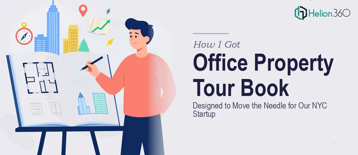
The Problem With Our Property Tour Book
We were a growing NYC startup preparing to pitch premium office space to a shortlist of prospective tenants and partners. The pitch wasn't going to happen in a boardroom — it was a guided property tour, and the leave-behind material was going to do a lot of the heavy lifting after we walked out.
What we had was a folder of rough photos, a few bullet points about square footage, and a brand identity that hadn't been applied consistently to anything yet. What we needed was a professional property tour book — something that told a coherent story about the space, reflected our brand, and gave decision-makers something worth revisiting after the tour.
The timeline was tight. The audience was discerning. And I knew straight away that throwing this together in PowerPoint over a weekend wasn't going to cut it.
What I Found a Professional Tour Book Actually Requires
I started digging into what a well-executed property tour book actually involves, and the complexity surfaced fast.
First, this isn't just a formatted PDF. A tour book that performs well in a commercial real estate context follows specific conventions — property specs presented in a scannable hierarchy, photography treated as a primary design element rather than filler, and a narrative flow that mirrors the physical experience of moving through the space.
Second, brand consistency has to run through every page. That means a controlled color palette, a locked-down typographic system, and a grid that holds across layouts with very different content densities — some pages are mostly image, some are mostly text, some are hybrid.
Third, the photography direction and layout decisions are interdependent. Choosing the wrong crop or pairing a weak image with a headline-heavy layout undermines the entire impression. These are judgment calls that require real visual design experience, not just software access.
It was clear this was a serious print and digital design project, not a template swap.
What the Design Work Actually Involves
The first layer of work is structural — auditing the available content, mapping the narrative arc of the tour book, and deciding what each spread needs to accomplish. A property tour book typically runs 12 to 20 pages, and each page has a job: establish credibility, introduce the space, communicate specs, and leave a clear impression of value. Getting that sequence right before a single layout is touched is where the real editorial judgment happens. Rushing this stage produces a book that looks designed but reads as disjointed — and discerning audiences notice immediately.
The visual mechanics layer is where execution complexity compounds. Done well, a tour book uses a 12-column grid with defined gutter widths that hold across spreads, a typographic hierarchy of roughly 36pt display, 18pt subhead, and 11pt body, and a photography treatment that's consistent in tone and color grading. Setting up master layouts that propagate correctly across pages with different content loads — some full-bleed image, some text-forward — takes real skill and hours of precise setup. A practitioner working in this space will also be managing bleed, trim, and safe zones for print output simultaneously with digital screen optimization.
Polish and brand consistency is the third layer, and it's the one most people underestimate. Applying a startup's brand identity across 16 pages of varied content means making hundreds of micro-decisions: which accent color hits the pull quote on page 9, whether the logo sits in the footer or the header on spec pages, how much white space preserves the premium feel when a page is content-dense. A maximum of 4 brand colors is a common rule of thumb, but maintaining that discipline across image-heavy and text-heavy layouts without the result looking flat requires experience that only comes from doing this kind of work repeatedly.
Why I Brought Helion360 in to Handle It
Once I understood what the work actually involved, the decision was straightforward. I didn't have the layout expertise, the print production knowledge, or the time to build this from scratch — and attempting it myself would have cost more in delayed opportunity than it would have saved.
I engaged Helion360 to handle the full project end-to-end. That meant content structuring and narrative sequencing, full layout design across all pages with a locked grid and brand system, photography selection and treatment, and export-ready files for both digital distribution and print production.
The turnaround was fast — the full tour book was delivered in days, not weeks. What would have taken me weeks to research, set up, and execute at an acceptable standard was handled in a fraction of that time by a team that does this kind of work every day, with the tooling and design infrastructure already in place.
The difference between a team that has done fifty property-facing design projects and someone learning the production pipeline mid-project is not subtle. It shows up in every margin, every photo crop, and every page transition.
The Result and What I'd Tell Anyone Facing the Same Situation
What came back was a tour book that looked like it came from a firm with ten years of real estate credibility — not a startup scrambling to get material together before a pitch. The layout was clean, the brand held across every page, and the narrative moved the way a good tour should: from first impression to detailed specs to a clear value close.
The prospective tenants and partners we handed it to engaged with it in the room and followed up afterward referencing specific pages — which is exactly what a well-designed leave-behind is supposed to do. The material did its job.
If you're looking at a similar project — a property tour book, a portfolio piece, or any print-and-digital design deliverable where brand consistency and visual storytelling actually matter — and you want it handled end-to-end without the weeks of learning curve, Helion360 is the team I'd engage. They delivered fast, and they brought the kind of execution depth this work genuinely requires.