

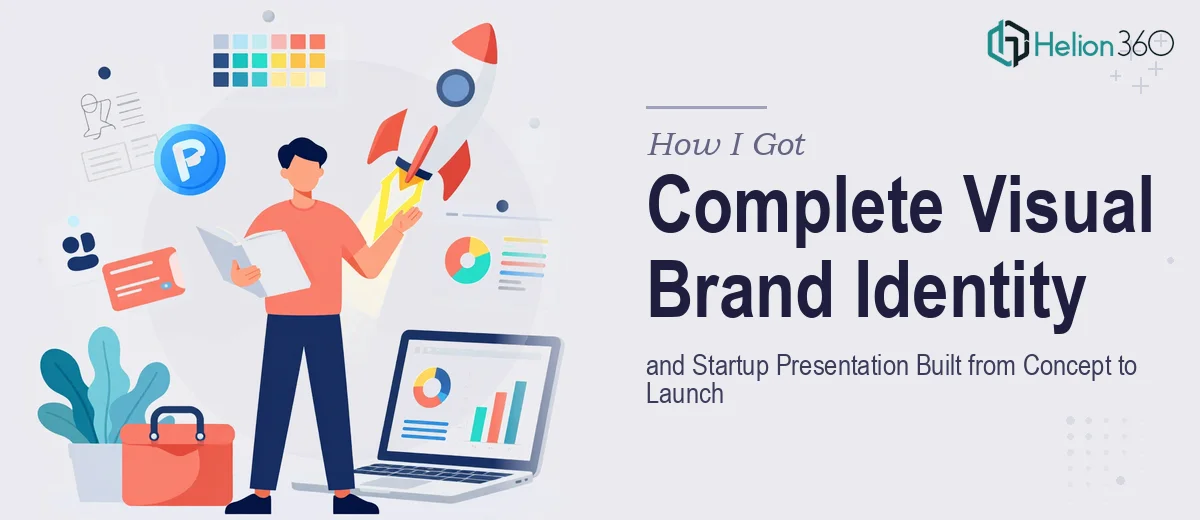
The Problem Was Bigger Than a Logo
When I looked at what our tech startup actually needed to go to market, it became clear very quickly that a logo was only the starting point. We needed a full visual brand identity — the logo mark, a complete color system, a typography hierarchy, and a visual language consistent enough to carry across every touchpoint, from the website to the investor pitch deck.
The stakes were real. Early investor conversations were already on the calendar. A product launch timeline wasn't flexible. And the founding team needed to show up looking like a company, not a side project. First impressions in the startup world are compressed — you get one shot in front of the right room. Walking in without a coherent visual identity was not an option. I knew straight away this needed to be done properly, end-to-end.
What I Found the Work Actually Required
Before I made any decisions, I spent time understanding what a professional brand identity engagement actually involves. What I found was that the real complexity isn't in making something that looks polished — it's in building a visual system that holds together across every use case it will face.
The logo itself needs to function in multiple configurations: a primary lockup, a horizontal variant, an icon-only mark, monochrome versions, and reversed treatments for dark backgrounds. Each version has to be constructed on a precise grid with defined clear space rules — typically expressed as a multiple of a specific logo element — so the mark scales without distortion from a business card to a conference banner.
Beyond the logo, a functional brand identity requires a defined primary and secondary palette with locked hex, RGB, and CMYK values, a type hierarchy covering at least three levels (display, body, caption), and explicit rules governing how all of it applies across both digital and print contexts. That's before a single slide or document is built. The number of decisions that need to be made and documented — and then executed with total consistency — made it obvious this wasn't something to approximate.
What the Execution Actually Involves
The structural foundation of a visual brand identity starts with the logo construction document. Done properly, the mark is built on a geometric grid — typically a unit-based system where every curve radius, stroke weight, and spatial relationship between letterforms or icon elements is defined by that grid. Clear space is specified as a minimum margin (often equal to the cap height of the wordmark or the width of a core icon element) that protects the mark at all sizes. This level of precision is what allows the logo to look intentional at 16px in a browser tab and at full scale on a product packaging mockup. Getting this right in the first pass requires someone who understands construction geometry, not just visual intuition — and redoing it after the fact is expensive.
The color and typography system carries equal weight in how the brand reads in the real world. A professional palette specifies no more than four primary brand colors with exact values across hex, RGB, CMYK, and Pantone references, plus a set of secondary and neutral tones with defined usage contexts. The type hierarchy uses specific point sizes and weights — a common tech startup system runs 48–56pt for display, 24–32pt for section headers, 16–18pt for body, and 12–14pt for captions — with defined line-height multipliers that keep layouts breathable. Selecting typefaces that hold up across the full hierarchy and also render correctly in both design tools and web environments is a distinct skill. Many teams discover the hard way that the typeface they chose for the logo doesn't have the full weight range needed for a 30-slide deck.
Applying the system to a launch presentation or pitch deck is where the execution friction becomes most visible. Every slide master needs to reflect the exact palette values, the correct type hierarchy, and the proper logo placement with its cleared space intact — across every slide variant in the deck. Visual consistency at this level means manually checking grid alignment (typically a 12-column layout with defined margins and gutters), icon style uniformity, and image treatment rules. A 25-slide deck with three or four master layouts can take a full workday just to audit and correct, even with a solid brand system in place. Without one, that time multiplies.
Why I Brought in Helion360 to Handle It
When I understood the full scope — logo construction, brand system documentation, and a launch-ready presentation all needing to work together — I recognized immediately that attempting to coordinate this myself wasn't the smart move. The time it would take to learn the craft depth involved, let alone execute it at the standard a tech startup launch requires, wasn't available.
Helion360 handled the full project end-to-end. That meant brand strategy grounding, logo development across all required configurations, the complete color and type system with documented values, brand guidelines production, and the pitch deck built on top of the system — all delivered fast, in a fraction of the time it would have taken to figure out and execute independently. The team came with the tooling, the process, and the judgment already in place. There was no learning curve to absorb — just clean, professional output that arrived ready to use.
The Outcome and What I'd Tell Anyone in My Spot
What came back was a complete, consistent visual identity — a logo system with all required file formats, a brand guidelines document that any future designer or developer could pick up and work from, and a pitch deck that looked like it belonged to the same world as the brand. The early investor meetings went into the room with materials that reflected the ambition of the company, not the budget constraints of a rushed launch.
The business outcome mattered: the presentation held up in rooms where visual credibility is part of the evaluation. That's the real value of doing this work properly from the start — it compounds every time the brand shows up somewhere new.
If you're looking at the same scope — logo, brand system, and a presentation that needs to carry the identity through — and you want it handled end-to-end without the weeks of learning curve, Helion360 is the team to engage. They delivered for me fast and brought exactly the execution depth this kind of work demands.