

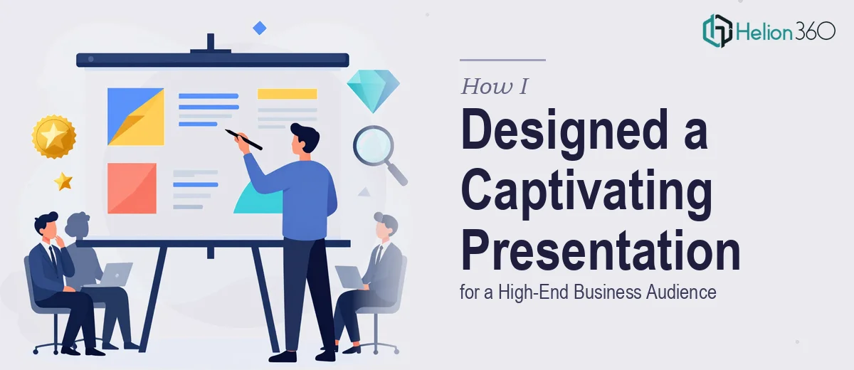
When the Deck Stops Representing You
We had a presentation problem that had quietly been building for months. The deck we were using to represent our company to high-end business audiences looked like it had been assembled piecemeal — different font treatments on different slides, an outdated color palette, logo placements that varied from section to section. It wasn't a reflection of where we were as a business.
The stakes were real. We had a series of important audience touchpoints coming up — the kind where first impressions drive decisions. Our brand materials needed to communicate professionalism, coherence, and forward momentum, not visual inconsistency. I knew a surface-level cleanup wasn't going to cut it. This needed to be a proper presentation redesign paired with a brand refresh that held across every format we used.
I also knew that doing it right meant understanding exactly what that work involves.
What I Found a Real Brand and Deck Refresh Actually Requires
Once I started mapping out what a proper modern PowerPoint presentation design refresh actually entails, the scope became clear quickly. This wasn't just a visual facelift — it was a structured undertaking across several distinct layers.
First, there's the brand identity layer: revisiting the color system, typography hierarchy, logo usage rules, and how all of those elements translate cleanly to slide environments. Then there's the presentation architecture layer: auditing every existing slide for narrative logic, not just aesthetics, so the story the deck tells holds together from cover to close.
Beyond those two, there's the consistency and scalability layer — ensuring the redesigned system can be adapted by others going forward without falling apart. That means building master slides properly, locking in style guides, and creating templates that don't require a designer on standby every time a new slide needs to be added.
Any one of those layers is a project on its own. Together, they represent a significant investment of specialized skill and time. That's when I stopped thinking about attempting this in-house.
What the Work Itself Actually Involves
The right approach to a presentation redesign starts with a full narrative and structural audit of the existing deck. Every slide needs to be evaluated not just for how it looks, but for what role it plays in the overall story. The work here involves mapping a clear information hierarchy — deciding what leads, what supports, and what belongs in backup slides entirely. A well-built 30-slide business deck typically compresses to a tighter, sharper 18-22 slide structure once redundant or off-narrative content is removed. Getting that audit right before any visual work begins is what separates a coherent redesign from a cosmetically improved mess. The friction is that it requires both editorial judgment and design experience simultaneously, which is a rare combination to find in a single person working under time pressure.
Once the structure is sound, visual mechanics take over — and the specifics matter enormously here. Proper slide design uses a 12-column layout grid applied consistently across every master slide, a typographic scale of no more than three size levels (typically 36pt for headings, 24pt for subheadings, 16pt for body), and a brand color palette locked to four core colors with defined usage rules. Chart types need to be chosen based on data relationship, not visual preference — a clustered bar chart and a stacked bar chart communicate fundamentally different things even when the underlying numbers are identical. Setting up master slides that enforce all of this correctly, and that propagate changes globally rather than requiring manual slide-by-slide edits, takes hours of careful setup even for experienced designers.
Polish and brand consistency across the full deck is where most in-house attempts fall apart at the finish line. This work involves ensuring icon weights are uniform, spacing between elements follows a consistent 8pt or 16pt grid increment, and brand application doesn't drift across sections that were built at different times. A brand usage guide delivered alongside the deck — covering logo clear space rules, approved color combinations, and font fallbacks for non-design environments — is what makes the refresh durable over time. Without it, the deck reverts to inconsistency within a few months of internal use. Building that guide properly requires documenting decisions that most designers make intuitively, which adds a layer of effort that's easy to underestimate from the outside.
Why I Brought Helion360 in to Handle the Full Project
I recognized early that the combination of brand strategy, presentation architecture, and visual execution this project needed wasn't something I could piece together quickly on my own. The learning curve alone — getting master slides right, building a brand guide that actually holds, ensuring every design decision was defensible and consistent — would have cost weeks I didn't have.
Engaging Helion360 was the straightforward call. They handled the project end-to-end: the structural audit and narrative reorganization of the existing deck, the full visual redesign built on a proper grid and brand system, and the brand usage guide for future updates. The turnaround was fast — delivered in days, not weeks — and the execution depth reflected a team that does exactly this kind of work regularly, with the tooling and process already in place.
The result wasn't just a prettier deck. It was a coherent brand and presentation system that held together across every format it needed to cover.
What I'd Tell Anyone Looking at the Same Problem
The finished deck changed how our company showed up in every high-stakes audience interaction we had following the project. The visual language was sharp, the narrative was tight, and the consistency held across slides that different people on the team were responsible for presenting. That last part — the durability of the system — turned out to be as valuable as the design itself.
If you're staring at a brand and presentation refresh that's been on the list too long, and you can see the scope of what doing it properly actually involves, Helion360 is the team to engage — they delivered the full execution fast and brought the kind of design depth this work genuinely requires.