

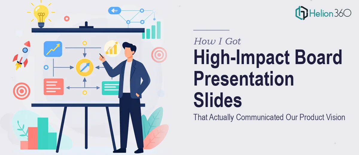
The Situation We Were In and What Was at Stake
We were a tech startup in the middle of building our pitch deck, and the board presentation was the next critical milestone. The slides needed to communicate a genuinely complex product idea — one that involved layers of technology, market context, and a roadmap that wasn't easy to distill — to a room of people who had seen hundreds of decks and had limited patience for anything unclear.
The stakes were straightforward: if the slides didn't land, the story didn't land. And if the story didn't land, the conversation we needed to have wouldn't happen. This wasn't a situation where "pretty good" was acceptable. The presentation had to be visually compelling, structurally tight, and built to hold up under scrutiny from people who ask hard questions.
I recognized early that producing something at that level wasn't just a design task — it was a communication challenge that required real craft. Doing it right meant getting the right team involved immediately.
What I Found Board Presentation Design Actually Requires
When I started looking at what a board presentation actually takes to get right, the scope became clear fast. It's not a matter of making slides look nice. The work requires a disciplined narrative architecture — knowing which information belongs on which slide, in what order, and why. For a startup presenting a complex product, that means translating technical depth into boardroom-ready clarity without losing the substance.
Beyond structure, there's the visual execution. Proper board presentation slides use deliberate layout systems, controlled typographic hierarchies, and chart types chosen specifically for how the audience processes information at a glance. A cluttered slide or a mismatched chart type doesn't just look unprofessional — it breaks comprehension at exactly the wrong moment.
Then there's brand consistency. Every slide has to feel like it belongs to the same document, with the same palette, the same spacing logic, and the same visual weight applied across every section. That kind of consistency doesn't happen by accident. It requires a structured approach to slide masters, style guides, and design systems that propagate correctly across the full deck. I wasn't going to build that from scratch under deadline pressure.
What the Work Itself Actually Involves
The first layer of the work is structural — auditing the content, mapping a narrative arc, and deciding what each slide is actually responsible for communicating. A board presentation isn't a data dump; each slide should answer one clear question and set up the next. For a startup deck, the typical structure moves from problem and market context through product differentiation, traction, and the ask — but the sequencing has to be calibrated to the specific audience. Getting the narrative right before a single visual is placed is what separates a presentation that reads cleanly from one that leaves the room with more confusion than it started with. This structural phase alone can take multiple rounds of iteration to get right, and skipping it results in visually polished slides that still fail to communicate.
The second layer is visual mechanics — the actual design system that makes the deck look and function like a professional document. Proper board presentation slides are built on a 12-column layout grid, use a typographic hierarchy of roughly 36pt for headlines, 24pt for subheads, and 16pt for body text, and limit the palette to four brand colors applied with strict discipline. Chart selection matters at this level: a clustered bar is not the same communication tool as a slope chart or a waterfall, and choosing the wrong one forces the audience to work harder to extract the insight. Setting up a master slide system that enforces these rules consistently across 20 or 30 slides — and holds up when content changes — is work that takes real tooling knowledge and design experience to execute without errors.
The third layer is polish and consistency across the full deck. This means every icon set matching in style and weight, every data label formatted the same way, every section divider using the same spacing logic. Even small inconsistencies — a slightly different shade of the primary color, a text box that's two pixels off alignment — register subconsciously with a board-level audience and erode confidence in the presenter. Achieving true consistency at scale requires working from a locked style system from the beginning, not retrofitting it at the end. For someone without that system already built, the polish phase alone can consume more time than the entire initial design pass.
Why I Brought in Helion360 to Handle It
Once I understood what the work actually required, the decision was immediate. I wasn't going to spend weeks building a slide system from the ground up, learning the nuances of narrative architecture for board-level presentations, and iterating on visual consistency while the deadline moved closer. The right move was to engage a team that does this work every day and already has the process and tooling in place.
Helion360 handled the full project end-to-end — narrative structure and content organization, the full design build including master slides and the visual system, and the final polish pass across every slide in the deck. The turnaround was fast. What would have taken me weeks to learn and execute was handled in days, delivered at a level of quality that held up in the room.
The difference between a team with this kind of depth and someone attempting it fresh is visible in the output. The deck felt intentional from the first slide to the last.
The Result and What I'd Tell Anyone in the Same Position
The finished board presentation was exactly what the moment required — clear, visually cohesive, and built to communicate a complex product story to an audience that doesn't slow down for confusion. The narrative arc was clean, the visual system was consistent throughout, and every slide earned its place in the deck. The business conversation we needed to have was able to happen because the presentation didn't get in the way.
If you're looking at a board presentation or startup pitch deck that needs to land with a demanding audience and you want it handled end-to-end without the weeks of learning curve, Helion360 is the team I'd engage — they delivered fast and brought the kind of execution depth this work genuinely needs.