

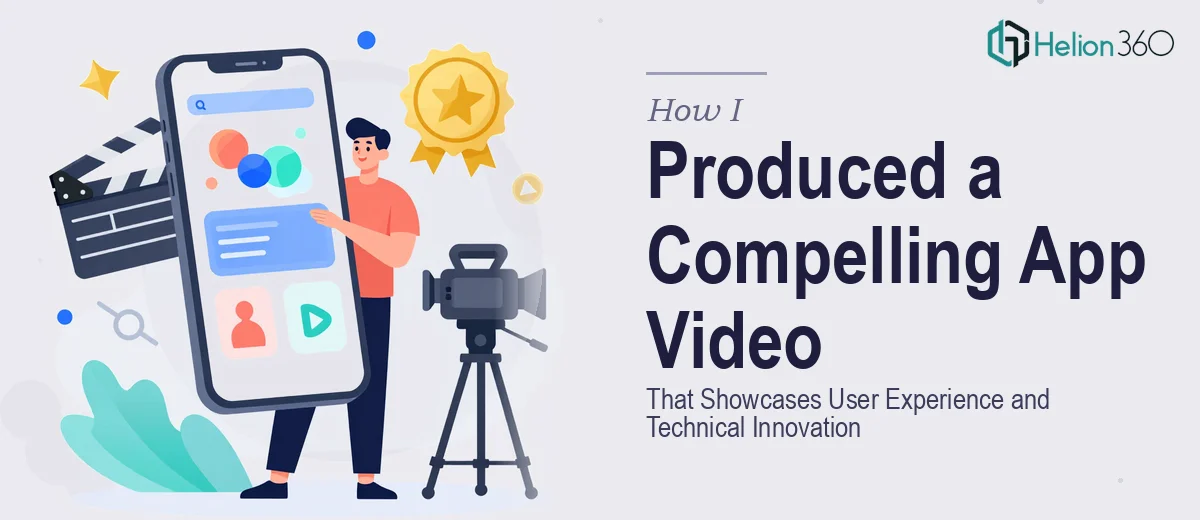
The Situation and What Was at Stake
We had a mobile app ready to show the world. The product was solid — genuinely well-built, with a user experience we were proud of. But the way we were presenting it wasn't doing it justice. The demos looked functional, not impressive. The portfolio assets we had were scattered across files that didn't visually connect to each other, and the overall presentation felt like an internal document rather than something that could win a client or impress a partner.
The stakes were real. We had an upcoming pitch cycle and a portfolio refresh that needed to land well. First impressions in this context carry a lot of weight — a Behance-worthy app presentation that shows UX flows, product design, and technical craft signals credibility before anyone reads a word. I knew that getting this right wasn't a matter of tweaking a few slides. It required a fundamentally different level of design execution, and I wasn't going to get there by spending weekends in Adobe InDesign.
What I Found the Solution Actually Required
Once I started looking at what a properly executed app portfolio presentation actually involves, it became clear this wasn't a small lift. The best examples — the kind of Dribbble and Behance case studies that consistently generate attention — share a specific set of qualities that don't happen by accident.
First, they use device mockups that are photorealistic and contextually appropriate. It's not enough to drop a screenshot into a frame. The mockup needs to reflect lighting, shadow depth, and surface material in a way that makes the interface feel real and in-use. Getting that right requires both the right assets and the judgment to compose them well.
Second, the soft animations used in these presentations — subtle transitions, reveal effects, micro-motion on UI elements — have to feel intentional rather than decorative. Poorly timed or mismatched animation undermines the whole thing. And third, the brand consistency across every frame of the presentation needs to be locked down: the same palette, the same typographic hierarchy, the same spatial logic from the first page to the last. I quickly understood that what looked effortless in the best examples was actually the product of a very controlled, technically demanding production process.
What the Work Actually Involves
A polished app portfolio presentation starts with narrative structure — deciding which UX moments to showcase, in what order, and at what level of detail. Done well, this means auditing the full product and mapping a visual story arc: problem context first, then key interaction flows, then the design decisions that set the product apart. The practitioner's job here is to reduce complexity without losing substance. Most apps have dozens of screens; a compelling presentation distills that into eight to twelve carefully selected moments. Selecting the wrong scenes, or sequencing them poorly, means the visual craft that follows lands without context — and the audience disengages.
The visual mechanics of this format are specific and demanding. Device mockups need to be composed at a consistent perspective — typically a 15–25 degree isometric or straight-on flat view — with lighting that matches across every frame so the presentation reads as a unified system, not a collection of screenshots. Typography follows a strict hierarchy: display text at 36–40pt for headlines, supporting labels at 18–20pt, and captions no smaller than 12pt on a dark background. Soft animations — entrance fades, element reveals, scroll simulations — require frame-by-frame timing decisions that are easy to get wrong. A 200ms ease-in that works on one element creates visual noise when applied without discretion across 40 frames.
Brand application across a multi-page portfolio presentation is where many attempts fall apart. Maintaining a palette of no more than four primary brand colors, applied consistently across backgrounds, accent elements, mockup overlays, and text, requires master slide discipline or a rigidly enforced style system. Spacing rules — consistent margin widths, gutters, and alignment grids — need to propagate without drift across every layout variant. In practice, even experienced designers spend significant time reconciling inconsistencies that appear only when all slides are viewed in sequence. For someone working without an established production workflow, this stage alone can consume days.
Why I Brought in Helion360 to Handle It
I recognized early that attempting this in-house wasn't a realistic path. The combination of mockup composition, soft animation production, and brand-consistent layout work across a full presentation requires a level of tooling and specialization that doesn't exist in most teams unless this is all they do.
Helion360 handled the full project end-to-end and delivered fast — what would have taken me weeks of learning and iteration was turned around in a matter of days. They took the raw app screens and brand guidelines, built out the mockup compositions, designed the full layout system, and applied the soft animation layer in a way that felt cohesive throughout. The story arc was mapped properly from the start, which meant every frame served a purpose rather than just filling space. There was no back-and-forth trying to explain what "Behance-quality" meant — they already knew, and the work reflected it.
The Result and What I'd Tell Anyone Looking at the Same Problem
The final presentation was exactly what a high-stakes portfolio showcase needs to be: visually tight, narratively clear, and animated in a way that drew attention to the right moments without distracting from the product itself. The pitch cycle went well. The portfolio refresh generated the kind of response we'd been hoping for — the work finally looked as good as the product behind it.
What I took away from this is straightforward: app portfolio presentation design is a specialized craft, and the gap between a passable result and a genuinely compelling one is wide. The technical depth required — mockup discipline, animation timing, brand system consistency — isn't something you close quickly.
If you're looking at the same kind of project and want it handled properly without spending weeks on the learning curve, Helion360 is the team I'd engage — they brought the expertise and tooling on day one and delivered the full execution fast.