

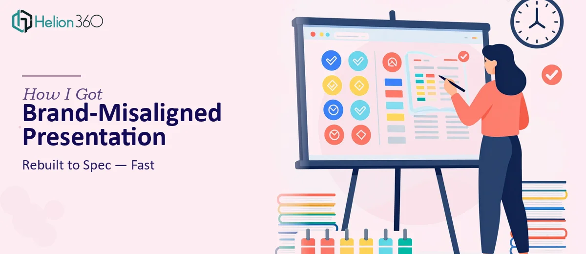
The Presentation Existed. The Problem Was That It Didn't Look Like Us.
I had a complete deck — slides written, content structured, ready to go out to a client. The problem was visible the moment I opened it. The fonts didn't match our brand guidelines, the colors were close but not correct, the data slides were walls of text, and the visual hierarchy was all over the place. For an internal draft, that would be fine. But this was going to a client, representing the agency, and it needed to look the part.
The stakes weren't abstract. A presentation that looks inconsistent or visually underdeveloped signals to a client that the work behind it might be too. The deck needed to reflect our brand accurately, incorporate proper visualizations for the data-heavy sections, and do all of it without losing the core content that was already there. I knew straight away this wasn't a quick formatting pass — it needed to be done properly.
What Doing This Well Actually Required
I spent some time looking at what a real brand-aligned presentation redesign involves before deciding how to handle it. What I found quickly was that this is not a cosmetic job.
First, brand guideline application is more exacting than it sounds. A proper style guide typically specifies exact hex codes, approved typeface pairings at defined weights, logo placement rules, approved color use ratios, and spacing standards. Applying all of that consistently across twenty or thirty slides — especially when the original file wasn't built to spec — requires rebuilding the slide master, not just reformatting individual slides.
Second, adding visualizations to data-heavy slides isn't a matter of inserting a chart. The right chart type needs to match the data story being told. A comparison calls for a different visual treatment than a trend, a distribution, or a part-to-whole relationship. Getting that wrong doesn't just look bad — it actively misleads the reader.
Third, the existing content had to be preserved in structure and meaning while the visual layer was overhauled. That's a more careful kind of work than building from scratch. It requires judgment at every slide about what to keep, what to reformat, and what to replace entirely with an infographic or diagram.
What the Work Actually Involves
The foundation of a proper presentation redesign is the slide master and layout system. Done well, this means auditing the existing file for every font instance, color value, and spacing irregularity, then rebuilding the master slides to enforce brand standards automatically — correct hex values for primary, secondary, and accent colors (typically no more than four approved brand colors), typeface hierarchy set at defined sizes such as 36pt for headlines, 24pt for subheads, and 16pt for body, and margin guides applied consistently. The execution friction here is real: a file built without master slide discipline requires manual correction on every individual slide before the master rebuild even begins, and that audit alone takes hours.
Visual translation of data is the second major layer. The right approach matches chart type to the story each data point is telling — clustered bar charts for category comparisons, line charts for trends over time, treemaps or donut charts for part-to-whole relationships. Each chart then needs to be styled to match the brand palette, stripped of default chart junk like excessive gridlines and default legends, and labeled in a way that removes ambiguity. What trips people up here is defaulting to whatever chart type is easiest to build rather than the one that communicates most clearly — and then spending another round fixing it when the client pushes back.
Consistency and polish across the full deck is the third layer, and it's where most self-managed redesigns fall apart at the finish line. Every icon set needs to match in style and weight. Every image needs to be on-brand in tone and treated consistently — same overlay style, same corner radius if rounded, same placement logic. Slide-to-slide transitions in visual weight need to feel intentional. A single off-brand slide buried in the middle of an otherwise clean deck is the kind of detail a client notices immediately, and fixing it after the fact takes as long as building it right the first time.
Why I Brought in Helion360 to Handle It
Looking at what the work actually involved, the decision to bring in a specialist team was straightforward. I didn't have the time to rebuild the master slide architecture, audit every color and font instance, and then layer in proper data visualizations — not with a client timeline in play. And doing it halfway would have been worse than not doing it at all.
Helion360 handled the full project end-to-end. That meant the master slide rebuild to brand spec, the visual redesign of every data slide with appropriate chart types and brand-consistent styling, and a final consistency pass across the entire deck. The turnaround was fast — done in days, not the weeks it would have taken me to work through the learning curve on master slide architecture and chart design discipline. They came to it with the tooling and process already in place, which meant no ramp-up time and no back-and-forth on the basics.
What Came Back and What I'd Tell Anyone in the Same Spot
The deck that came back was unrecognizable in the best way. The brand was precise — correct colors, correct type hierarchy, consistent spacing throughout. The data slides had been converted into clean, readable visualizations that actually communicated what the numbers were saying. The content was all there, restructured where it needed to be, untouched where it didn't. The client noticed the quality immediately, and the presentation did its job.
If you're sitting with a deck that's content-complete but visually off-brand, or loaded with data that's living in tables and bullet points instead of charts and diagrams, the solution is clearer than it might seem — but executing it properly is a specific skill set that takes time to apply at scale. The work isn't complicated to understand; it's just time-intensive and detail-sensitive in ways that compound quickly across a full deck.
If you're in that spot and need it handled properly and quickly, Helion360 is the team I'd engage — they delivered the full execution fast and brought the kind of brand and visualization depth this work genuinely requires.