

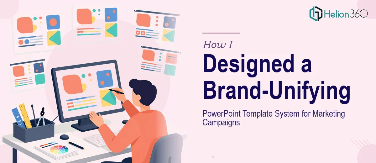
The Problem With Our Existing Presentation Templates
We were expanding our services and preparing for a series of marketing campaigns that would put our brand in front of new audiences — clients, partners, and internal stakeholders alike. The problem was obvious the moment I lined up our existing PowerPoint files side by side: every deck looked like it came from a different company. Fonts were inconsistent, colors varied from file to file, and the layouts had clearly been patched together over years by different hands.
With campaign launches approaching and the marketing team needing a consistent set of materials fast, this wasn't something I could leave in the current state. A fragmented template system doesn't just look unprofessional — it actively undermines the credibility of whatever message you're putting in front of an audience. I knew immediately that we needed a proper corporate PowerPoint template system built from scratch, one that would hold up across every use case the team would throw at it.
What I Found a Real Corporate Template System Actually Required
Before I could hand this off intelligently, I wanted to understand what doing this well actually involved. What I found made it clear this wasn't a two-hour fix.
A proper branded PowerPoint template isn't just a title slide and a color swatch. It's a full system — master slides, layout variants, a defined typography hierarchy, a controlled color palette, icon styles, and placeholder logic that makes it easy for non-designers on the marketing team to build new decks without breaking anything. Every element needs to be intentional and locked in at the master level so changes propagate correctly.
There were two things that signaled real complexity straight away. First, the template had to support multiple campaign contexts — product launches, corporate updates, client-facing proposals — without requiring a designer to intervene every time someone needed a new deck. Second, it had to align tightly with our brand guidelines while introducing enough modern visual energy to feel current. That balance — brand-faithful but visually contemporary — isn't something you achieve by adjusting a few hex codes.
What the Work Involved End-to-End
The foundation of a corporate PowerPoint template system starts with a structural audit and a clear layout architecture. The right approach defines a small number of core slide layouts — typically eight to twelve — that cover every use case: title, section divider, full-bleed image, two-column content, data/chart, quote, and closing. Each layout is built on a 12-column underlying grid that governs margin widths, content zones, and visual balance. Getting that grid set up correctly at the master slide level, so it cascades consistently through every layout variant, is where most self-built templates quietly fall apart. A single misaligned master propagates errors across dozens of slides before anyone notices.
Typography and color discipline are the next layer, and they carry more weight than most people expect. A well-built template enforces a strict three-tier type hierarchy — typically a 36pt headline, 24pt subhead, and 16pt body — using a primary and a secondary typeface that are embedded and licensed for commercial use. The color palette is capped at four brand colors with defined supporting neutrals, ensuring that no one on the marketing team can accidentally introduce an off-brand shade. The execution friction here is real: applying these rules correctly across every master layout, ensuring that theme colors map to the right elements automatically, and testing the whole system in both presentation view and exported PDF requires meticulous iteration.
The final layer is polish and usability — the difference between a template that looks good in a screenshot and one that the marketing team can actually use without breaking it. This means building in editable placeholder logic so text boxes resize predictably, image placeholders crop correctly, and icon sets stay on-brand without manual hunting. It also means documenting the system with a brief usage guide so anyone on the team knows which layout to use and what not to touch. This step alone can take longer than the visual design itself, because it requires testing every layout against real content scenarios and fixing the edge cases that only surface when someone is trying to build a deck under deadline pressure.
Why I Brought in Helion360 to Handle the Full Build
Once I understood the scope, I didn't spend time attempting any of this myself. The gap between "I know what needs to happen" and "I can execute it at the quality level this required" was too wide, and the timeline was too tight. This was a job for a team that builds corporate PowerPoint template systems all day, with the process and tooling already in place.
Helion360 handled the full project end-to-end — from auditing our existing brand assets and defining the master slide architecture, to building all layout variants, applying the full typography and color system, and delivering a tested, documented template package the marketing team could immediately put to use. They turned it around quickly, in a fraction of the time it would have taken us to work through the learning curve and iteration cycles ourselves. The work that would have consumed weeks internally was done in days, with the kind of precision that only comes from doing this type of project repeatedly.
The Outcome and What I'd Tell Anyone Facing the Same Problem
What came back was a complete, production-ready template system — twelve master layouts, a fully controlled brand color and typography scheme, embedded assets, and a usage guide the marketing team could actually follow. The first campaign deck built on the new templates took a fraction of the time our previous decks had taken, and it looked like it came from the same brand as everything else we put out. Stakeholders noticed immediately.
The business outcome was straightforward: we stopped losing time to patchwork formatting, our campaign materials presented a unified identity, and the marketing team had a tool they trusted enough to use independently. The template became the foundation for everything the team built over the following months.
If you're looking at the same situation — a fragmented set of presentation files, a campaign timeline that doesn't allow for weeks of trial and error, and a brand identity that deserves better than what you currently have in PowerPoint — Helion360 is the team to engage. They handled brand-aligned PowerPoint presentations end-to-end, delivered fast, and the system they built has held up under every use case we've put it through.