

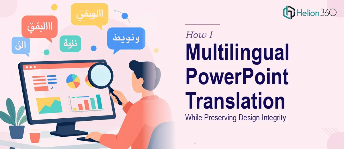
When a Simple Translation Turned Into a Formatting Problem
I was handed what seemed like a straightforward task: translate a corporate promotion PowerPoint from English to Italian. The deck was not long, and the content itself was not complicated. On the surface, it looked like a clean afternoon of work.
I started by going slide by slide, replacing the English text with Italian equivalents. That part went smoothly at first. But within a few slides, I started noticing something that I had not anticipated. Italian text almost always runs longer than English. A sentence that fit neatly in a text box in English was now spilling outside the box, overlapping with icons, or pushing other elements out of alignment.
The Formatting Challenge Nobody Warns You About
This is the part that most people underestimate when they think about multilingual PowerPoint translation. It is not just about swapping words. Different languages have different character densities, sentence structures, and line rhythms. Italian tends to be more descriptive, which means the same idea expressed in English might need 20 to 30 percent more space in Italian.
I was dealing with text boxes that had fixed dimensions tied to the overall layout. Expanding them would push into the visual zones reserved for brand graphics or product imagery. Shrinking the font size felt like a compromise that made the slides look unpolished. Every fix I tried created a new problem somewhere else on the slide.
Beyond the text overflow, there were also typographic consistency issues. Bullet point alignment had shifted, heading sizes felt uneven across slides, and some text was colliding with graphic elements in ways that looked unprofessional. The deck was a promotional piece meant to represent the company to Italian-speaking customers — it had to look clean and intentional, not like a rough draft.
Bringing in the Right Support
After spending more time on formatting fixes than on the actual translation, I realized this needed more than a text swap approach. I reached out to Helion360, explained the situation, and shared both the original English deck and the partially translated version I had been working on.
Their team understood the problem immediately. They had handled multilingual presentation design before and knew exactly what kind of layout adjustments Italian text requires. Rather than treating it as a translation job, they approached it as a PowerPoint formatting and localization project — which is exactly what it was.
What the Process Looked Like
Helion360 worked through the deck with a focus on two things: translation accuracy that respected Italian language habits, and formatting precision that kept the visual design intact. They adjusted text boxes where needed, rebalanced spacing across slides, ensured font sizing was consistent, and preserved the original hierarchy of headings and body text.
They also paid attention to how the Italian text read naturally — not just a literal word-for-word translation, but phrasing that would feel right to an Italian-speaking audience. That attention to how language flows in context made a noticeable difference in the final result.
The output was a deck that looked like it had been designed in Italian from the start, not retrofitted from an English version. The layout was clean, the spacing was consistent, and the brand identity of the original was fully preserved.
What I Took Away From This
The experience changed how I think about multilingual presentation work. Translation is just one layer. The real complexity is in maintaining design integrity when the language changes — keeping every slide looking intentional, proportionate, and on-brand even after the text has been completely replaced.
If you are dealing with a similar project — whether it is English to Italian, or any other language pair — and you are finding that your slides are falling apart the moment you start swapping text, that is a signal the project needs both translation expertise and presentation design skills working together.
Helion360 handled both sides of that equation cleanly, and the final deck was exactly what was needed — ready for the target audience without a single slide looking out of place.