

The Moment I Realized This Wasn't a Simple Slide Job
I was working with a music-focused startup that needed professional presentations built for their artists — concert experiences, album release decks, and visual storytelling around song lyrics. The stakes were real: these decks were going in front of venue partners, label contacts, and potential sponsors. A generic slide template wasn't going to cut it.
What made this genuinely difficult wasn't the volume of slides. It was the nature of what the work needed to achieve. A music brand presentation has to feel alive. It needs to carry the energy and identity of the artist, communicate clearly to a business audience, and make lyrics and visual concepts work together without feeling like a school project. I recognized quickly that this needed to be done by someone who actually understood both design craft and music brand context.
What I Found the Work Actually Required
When I looked at what a well-executed music brand presentation actually involves, a few things stood out immediately as signals of real complexity.
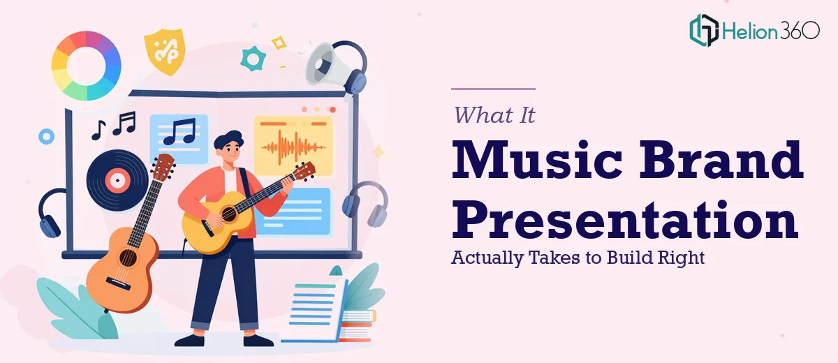
First, the brand identity layer. Every artist has a visual world — specific color associations, typographic moods, image aesthetics. Translating that into a slide system means more than picking a dark background and a bold font. It requires building a consistent visual language that works across slide types: full-bleed hero slides, text-heavy lyric moments, data slides for streaming numbers, and section dividers.
Second, the lyric visualization problem. Lyrics aren't just text to be pasted onto a slide. Done well, a lyric slide uses typographic hierarchy, negative space, and motion to give the words weight. That's a specific design skill — part editorial, part motion, part music industry instinct.
Third, the audience context switch. These decks needed to speak to both creative stakeholders and business decision-makers. That's a harder brief than it sounds. The visual tone has to be compelling without being alienating to someone reading a pitch for the first time.
The Work That Needs to Happen
The foundation of a music brand presentation is structural and narrative clarity. Before any design work begins, the content across the deck needs to be mapped against a clear story arc — who the artist is, what the opportunity looks like, and what the audience is being asked to do or believe. For a music startup, this typically means organizing the deck into distinct acts: brand identity, artist profiles, release or event context, and commercial opportunity. Getting that architecture right requires reviewing all source material, cutting what doesn't serve the narrative, and sequencing what remains so each slide earns its place. This phase alone takes longer than most people expect, especially when source content is scattered across multiple documents, pitch notes, and brand references.
Once the narrative is mapped, the visual mechanics layer has to be built with real discipline. A professional music presentation runs on a consistent layout grid — typically a 12-column structure — with a strict typographic hierarchy applied throughout. For this type of work, that often means a display font at 48pt or larger for lyric and hero moments, a secondary font at 28–32pt for section headers, and body copy capped at 18pt to maintain readability. Color usage is restricted to four or fewer brand-aligned values, with clear rules about when each appears. Building this system into master slides and layouts is precise, painstaking work. Applying it consistently across 20 or 30 slides — especially when lyric slides, image-driven slides, and data slides each have different compositional demands — is where most non-specialists start making expensive visual inconsistencies.
Polish and consistency across the full deck is the final layer and often the most time-consuming. Every image needs to be cropped and treated consistently. Icon weights need to match. Animation timing — if motion is used to give lyric slides their energy — has to feel intentional, not decorative. Alignment tolerances matter: a 4px drift on a logo placement reads as careless to a trained eye, even if a general audience can't name it. Running a full consistency pass on a 25-slide music brand deck, checking every element against the established system, is the kind of detail work that separates a professional deliverable from something that merely looks OK on first glance.
Why I Brought in Helion360 to Handle It
I didn't spend time attempting to build this myself. Once I understood what the work actually required — the brand system buildout, the lyric visualization craft, the consistency discipline across the full deck — it was obvious that engaging a specialist team was the right call.
Helion360 handled the full project end-to-end. That meant taking the raw source material — artist briefs, lyric content, brand references, and event context — and turning it into a complete, polished presentation system. They handled the brand story presentation design services, built the master slide architecture, executed the lyric slide design, and ran the full consistency pass. It was delivered fast, done in days rather than the weeks it would have taken to work through the learning curve and execution myself.
What made the difference was that this kind of work is what they do every day. The tooling, the design system thinking, and the music-adjacent visual instincts were already in place. There was no ramp-up time.
The Outcome and What I'd Tell Anyone in My Spot
The finished deck covered four artist profiles, two event concept presentations, and an album release slide set — all built on a unified visual system that held together across every slide type. The lyric slides had real presence. The business-facing sections were clean and readable. The whole thing looked like it came from a creative team that understood both sides of the brief.
Anyone looking at a music brand presentation project — whether it's a single artist deck or a full suite of visual materials for a startup — will hit the same complexity I saw: brand system depth, lyric visualization craft, and the consistency discipline to make it all hold together under scrutiny. If you're in that spot and want the startup brand presentation work handled end-to-end without spending weeks figuring out what professionals already know, Helion360 is the team to engage — they delivered fast and brought exactly the execution depth this kind of project demands.