

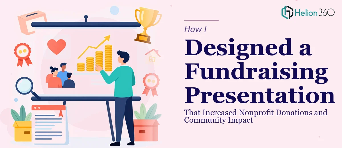
When a Good Cause Has a Weak Presentation
The organization had done genuinely meaningful work. Years of community programs, measurable outcomes, real lives changed. But when I sat down with their existing fundraising presentation, it told almost none of that story. Slides were dense with text, the structure jumped between topics without a clear thread, and the visuals felt like they had been pulled together in a hurry — because they had been.
An upcoming fundraising event had a firm deadline. The presentation needed to do two things at once: communicate the organization's mission clearly and move potential donors emotionally enough to act. That is a harder design challenge than it looks.
What I Tried to Fix on My Own
I started by working through the content myself. I reorganized the slide order to follow a more logical arc — mission first, then community impact, then specific achievements, then the ask. That part felt manageable. But when I got into the actual design work, I ran into the limits of what I could do well under time pressure.
The slides needed custom visuals that reflected the organization's identity without looking generic. The impact data needed to be presented as something emotionally resonant, not just numbers on a page. The content itself needed a rewrite in places — tighter language, stronger headlines, phrasing that felt urgent without being pushy. Doing all of that at a level that would hold up in front of major donors was more than I could pull off alone in the time available.
Bringing In the Right Help
After hitting that wall, I reached out to Helion360. I explained the situation — a nonprofit fundraising event, an existing deck that needed both a content overhaul and a full visual redesign, and a deadline that did not have much room. Their team understood the brief immediately and asked the right questions: Who is the audience? What action do we want them to take? What does the organization's brand look like, and how strictly does it need to be followed?
Those questions shaped everything that came next.
How the Presentation Came Together
Helion360 approached the project in two parallel tracks — content restructuring and visual design — and kept both aligned throughout.
On the content side, they rewrote slide copy to be sharper and more donor-focused. Instead of listing program activities, the slides led with community outcomes. Instead of describing what the organization does, the language shifted to what changes because of what the organization does. That framing shift made a significant difference to how the whole deck felt.
On the design side, they built a visual system that felt warm and credible without being overly corporate. The impact numbers were turned into clean, readable data visuals rather than buried in paragraphs. Photography and iconography were used purposefully to reinforce the human side of the work. The result looked like something a well-resourced organization had invested in — which, in a fundraising context, matters.
What the Finished Deck Actually Did
When the presentation went in front of donors at the event, the response was noticeably different from previous years. The feedback mentioned clarity and emotional resonance — two things the original deck had struggled with. The organization's mission came through without needing anyone to explain it. The ask felt natural because by the time it appeared, the audience already understood the stakes.
From a practical standpoint, the redesigned nonprofit fundraising presentation became a reusable asset. It was formatted in a way that made future updates straightforward, so the team could refresh impact numbers and program details without rebuilding the whole deck.
What This Process Taught Me
A fundraising presentation is not just a design problem. It is also a content strategy problem and a persuasion problem. Getting one of those right is not enough. The visual design has to carry the message, and the message has to be shaped for the specific audience sitting in the room.
When you are close to the work — as the people inside a nonprofit often are — it is genuinely difficult to write about it in the way an outside donor needs to hear it. That distance is actually useful, and it is one of the things a skilled team brings to the project.
If you are preparing a nonprofit fundraising presentation and finding that the content or design is not coming together the way you need it to, Helion360 is worth reaching out to — they handled both sides of this project and delivered something that held up under the real conditions of an investor pitch deck.