

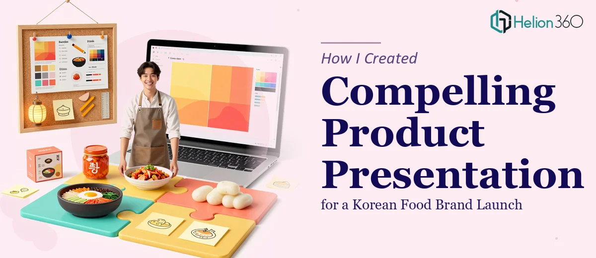
When a Product Launch Needs More Than a Few Good Slides
When our team decided to launch a new line of Korean food products, I knew the presentation would matter just as much as the products themselves. Buyers, distributors, and internal stakeholders were all going to see this deck. It had to communicate the brand story, explain each product clearly, and still feel polished enough to hold attention in a room full of decision-makers.
I took on the task myself, confident that a solid product presentation was something I could put together with enough planning and the right content.
Where It Started to Get Complicated
The challenge wasn't just making it look good. It was making it work across different audiences. The same deck needed to speak to internal teams who cared about margins and logistics, and to external partners who wanted to know why these Korean food products deserved shelf space or menu placement.
I started building the structure — an intro to the brand, product category overviews, feature highlights, origin stories for key ingredients. That part felt manageable. But when I got into the visual layer, things slowed down considerably. Product photography needed to be placed with intention. Typography had to feel warm but professional. The brand colors needed to feel culturally considered, not generic. And every layout I tried either felt too corporate or too casual.
I also realized that the slides were carrying too much text. I kept writing in paragraphs when the content needed to breathe — short punches of copy, strong visuals, a clear flow from one product to the next. I knew what the deck needed to do, but I wasn't getting there on my own.
Bringing in the Right Help
After a few rounds of revisions that weren't moving the needle, I reached out to Helion360. I explained the scope — a new product line, multiple audience types, a brand with a specific cultural identity to honor. Their team asked the right questions upfront: What tone did the brand carry? Who was the primary buyer persona? What action did we want audiences to take after seeing the deck?
That conversation alone helped clarify things I hadn't fully articulated yet. Then they got to work.
What the Final Presentation Looked Like
Helion360 restructured the entire deck with a clear narrative arc. The opening established the brand's Korean food identity with warmth and confidence — not an overloaded history lesson, but just enough context to build trust. Each product section was designed with consistent visual templates, so the deck felt cohesive while still giving each product room to stand out.
The data slides — things like market size and category growth for Korean food in international markets — were turned into clean visual formats that didn't feel like spreadsheet exports. The product photography was framed and sized in a way that made each item look premium. Copy was tight, scannable, and persuasive without being pushy.
The team also created two versions: one for internal stakeholders that included more operational detail, and a cleaner external-facing version for partners and buyers. That distinction made a real difference in how each audience received the material.
What I Took Away From This
Building a product launch presentation for a specialized food brand is not the same as putting together a general business deck. The cultural nuance, the audience segmentation, the visual storytelling required — it all adds up quickly. I could write the content, but translating that content into a professional presentation that worked visually and structurally across multiple contexts was where I needed support.
The outcome was a deck that held up in every room we took it into. Stakeholders who had seen draft versions were noticeably more engaged with the final product.
If you're working on a product launch presentation and finding that the gap between your content and the finished slides is wider than expected, Helion360 is worth reaching out to — they took what I had and turned it into something that actually performed.