

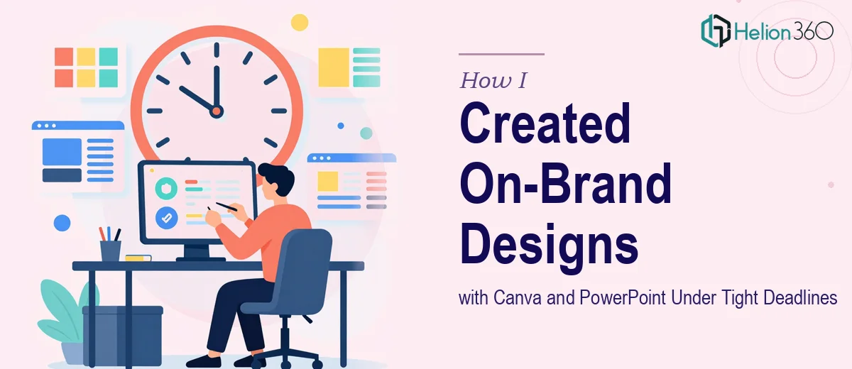
When a Simple Design Task Gets Complicated Fast
I work at a small startup. Most of the time, we move fast and figure things out as we go. So when we needed a handful of on-brand slides and a couple of Canva designs for an upcoming presentation, it seemed like something I could knock out in an afternoon.
The brief was straightforward enough: keep it simple, make sure everything matches our brand, and get it done quickly. We had a color palette, a logo, and a basic idea of what each slide should say. I had used both Canva and PowerPoint before. How hard could it be?
Where Things Started to Slow Down
The first issue was consistency. I would get one slide looking the way I wanted it, and then the next one would feel slightly off — different spacing, a font weight that did not quite match, a color that was close but not exact. Canva's drag-and-drop flexibility is great, but it also makes it easy to introduce small inconsistencies without noticing until you step back and look at everything together.
The second issue was time. What I thought would take two hours stretched into most of a day. I was adjusting layouts, second-guessing font choices, and restarting slides from scratch because the hierarchy felt wrong. For a startup under deadline pressure, that kind of time drain is not something you can afford.
I also realized partway through that I did not have a solid system for applying brand guidelines across multiple slides. I was working from memory and a loosely written brand doc, and that showed up in the output.
Bringing in the Right Support
After losing most of a day and still not feeling confident about what I had, I decided to get some outside help. That is when I came across Helion360. I explained what we needed — a few on-brand Canva designs and PowerPoint slides, nothing complex, but done properly and fast. I shared the brand colors, the logo, the rough content for each slide, and my notes on what had not been working.
Their team took it from there. What I noticed immediately was how they approached the brief — they did not just copy what I had already tried. They set up a consistent slide master with the correct fonts and spacing locked in, so every new slide started from the same foundation. The Canva designs followed the same logic: a clear visual structure, the brand colors applied correctly, and layouts that did not need constant manual tweaking.
What the Final Output Looked Like
The turnaround was fast, which was exactly what we needed. But speed was not the only thing that stood out.
Every slide held together visually. The typography was consistent across both the Canva files and the PowerPoint deck. The brand colors were accurate, not approximate. The layouts were clean and uncluttered, which matched our startup's visual identity — we are not a company that uses heavy graphics or complicated slide animations, and the designs reflected that.
I also came away with a working template structure I could use going forward, which saved time on the next round of internal presentations.
What I Learned From the Experience
The real lesson was not about Canva or PowerPoint specifically. It was about recognizing when a task that looks simple on the surface is actually more time-sensitive and detail-dependent than it first appears. Keeping presentation design on-brand under a deadline requires more than knowing the tools. It requires a systematic approach to consistency — something that is genuinely hard to do when you are also running other parts of a startup.
The other thing I took away was the value of having a clean, reusable template. I had been rebuilding slides from scratch every time, which is inefficient. A properly set-up master layout solves that problem from the start.
If you are dealing with the same kind of situation — a tight deadline, brand guidelines to follow, and not enough time to get the slides looking right — Helion360 is worth reaching out to. They handled what I could not get across the finish line and delivered exactly what was needed.