

The Situation We Were In — and Why Getting It Right Mattered
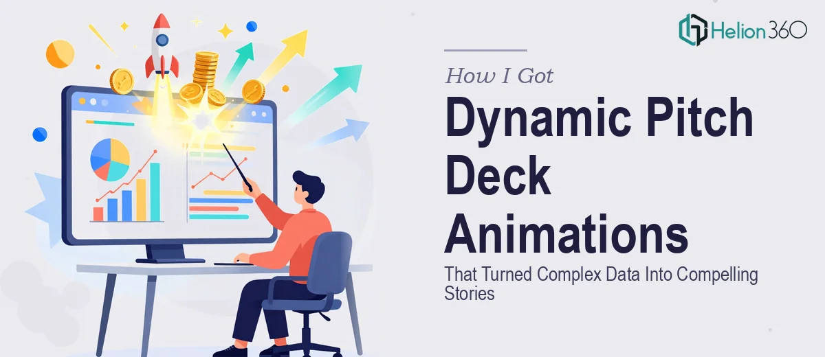
Our startup was preparing for a round of investor conversations, and the deck we had was functional at best. It communicated the facts, but it did nothing with them. Complex market data sat in static tables. Our product's core flow was described in bullet points. And the story — the actual reason investors should care — wasn't landing the way it needed to.
The stakes were real. These weren't internal reviews. These were rooms where first impressions stick, and where a presenter who can't make their data readable in thirty seconds loses the thread entirely. I knew that what we needed wasn't just a cleaner deck. We needed animated pitch deck slides that could guide attention, sequence information the way a good story does, and make complex ideas feel intuitive rather than overwhelming. That kind of work isn't something you fix with a weekend of tinkering.
What I Found Out This Kind of Work Actually Requires
I started researching what separates a professionally animated pitch deck from a deck where someone just added fade transitions. The gap is significant.
Done well, pitch deck animation is a narrative tool, not a cosmetic one. Each animated element has to serve the story — revealing data points in sequence, directing eye movement, and controlling the pace at which an investor processes what they're seeing. That requires both motion design judgment and a clear understanding of investor presentation conventions.
Three things stood out immediately as signals of real complexity. First, the motion logic has to be intentional — a chart that builds element-by-element to emphasize a trend is fundamentally different from one that appears all at once, and choosing the wrong approach actively undermines the story. Second, the animation has to stay consistent across the entire deck, which means working from a structured master file rather than slide-by-slide. Third, tools like After Effects — which handle the kind of fluid, branded motion this work demands — carry a steep learning curve that takes months to move through properly. This was not a weekend project.
What the Work Actually Involves
The right approach to animated pitch deck design starts with the narrative structure, not the motion itself. A practitioner audits the source content first — identifying which data needs to be visualized, what the logical sequence of each section is, and where motion adds clarity versus where it creates noise. For a standard early-stage investor deck, that typically means mapping twelve to eighteen slides against a clear story arc: problem, solution, market, traction, ask. Getting that architecture right before a single animation is built is what separates decks that communicate from decks that just look active. Skipping this step is one of the most common mistakes, and it produces decks where the motion feels random rather than purposeful.
Visual mechanics are the second layer. Proper pitch deck animation uses a constrained visual system — typically a four-color brand palette, a strict typographic hierarchy (headline at 40pt or larger, supporting text at 24pt, labels at 16pt), and a layout grid that holds across every slide so nothing feels unanchored when elements animate in. Chart types have to match the data: a bar chart building left-to-right communicates growth momentum; a scatter plot appearing all at once communicates relationships. These decisions require both design literacy and knowledge of what investor audiences read quickly. Getting the mechanics wrong — inconsistent sizing, mismatched chart types, animation timing that's too fast to follow — erodes credibility fast.
Polish and cross-deck consistency is where most non-specialists lose the most time. In a motion-forward deck, every animated element needs to respect the same easing curves, the same timing offsets, and the same entry directions. A standard build might involve fifty or more individual animation triggers across twenty slides. Managing that in PowerPoint's animation pane is tedious and error-prone; doing it in After Effects with properly organized composition layers is far more reliable but requires fluency with the tool. Even experienced PowerPoint users find that maintaining this level of consistency across a full deck — especially when content changes late — takes days of careful revision work.
Why I Brought Helion360 In to Handle the Full Project
I recognized quickly that attempting this ourselves wasn't the right call. The learning curve alone — on both the motion design side and the narrative architecture side — would have consumed time we didn't have. And the risk of producing something that looked amateurish in front of investors was a risk I wasn't willing to take.
Helion360 handled the full project end-to-end. That meant taking our raw content and data, restructuring the narrative flow into a clear investor story arc, building the visual system from scratch to match our brand, and producing all the animated sequences across the complete deck. They handled the chart design and data visualization, the motion logic for each slide, and the final consistency pass across every animated element. The turnaround was fast — done in days, not weeks — and what came back was work that would have taken us months to learn how to execute at that level.
The Outcome and What I'd Tell Anyone Who Finds Themselves Here
The delivered deck changed how the investor conversations went. Information that previously required us to explain at length was now self-evident on the slide — the animation sequenced it so the logic landed before we even spoke to it. The data felt confident and readable rather than cluttered. And the visual consistency across the full deck signaled that our team takes execution seriously, which is exactly the impression you want to make.
If you're looking at a similar situation — a pitch that needs to actually work in the room, with complex data that needs to become a clear story — and you want it handled properly and delivered fast, Helion360 is the team I'd engage without hesitation.