

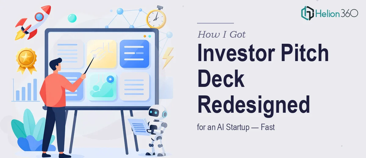
The Deck Was Solid. The Look Was Holding It Back.
The content was already there. The narrative, the market framing, the value proposition — all of it had been worked through carefully. What wasn't there was a visual presentation that matched the ambition of the product. This was an investor pitch deck for an AI startup, and it needed to feel like one. The existing slides were functional at best — generic fonts, placeholder-style layouts, and imagery that didn't communicate anything about the technology or the company's identity.
The stakes were real. Investor conversations were on the horizon, and first impressions in that room are made in the first thirty seconds of a deck. Showing up with slides that looked like an internal working document was not an option. The deck needed a sophisticated, high-tech visual language — the kind that signals to investors that the team behind it knows what it's doing at every level. I knew immediately this needed to be handled properly.
What I Found Out This Kind of Redesign Actually Requires
My first instinct was to understand what "done well" actually looks like for an AI startup investor pitch deck redesign. What I found was that this isn't a cosmetic exercise — it's a precision design problem with several compounding layers.
The deck lived in Google Slides, which carries its own set of constraints. The platform handles custom typography, image masking, and layout grids differently than a desktop design tool, and getting consistent visual output across 15 primary slides plus 4 appendix slides requires working within those constraints deliberately — not around them.
Beyond the platform mechanics, there's the question of visual language for an AI-focused company. The imagery, the color system, the iconography — all of it needs to communicate "technology-forward" without falling into clichés. That's a judgment call that takes design experience in this specific space. And then there's the infographic layer: technology products often require custom diagrams that explain how the product works. Building those to look polished, be readable at a glance, and stay on-brand is its own discipline entirely.
What the Redesign Work Actually Involves
The starting point for a project like this is a thorough audit of the existing slide structure — understanding which slides carry the most visual weight, where the narrative peaks are, and how the layout hierarchy needs to shift to support the spoken pitch. For an investor deck, slides like the problem statement, the product overview, and the traction page do the heaviest lifting. The right approach maps each slide to a visual treatment that reinforces the message rather than competing with it. This structural pass alone, done properly, takes several hours before a single visual element is touched.
The visual mechanics of a high-tech pitch deck are specific. A disciplined typographic scale — something like 40pt for headline statements, 24pt for subheads, and 16pt for supporting detail — keeps the hierarchy legible without the slides feeling cramped. Color usage follows strict rules: a dark base palette (typically near-black or deep navy) with one high-contrast accent color handles the "sophisticated AI" aesthetic well, but applying it consistently across master slides in Google Slides requires methodical template work. Custom tech-style infographics — product architecture diagrams, process flows, comparison visuals — each need to be built from scratch as vector-based shapes rather than dropped-in screenshots, which is time-intensive work that trips up most non-specialists.
Polish and consistency across 19 slides is where projects like this quietly fall apart without expert execution. Every icon family needs to match in weight and style. Every image needs to be treated with the same overlay or masking technique so the deck feels unified. Slide margins need to be identical — even a few pixels of drift looks unprofessional on a projected screen. Applying all of this consistently, without breaking the existing content or losing the approved language, requires someone who works in this environment daily. For someone doing it for the first time in Google Slides, the learning curve alone would consume most of a two-week window.
Why I Brought Helion360 In to Handle the Full Project
I didn't spend time attempting a version of this myself. Looking at what the work actually required — the platform expertise, the visual language judgment for an AI-focused brand, the custom infographic builds, the 19-slide consistency work — it was clear this needed a team that does exactly this, with the tooling and process already in place.
Helion360 handled the full project end-to-end: the layout restructuring across all primary and appendix slides, the custom infographic design for the product explanation slides, and the full application of a high-tech visual system across the deck — all within Google Slides. The turnaround was fast. What would have taken me weeks of learning, iteration, and inevitable rework was handled in days. The team didn't need to be briefed on what "sophisticated and tech-forward" means for an investor audience — that judgment was already built into how they approached the work.
What Was Delivered and What I'd Tell Anyone in This Situation
The final deck was a significant step up from where it started. The slides carried genuine visual authority — the kind that makes an investor lean in rather than glance away. The typography was clean and hierarchically sharp. The product diagrams were custom-built and immediately legible. The dark, high-contrast palette ran consistently from the cover slide through every appendix page. The content — which was already strong — finally had a visual wrapper that matched it.
Anyone looking at a similar situation: a solid deck with weak visual execution, a tight timeline, and an investor audience that will judge the product partly by how the deck looks — the calculus is straightforward. The work is real, the learning curve is steep, and the window is short.
If you're in that spot and need it handled end-to-end without burning two weeks on it yourself, Helion360 is the team I'd engage — they delivered fast, worked natively in Google Slides, and brought the design depth this kind of project actually requires.