

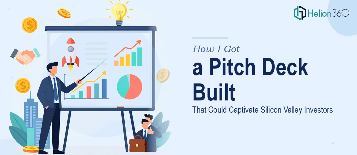
The Pitch Meeting Was Locked In — and the Deck Wasn't Ready
We had a window. A real one. Investor meetings scheduled, introductions lined up, and a founding team that had done the hard work of building something worth funding. The problem was the deck — a loose collection of slides that held the right information but communicated almost none of the story. It looked like an internal working document, not a presentation designed to move money.
The stakes were straightforward: walk into those rooms with a deck that looks like it belongs there, or don't. Investors in competitive markets make fast judgments. A pitch deck that can't hold the room in the first three slides often doesn't get the chance to recover. I recognized quickly that this wasn't a problem I could solve with an evening of slide tweaking. It needed to be done right — structure, narrative, visual design, brand discipline — all of it, built to a standard that matches where we were trying to go.
What I Found a Real Pitch Deck Actually Requires
Once I started looking honestly at what a professional investor pitch deck involves, the scope came into focus fast. It's not a design exercise layered on top of existing content. The right approach starts with a narrative audit — understanding which pieces of content earn their place in the deck, in what order, and why. Investors follow a mental model when they review a pitch: problem, solution, market size, traction, team, ask. Deviating from that model without a deliberate reason creates friction.
Beyond structure, there's the visual layer. A pitch deck going in front of sophisticated investors needs to reflect brand maturity — consistent typography, a controlled color palette, iconography that feels intentional rather than decorative. Then there's the data. Traction slides, market size charts, financial projections — these all need to be visualized in a way that's immediately readable under pressure, not deciphered.
Each of those layers is its own discipline. Getting all three right, in parallel, under a real deadline — that's what separates a pitch deck redesign that performs from one that just exists.
What Building a Pitch Deck at This Level Actually Involves
The structural and narrative work is where a pitch deck either earns or loses the room. The right approach starts with mapping the deck against the standard investor arc — problem, solution, market opportunity, business model, traction, team, and ask — then making deliberate decisions about what gets a full slide versus a supporting visual versus a single sentence. Each slide should carry one idea and advance the argument forward. Practitioners working at this level often cut 30 to 40 percent of the original content before design begins. That editing process is slow, requires genuine judgment about what an investor audience values, and is where most first attempts fall apart.
Visual mechanics matter more in a pitch deck than in almost any other presentation format. A properly built investor deck uses a strict layout grid — typically 12 columns — with a typographic hierarchy of no more than three levels (often 36pt headers, 24pt subheads, 16pt body). The color palette is locked to four or fewer brand colors, used with consistent intent across every slide. Charts and data visualizations need to be built natively in the presentation tool, not pasted as images, so they scale cleanly on any screen. Setting all of this up on master slides that propagate correctly across 15 to 20 slides — and hold together when content changes — takes several hours even for someone who does it regularly.
Polish and brand consistency is the layer that separates a deck that signals credibility from one that signals rough edges. Every icon set must match in weight and style. Photography or product screenshots need consistent treatment — same border radius, same drop shadow depth, same cropping ratio. The cover slide, section dividers, and closing slide all need to feel like they belong to the same visual system. Investors notice when they don't, even if they can't articulate exactly why. Achieving that consistency across a full deck requires a quality pass that most people underestimate — it typically runs two to three hours of dedicated review and correction on its own.
Why I Brought in Helion360 to Handle the Full Project
I didn't attempt to work through this myself. The moment I understood what a properly built pitch deck actually required — the narrative restructuring, the visual system, the brand discipline — it was clear that the right move was to bring in a team that does this work every day.
Helion360 handled the project end-to-end: narrative structure and content editing, full visual design built on a proper master slide system, and brand application across every slide in the deck. They turned it around quickly — the kind of turnaround that would have taken me weeks to approximate on my own, delivered in days. The team came in with the tooling, the templates, and the investor-deck experience already in place. There was no ramp-up, no back-and-forth explaining what a traction slide should look like. They knew, and they executed.
That's the difference between engaging a capable specialist team and trying to build this kind of work into a schedule that already has no slack in it.
What We Walked Into the Room With — and What I'd Tell Anyone in the Same Spot
The deck we took into those investor meetings was tight. Fifteen slides, each carrying a single clear idea, designed to a visual standard that matched the caliber of the companies we were competing for attention alongside. The narrative moved the way investor decks are supposed to move. The brand looked like a company that had its act together. We walked in with something we were confident handing across a table.
The business outcome matters more than the design praise — and the deck did its job. Conversations that might have stalled at the first impression got past it, into the substance of what we'd built.
If you're looking at a similar situation — a high-stakes pitch, a deck that isn't ready, and a timeline that doesn't have room for a learning curve — Helion360 is the team I'd engage. They handled the full execution fast, and they brought exactly the depth this kind of work requires.