

The Situation and What Was Actually at Stake
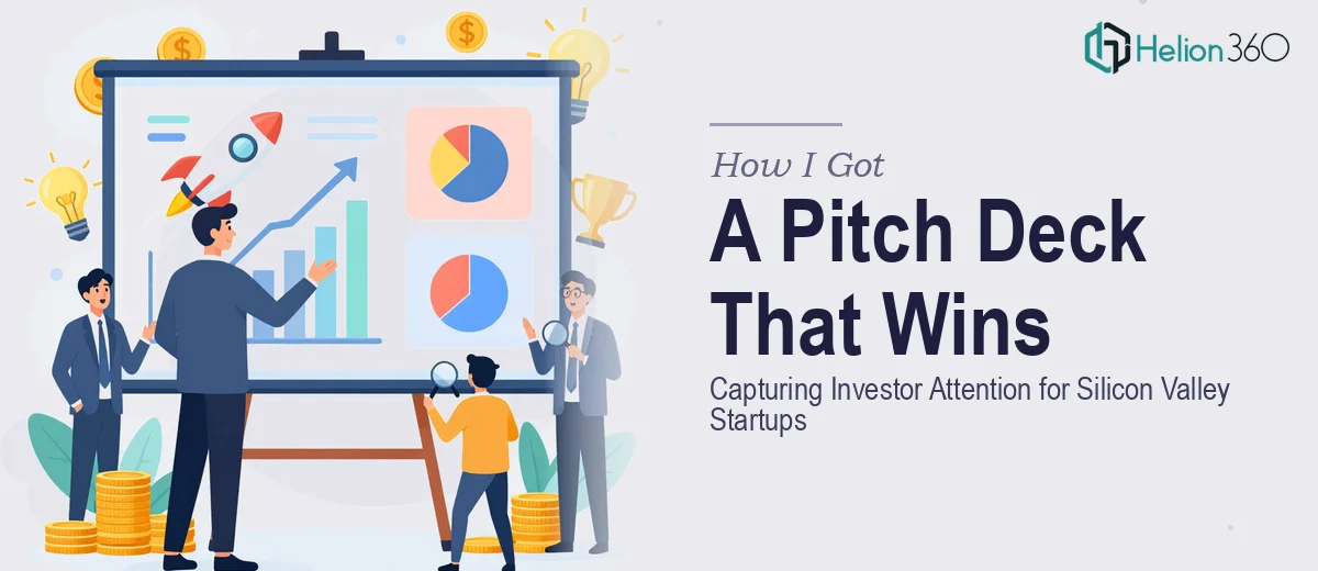
We were a fast-growing tech startup in Silicon Valley, and we had a genuine window to get in front of the right investors. The problem was straightforward: our story was strong, our product was real, and our traction was building — but none of that came through in the deck we had. It looked like a document, not a pitch. The slides were text-heavy, the branding was inconsistent, and there was no clear visual narrative pulling the reader from problem to solution to opportunity.
The stakes were high. Investor attention spans are short, and first impressions in a pitch context are nearly impossible to recover from. I knew immediately that patching the existing deck wasn't going to cut it. What we needed was a properly built startup pitch deck — one that communicated the vision clearly, held together visually from slide one to the last, and made investors want to keep reading. That's not something you produce in a weekend.
What I Found a Professional Pitch Deck Actually Requires
Once I started researching what a genuinely effective investor pitch deck involves, the complexity surfaced quickly. It's not a design project in the surface-level sense — it's a structured narrative exercise that happens to live inside a visual medium.
The first signal of real complexity was the narrative architecture. Investors follow a specific mental journey: problem, solution, market, traction, business model, team, ask. Each section has to earn the next. The story has to flow logically and build momentum, and each slide needs to carry exactly one idea — no more. Getting that structure right before a single visual decision is made takes deliberate, experienced thinking.
The second signal was the visual system. Consistent branding across 15 to 20 slides — type hierarchy, color palette discipline, icon language, layout grid — is deceptively difficult to maintain. One slide that breaks the visual rhythm signals to an investor that the team doesn't sweat the details. That's a bad signal in any fundraise.
The third signal was data visualization. Traction charts, market size graphics, and financial projections all need to communicate clearly and credibly without overwhelming the slide. That's a specific skill, and doing it badly is worse than not doing it at all.
The Work That Needs to Happen
The foundation of a strong investor pitch deck is narrative structure — the work of auditing the source material and mapping a story arc that moves with intention. The right approach starts with identifying the single most compelling version of the problem the company solves, then sequencing the solution, market opportunity, and traction in an order that builds conviction. Practitioners working at this level enforce a strict one-idea-per-slide rule, and every slide is evaluated against a single question: does this earn the next one? Getting this architecture right before opening a design tool takes hours of structured thinking, and skipping it produces decks that look polished but fail to persuade.
Once the narrative is locked, the visual mechanics determine whether the deck reads as credible and professional. A properly built pitch deck operates on a consistent layout grid — typically a 12-column base — with a type hierarchy of roughly 36pt for headlines, 20-24pt for body copy, and a strict limit of three to four brand colors applied with discipline across every slide. Alignment, whitespace, and visual weight are not aesthetic preferences; they're the mechanisms that direct attention. For someone new to master-slide systems in PowerPoint or Keynote, building a template that propagates correctly across 18 to 20 unique slide layouts without breaking takes significant time and technical familiarity.
Data visualization on the traction and market slides carries its own execution requirements. The chart type has to match what the data is actually saying — a bar chart for comparison, a line chart for growth trajectory, a clean TAM/SAM/SOM diagram built to scale rather than guessed at visually. Each data visual needs axis labels, source attribution where relevant, and enough white space that the key number or trend reads at a glance. The common failure here is over-annotating, which shifts cognitive load onto the investor instead of removing it. Getting these visuals right, especially when the underlying data is coming from multiple sources in different formats, is where many in-house attempts stall.
Why I Brought Helion360 in to Handle the Full Project
I didn't attempt the work myself. After understanding what a properly built investor pitch deck actually required, it was clear that the gap between what we had and what we needed wasn't a gap I could close in the time we had — not without weeks of learning curve and significant risk of getting the narrative wrong.
Helion360 handled the full project end-to-end. That meant the narrative audit and story architecture, the visual system built from scratch to match our brand, and the data visualization across every relevant slide. The traction charts, the market sizing graphics, the financial summary — all of it was handled with the kind of craft and structural thinking that the work actually demands.
What stood out was the speed. The deck was turned around in a fraction of the time it would have taken me to learn and execute it myself. This is a team that does this work every day, with the tooling and expertise already in place. Done in days, not weeks — and the quality reflected that depth of practice, not a rushed output.
The Result and What I'd Tell Anyone in the Same Position
What we ended up with was a 19-slide deck that held together visually from cover to close, communicated our traction and market opportunity clearly, and told the story in a sequence that felt inevitable rather than assembled. Investor conversations changed in tone almost immediately — the deck was doing the work it was supposed to do before we even got on a call.
If you're looking at a similar problem — a fundraise coming up, a deck that isn't carrying its weight, and not enough time to build something credible from scratch — Helion360 is the team to engage. They delivered the full execution fast, and the kind of depth this work requires was already built into how they operate.