

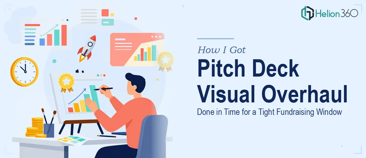
The Fundraising Window Was Open — and the Deck Wasn't Ready
The situation was straightforward but the pressure was real. We were a growth-stage startup with active investor conversations in motion, a two-week window before the next round of meetings, and a pitch deck that hadn't been touched visually since an earlier stage of the company. The content was solid — the story, the numbers, the market framing — but the visual presentation didn't reflect where the company actually was. Investors notice that gap immediately. A deck that looks like it was built in a hurry signals that the team either doesn't care about presentation or hasn't thought carefully about how they're perceived.
I knew the visual update needed to be done properly, not patched. The stakes were too high to hand something rough to the room.
What I Found Out This Kind of Work Actually Involves
Before moving forward, I spent time understanding what a proper pitch deck visual overhaul actually requires — not just swapping colors and fonts, but genuinely elevating how the material lands.
The first thing that became clear is that investor pitch deck design isn't purely aesthetic. The visual choices have to serve the narrative. Slide hierarchy, the weight given to key claims, the way data is visualized — all of it affects how a sophisticated reader moves through the deck and what they walk away believing. Cosmetic changes that don't reinforce the story actually make things worse.
The second signal of real complexity was slide-by-slide consistency at scale. A deck of 15 to 20 slides needs to feel like a single designed object, not a collection of individually styled pages. That requires a master slide system built with discipline — not something you improvise slide by slide.
The third thing I noticed: growth-stage decks have specific conventions that experienced investors expect to see honored. Traction slides, unit economics visualization, team positioning — each has a right and wrong way to present it visually. Getting those wrong, even slightly, creates friction.
What the Work Actually Involves at Each Stage
The structural work starts before a single slide is touched visually. A practitioner doing this well audits the existing deck for narrative flow — identifying where the story stalls, where a slide is trying to do too much, and where a visual reframe would make the argument land harder. Proper slide sequencing follows a clear arc: problem, solution, market, traction, ask — with each section allocated space proportional to its weight in the investor's decision. Restructuring that arc before applying any visual layer takes focused judgment, and doing it wrong means the visual polish lands on top of a broken story.
Visual mechanics are where the execution depth becomes obvious. A well-designed pitch deck operates on a consistent layout grid — typically a 12-column structure — with a strict typographic hierarchy running at roughly 36pt for headlines, 24pt for subheads, and 16pt for supporting detail. Chart and data slide choices follow specific logic: bar charts for comparison, line charts for trend, single large numbers for milestone claims. Each choice has to be deliberate, and applying that logic consistently across 18 or 20 slides — while keeping every element optically balanced — is painstaking work. A single misaligned element or wrong chart type on a traction slide reads as careless to an experienced eye.
Brand and palette discipline closes the loop. A growth-stage deck typically operates within a tight palette of three to four brand colors, with one accent used sparingly for emphasis. Every slide background, icon, chart color, and text block has to pull from that same set without exception. Applying that discipline retroactively to an existing deck — especially one built incrementally over time with inconsistent sourcing — means auditing every element rather than just restyling the template. That audit alone takes hours, and it's exactly the kind of work that gets skipped when someone is rushing.
Why I Brought in Helion360 to Handle It
I looked at the scope clearly and made the call quickly. The work involved structural judgment, visual mechanics expertise, and brand application discipline — applied consistently across a full deck, under a two-week deadline. Attempting it myself wasn't realistic. The learning curve on doing it well was too long, and the cost of doing it badly was too high.
Helion360 handled the full project end-to-end. That meant the narrative audit and slide restructuring, the full visual system build from master slides through to individual layouts, and the brand application across every element of the deck. They turned the work around fast — delivered well within the window I needed, in a fraction of the time it would have taken me to learn and execute this myself. The team operates with the tooling and pattern recognition already in place for exactly this kind of project.
The Result — and What I'd Say to Anyone Staring Down the Same Situation
What came back was a deck that looked and felt like it belonged in the room. The visual system was coherent, the data slides were clean and legible, the hierarchy was clear throughout, and the overall impression matched the stage of the company. Investor conversations that followed moved faster — the deck wasn't something that needed to be explained or apologized for.
If you're a growth-stage startup with a fundraising timeline closing in and a deck that isn't visually where it needs to be, the work involved is deeper than it first appears — and the margin for error is narrow. If you're looking at the same situation and need it handled properly and fast, Helion360 is the team I'd engage — they delivered end-to-end with the speed and execution depth this kind of project demands.