

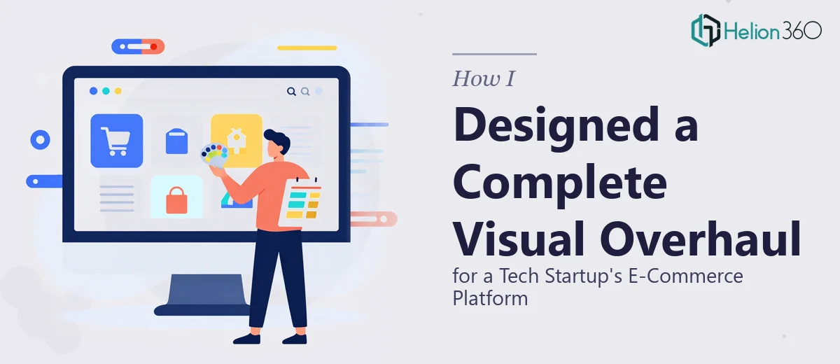
The Problem with Launching a Platform That Doesn't Look the Part
We had just launched a new e-commerce platform and were weeks out from a trade show that would put our brand in front of exactly the kind of audience we'd been building toward. The platform worked. The product was solid. But the visual presentation — the website layout, the brand cohesion, the deck we'd bring to the show floor — didn't reflect any of that. It looked like a startup in progress, not a startup ready to scale.
The stakes were real. Trade show first impressions are largely visual. Buyers, partners, and press make snap judgments based on what they see before they hear a word you say. I knew that going in with mismatched visuals, an inconsistent color language, and a deck that didn't connect back to our website would cost us credibility we couldn't afford to lose. This needed to be done right, and it needed to happen fast.
What I Found Out This Kind of Work Actually Involves
I started by mapping out what "done right" actually meant here. The scope wasn't just "make it look better." A real visual overhaul across a platform and a presentation means working from a unified brand system — not just picking colors that look nice together.
The first thing that stood out was the dependency chain. You can't design presentation slides that feel consistent with your website if the website itself hasn't been brought to a coherent visual standard. That means the layout grid, the type scale, the color palette, and the component styling all need to be locked before anything downstream gets built.
The second signal of real complexity was the interactive layer. Modern e-commerce platforms and trade show decks both rely on motion and interaction to carry attention — hover states, animated transitions, scroll behavior on the web side, and animated slide builds on the presentation side. These aren't cosmetic extras; they're the difference between something that feels polished and something that feels flat.
The third thing I realized was how much brand discipline this required across two very different output formats — a live website and a presentation deck. Keeping them visually unified while respecting the rules of each medium is genuinely specialized work.
What a Project Like This Actually Requires to Execute Well
The right approach starts with a structural and narrative audit of both surfaces — the website and the presentation — before a single visual decision gets made. On the website side, that means evaluating the layout grid, identifying where hierarchy breaks down, and mapping which sections need structural rework versus purely visual refinement. On the presentation side, it means defining the story arc: what impression does slide one set, what does the middle section establish, and what does the closing leave the audience with. Done well, this audit phase sets constraints that keep the rest of the work coherent. Skipping it is what produces decks and websites that feel like they belong to different companies.
The visual mechanics layer is where the complexity compounds. A consistent brand system across two surfaces typically means working with a defined type scale — something like 40pt/28pt/18pt/14pt across heading, subheading, body, and caption roles — applied consistently in both the web stylesheet and the slide master. Color discipline usually caps the active palette at four brand colors plus two neutrals, with strict rules about which values appear on which background types to maintain contrast ratios. Setting this up correctly in a slide master so that it propagates across 30 or 40 slides without breaking takes considerably longer than most people expect, and a single inconsistency in the master template creates cascading errors throughout.
Polish and consistency across the full deck and across the website's visual components is the phase that catches people off guard. It's not just about making individual slides look good — it's about ensuring spacing, icon weight, image treatment, and motion parameters feel identical from the first slide to the last and from the landing page to the product page. Experienced designers work from a component library so that every button, callout box, and data visualization instance is pulled from the same source. Building and applying that library from scratch, with no existing system to draw from, is realistically a multi-day effort even for someone who does this professionally.
Why I Brought Helion360 in to Handle the Full Project
I didn't attempt to work through any of this myself. Looking at the scope — two surfaces, a tight trade show deadline, a brand system that needed to be built from the ground up — it was immediately clear that the right move was to engage a team that does exactly this kind of work every day.
Helion360 handled the project end-to-end: the brand system definition, the presentation design built against that system, and the visual enhancement work on the platform itself. They came in with the component library approach already in place, which meant the consistency work that would have taken me weeks to learn and execute was handled in a fraction of that time. The deck was turned around quickly — done in days, not weeks — with the website visual work delivered on the same timeline.
What made the difference wasn't just the output quality. It was the speed at which a team with the tooling and expertise already built in could move through work that would have stalled me at every stage.
The Outcome and What I'd Tell Anyone Who's Facing the Same Call
We went into the trade show with a presentation and a platform that looked like they came from the same place — because they did. The brand system held across both surfaces, the deck told a clean story from first slide to last, and the interactive elements on both the web and presentation side landed the way they were supposed to.
The business outcome was straightforward: we showed up looking like a company that had its act together, and that opened conversations that wouldn't have started otherwise. If you're looking at a similar situation — tight timeline, two surfaces to unify, a brand system that needs to be built before anything else can move — Helion360 is the team I'd engage. They handled the full execution fast and brought the kind of depth this work requires from day one.