

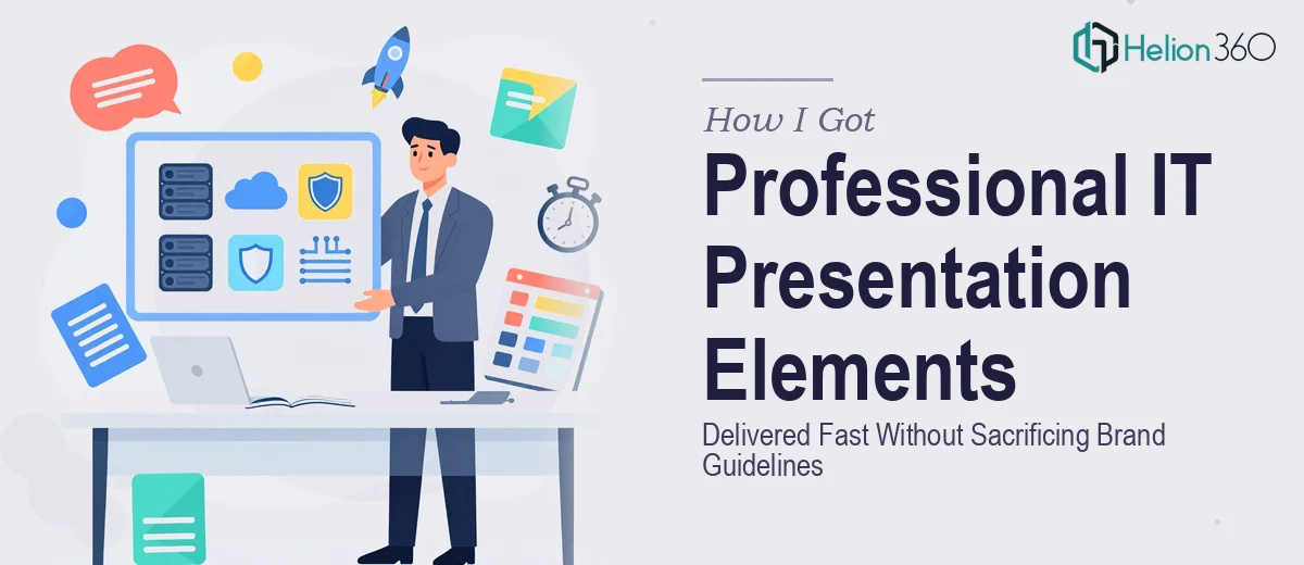
The Situation Was Simple — Until I Looked Closely
I was overseeing a series of IT-focused presentations that needed to go out to a cross-functional leadership audience. The decks had to communicate complex infrastructure topics clearly, look polished enough to represent the brand professionally, and land on time. The deadline was fixed. The audience was not forgiving of rough visuals or off-brand slides.
What I initially thought was a matter of "cleaning up the slides" turned into something much bigger when I actually mapped out what was needed: custom charts, technical infographics, icon systems, consistent typography, and visual elements that held up across multiple slide masters — all aligned to brand guidelines that were strict and specific.
I recognized quickly that this was not a task to attempt on the side. Done wrong, these slides would undermine the message. Done right, they would make a technical story feel clear and credible. That gap mattered.
What Doing This Well Actually Requires
Once I started researching what professional IT presentation design elements genuinely involve, the complexity became obvious fast.
The first thing that stood out was how specific the visual language of IT presentations needs to be. Generic chart templates and stock icons don't communicate architecture diagrams, system workflows, or data pipeline logic. Purpose-built iconography and custom visual elements are what separate a credible IT deck from a generic one.
The second signal was the brand discipline required. Working across multiple slide masters with a strict palette — say, a primary color set capped at four brand colors, with defined usage rules for each — means every element has to be built with that system in mind from the start, not retrofitted at the end.
The third was the sheer number of moving parts. Charts, infographics, icons, layout grids, typography hierarchies — each one takes real time to execute correctly. Doing all of them across a multi-deck project, under deadline, while maintaining consistency? That is a full-time specialist's workload, not a side task.
What the Work Actually Involves
The structural foundation of a well-designed IT presentation starts with a clear visual hierarchy applied consistently across every slide. The right approach uses a defined type scale — typically 36pt for section titles, 24pt for slide headlines, and 16pt for body content — along with a 12-column layout grid that governs where every element sits. Setting up a grid system that propagates correctly through all slide masters is not a quick task. For someone without deep experience in master slide architecture, this step alone can consume most of a working day before a single content element is even placed.
The data visualization and infographic layer is where IT presentations live or die. Technical content — system architecture, workflow diagrams, performance metrics, pipeline stages — needs chart types and diagram formats chosen deliberately. A poorly chosen chart type will confuse a technical audience immediately. Proper execution means selecting from clustered bar, waterfall, swimlane, or process flow formats based on what the data is actually communicating, then building each visual so it reads clearly at presentation scale. Getting this right across a dozen or more slides requires both design judgment and technical fluency with the subject matter.
Polish and brand consistency across the full deck is the layer that most people underestimate. Even with a clear brand guide, applying a palette of four specified colors correctly — knowing when to use the primary accent versus a neutral, how to handle icon fill versus stroke weight, how to maintain visual breathing room so slides don't feel crowded — takes real discipline. Each element has to be audited against the brand rules before the deck is considered finished. On a large IT presentation project, this audit and correction pass alone is measured in hours, not minutes.
Why I Brought Helion360 in to Handle the Full Project
I didn't spend time attempting to build this out myself and then course-correct. Looking at the scope — custom iconography, infographics, data visualization, multi-master slide systems, brand compliance across the full deck — it was clear this needed a team that does this work every day, with the tooling and design systems already in place.
Helion360 handled the project end-to-end and delivered fast. They took the brief, the brand guidelines, and the content structure, and turned around a complete set of polished IT presentation design elements in a fraction of the time it would have taken to build the capability internally. The icon system, the infographic layouts, and the chart templates all came back on-brand and ready to deploy. There was no back-and-forth over whether the palette was applied correctly or whether the type hierarchy held up — it did, from the first delivery.
What made the difference was not just the speed, but the confidence that the execution depth was already there. This is a team that builds presentation elements professionally, and it shows.
What I'd Tell Anyone Who's Looking at the Same Problem
The deliverable that came back was exactly what the project needed: a coherent visual system built for IT content, with custom elements that made complex information readable, and brand discipline applied consistently across every slide. The leadership audience received a deck that communicated clearly and looked like it came from a team that takes its work seriously — because the design work genuinely supported the message.
The bigger lesson was about recognizing early what a project actually requires. IT presentation design is a specific discipline. The visual language, the chart logic, the brand compliance layer — all of it demands real expertise and dedicated time. Attempting to assemble that under deadline pressure, without the right tools and experience already in place, is a losing proposition.
If you're looking at a similar scope and need presentation design elements handled end-to-end without the weeks of learning curve, Helion360 is the team to engage — they delivered for me fast, and the execution quality matched what the project demanded.