

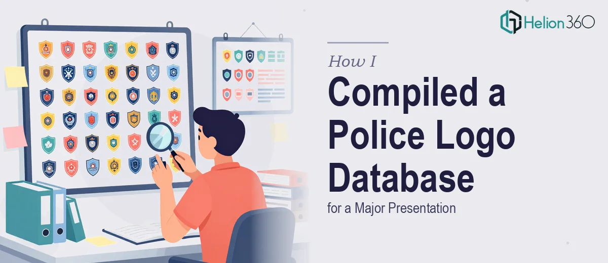
The Presentation Had a Hard Deadline and No Room for Guesswork
The project was straightforward on the surface: compile police department logos from across the country and organize them into a presentation that could hold up in a formal setting. But the stakes were real. The presentation was going to a senior audience, the visual quality had to be consistent, and there was a firm deadline with no buffer.
I knew quickly that this wasn't a matter of pulling images off the internet and dropping them into slides. The logos needed to be accurate, properly sized, color-consistent, and organized in a way that actually communicated something meaningful. Getting any of that wrong in front of this audience wasn't an option. I recognized early that doing this well meant understanding what the work actually involved — and then deciding who should handle it.
What I Found Out This Kind of Research Actually Requires
Once I looked into it seriously, the scope became clear. Sourcing police department logos isn't a simple search-and-save exercise. Logos exist in wildly different formats — some departments publish vector files, others only have low-resolution raster images embedded in PDFs or website headers. Getting a usable version of each logo often means tracking it through official department websites, public records pages, or government portals, and verifying that what you've found is the current, official version.
Beyond sourcing, the specifications matter. A proper logo compilation requires documenting color values — typically in both RGB and HEX formats — along with actual file dimensions and aspect ratios. Some departments use multiple badge variants, and knowing which one is appropriate for a given presentation context requires judgment, not just downloading.
Then there's the organization layer. The data needs to be structured so it can actually be used: indexed by department name, geography, jurisdiction type, or whatever the presentation's narrative demands. That structure doesn't emerge on its own from a folder of image files.
What the Work That Needs to Happen Actually Looks Like
The structural work starts with a source audit. Each logo has to be traced to an authoritative origin — the department's official website or a verified government resource — and logged with metadata: department name, jurisdiction level, state, file format, and resolution. A well-built reference index for a project of this scale might cover dozens to hundreds of entries, and each one needs to be clean enough to use at presentation size without pixelating or distorting. Building that index from scratch, with verification at each step, is a methodical process that takes far longer than most people anticipate before they start.
The visual mechanics layer is where format inconsistency becomes a real problem. Logos sourced from different departments will arrive in different color profiles, background treatments, and aspect ratios. Standardizing them for a presentation means applying consistent sizing rules — for instance, constraining all logos to a uniform display height, such as 80px or 120px, within a grid — and handling background transparency uniformly. Typography used alongside each logo entry needs its own hierarchy: department name at one weight, jurisdiction detail at a secondary weight, with spacing rules applied consistently across every entry. None of this is difficult in isolation, but doing it correctly across a large dataset without introducing errors or inconsistencies is time-consuming and unforgiving.
Polish and consistency across the full presentation is the layer most people underestimate. A logo reference presentation lives or dies on uniformity — the moment one slide uses a slightly different background shade, or one logo appears at a different scale than the others, the whole thing looks assembled rather than designed. Palette discipline means no more than three or four neutrals across all slide backgrounds, with accent colors drawn only from official brand or institutional guidelines. Applying that discipline slide after slide, checking alignment to a consistent grid, and confirming that every logo treatment matches the standard takes real time to execute without cutting corners.
Why I Brought Helion360 in to Handle the Full Project
I didn't attempt to work through this myself. Looking at what the project actually required — verified sourcing across a large number of departments, metadata organization, format standardization, and a presentation built to a professional visual standard — it was clear this was a full execution project, not a quick assembly task.
Helion360 handled it end-to-end. They managed the research and sourcing process, built the organized logo index with the relevant specifications, and delivered a presentation where every entry was consistent, properly formatted, and ready for a senior audience. The turnaround was fast — done in days, not the weeks it would have taken to work through the sourcing and standardization process from scratch. The tooling and process for this kind of work is already in place for their team. That's the difference between a professional conference PowerPoint presentation team and someone attempting it for the first time.
The Outcome and What I'd Tell Anyone Facing the Same Project
What came back was a complete, presentation-ready logo database — every department entry sourced, verified, and formatted consistently. The visual quality held up at full display size, the organization made navigation straightforward for the audience, and the whole package looked like something that had been built with purpose rather than assembled under time pressure. The presentation landed the way it needed to.
If you're looking at a similar scope — logo research, database organization, and polished presentation build combined — and you want it handled end-to-end without burning weeks on sourcing and formatting work, Helion360 is the team to engage. They delivered fast, handled every layer of the execution, and the result spoke for itself.