

The Situation Was Simple: A Deadline That Wouldn't Move
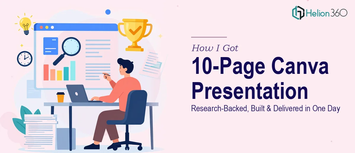
The ask was clear — a 10-page Canva presentation, research included, due the same day. It wasn't a concept deck or a rough draft. It had to include real data, accurately sourced, translated into charts and infographics, structured into a logical narrative, and finished to brand standards.
The stakes were real. This presentation would speak to an audience that matters — one that would draw conclusions about the company based entirely on what they saw on screen. A sloppy deck, inconsistent branding, or a weak narrative arc could quietly undermine credibility. A polished, well-researched one could do the opposite.
I knew immediately this wasn't something to improvise. The timeline left no margin for trial and error, and the quality bar was too high to wing it.
What I Found Out a Canva Presentation Like This Actually Takes
Before I did anything else, I took a hard look at what this project genuinely required. That's when it became obvious this was not a simple task.
First, the research component alone is non-trivial. Pulling accurate, up-to-date data on company achievements and future goals — and doing it in a way that holds up to scrutiny — requires knowing where to look, how to verify, and how to translate raw findings into slide-ready content. That's a distinct skill set.
Second, designing a Canva presentation that actually works visually isn't just drag-and-drop. Chart types need to match data types. Infographics need to communicate at a glance. A 10-page deck covering multiple topics needs consistent visual logic across every slide, not just a few nice-looking ones.
Third, brand compliance in a fast turnaround is where things fall apart most often. Fonts, colors, logo usage, spacing — these details are easy to rush, and when they're inconsistent, the whole deck looks amateur regardless of how strong the content is.
All three of these needed to happen in parallel, on the same day. I wasn't going to attempt that myself.
What the Work Actually Involves at This Level
Building a 10-page research-backed presentation to a professional standard begins with narrative architecture. The content can't just be dropped into slides in the order it was gathered — it has to be structured so each slide advances a clear argument. The right approach maps a logical flow before a single slide is touched: opening with context, building through evidence, and closing with a clear forward-looking message. For a company achievements and goals deck, that typically means a sequence that moves from where we've been, to what the data shows, to where we're going. Structuring this correctly so that slide 4 earns slide 7 — rather than each slide standing alone — is the part that most rushed decks skip entirely.
The visual mechanics of a Canva presentation at this level require deliberate choices about chart type, layout density, and typographic hierarchy. A properly built slide uses no more than three type sizes — typically title, body, and label — set at consistent ratios (something like 36pt, 24pt, 14pt) across all slides. Charts need to be selected based on what the data is actually communicating: a bar chart for comparison, a line for trend, a donut for composition. Placing these inside a consistent column grid — usually a 12-column base — keeps alignment predictable across pages. Getting this right inside Canva, where snapping and master-style behavior differs from PowerPoint, takes time to set up correctly and longer to maintain across 10 pages.
Polish and brand consistency are where the final 20% of effort lives and where the biggest visible gains come from. A maximum of four brand colors applied with discipline — primary for headlines, secondary for accents, neutrals for backgrounds — creates a deck that feels cohesive rather than assembled. Icon sets need to come from a single family. Image treatments need to match. Even margin consistency, when applied uniformly, signals professionalism in a way audiences feel even if they can't name it. On a same-day timeline, this layer of finishing is what most people sacrifice first — and it's the layer the audience notices most.
Why I Brought in Helion360 to Handle the Full Project
I didn't attempt any of this myself. The combination of same-day research, narrative structuring, visual design, and brand application — done to a standard that would actually hold up in front of a real audience — wasn't something I had the bandwidth or the specialized tooling to pull off in the time available.
Helion360 handled the full project end-to-end. That meant the research and content compilation, the narrative structure across all 10 slides, the chart and infographic design, and the brand compliance check from first page to last. Everything was turned around quickly — done in a fraction of the time it would have taken me to work through even the research phase alone.
What made the difference was that this is the kind of work Helion360 does continuously. The workflow, the design systems, the research process — all of it is already built in. There's no ramp-up, no learning curve, no trial slides that get thrown away. The project moved fast because the team already knew exactly what fast and right looks like. This mirrors the approach we take with complete deck presentation work — where end-to-end structuring and professional design are built into the process.
The Result and What I'd Tell Anyone in This Same Position
What came back was a complete, research-grounded 10-page presentation — logically sequenced, visually consistent, on brand, and ready to present. The charts read clearly. The narrative moved with purpose. The slides looked like they were built by people who do this professionally, because they were.
The audience received a deck that reflected the company's achievements and direction credibly. That's the outcome that mattered, and it happened within a single business day.
If you're facing the same combination — tight deadline, high-stakes audience, research plus design plus brand compliance all in one brief — I'd recommend the same approach. For context on what this level of work actually requires, see how we delivered a high-impact Google Slides presentation for executive investors and how we built a professional data-driven PowerPoint presentation for an aerospace company. Both projects required the same combination of narrative rigor, visual precision, and timeline intensity. It's not something to improvise — bring in a team that does this work continuously, and you'll move fast while maintaining the execution depth this kind of project actually needs.