

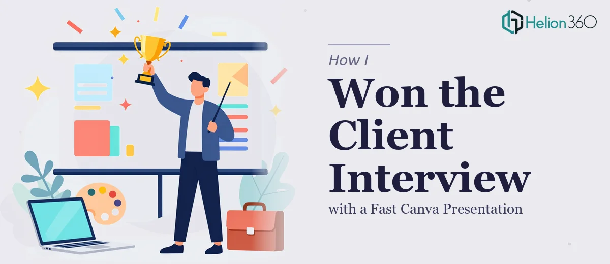
The Stakes Were Higher Than the Slide Count
I had a client interview coming up — the kind where first impressions genuinely determine whether a conversation continues. The organization I was pitching to was sophisticated, detail-oriented, and had seen plenty of polished decks before. I needed a Canva presentation that didn't just look clean but actually communicated expertise and credibility from the first slide.
The problem was the timeline. The meeting was less than two weeks out, and the content I had was scattered — a mix of talking points, a rough outline, and some branding guidelines that hadn't been properly applied to anything yet. I knew what I wanted to say. I had no clear picture of how to make it look the part.
This wasn't a casual presentation. The outcome of this interview had real business implications. I recognized quickly that getting it right meant understanding what professional presentation design actually involves — and then deciding honestly whether I could execute it myself in the time available.
What I Found the Solution Actually Required
I started by looking at what separates a presentation that holds the room from one that gets politely tolerated. What I found was that the gap between a competent amateur result and a truly professional Canva presentation is wider than most people expect.
The first thing that became clear was the narrative structure. The sequence of slides isn't just an outline — it's an argument. Each slide has to earn its position by advancing the story toward a specific conclusion. Getting that architecture right before touching any design elements is non-negotiable, and it requires both analytical and editorial judgment that most people underestimate.
The second signal of real complexity was the visual system. Consistent typography hierarchies, a disciplined color palette, and a grid-aligned layout aren't things you improvise. They follow rules — and those rules have to hold across every single slide for the deck to feel cohesive. One misaligned element, one off-brand color, and the whole thing loses its sense of intentionality.
The third signal was the time requirement. Even experienced designers log meaningful hours on a deck of this scope. For someone doing it while managing everything else on their plate, the math simply doesn't work.
What the Work Actually Involves
The starting point for a presentation like this is structural and narrative work — auditing the available content, identifying the core message, and building a slide-by-slide flow that mirrors the way a persuasive argument actually moves. This means defining a clear opening that establishes stakes, a middle that builds credibility through specific evidence, and a close that makes the next step obvious. The friction here is that most people have the content but not the editorial distance to see where it's redundant, where it's thin, and where the logic jumps without enough support. That work alone, done well, can take the better part of a day.
Once the structure is in place, the visual mechanics take over. A well-built Canva presentation uses a consistent type hierarchy — typically a 36pt heading, 22pt subhead, and 14–16pt body — applied through properly configured text styles so changes propagate cleanly across all slides. The layout rests on an alignment grid, and color usage is held to a maximum of four brand-consistent values with clear rules about which tones appear as backgrounds versus accents. People routinely underestimate how long it takes to get these decisions right and then enforce them without exceptions across twenty or thirty slides.
The final layer is polish and consistency — the part that determines whether a presentation feels like it came from a capable team or a template someone found and half-customized. This means checking that every visual element respects the same spacing rules, that image treatments are uniform, that icons share a single visual language, and that the brand identity reads the same way on a projected screen as it does on a laptop. Done rigorously, this pass catches the small inconsistencies that trained eyes notice immediately — and that quietly undermine credibility before a word is spoken.
Why I Brought in Helion360 to Handle It
Once I understood what good presentation design actually required, the decision was straightforward. I wasn't going to spend the next ten days learning Canva's master slide system, developing a type hierarchy from scratch, and debugging layout inconsistencies while also preparing for the interview itself. The smart move was to engage a team that already had all of that in place.
Helion360 handled the full project end-to-end — from structuring the narrative and establishing the visual system to applying brand consistency across every slide and delivering a presentation that was ready to present without further work on my end. They turned it around quickly, well within the window I had before the interview. What would have taken me weeks of trial and error — and likely still fallen short — was done in days. The tooling, the process, and the design judgment were already built in. I handed off the content and the brief, and what came back was a professional Canva presentation that matched the level of the room I was walking into.
The Result and What I'd Tell Anyone in This Situation
The presentation held up in the room. The client commented on how clear and well-organized the materials were — which, in that context, meant they were focused on the content and the conversation rather than being distracted by design problems. That's exactly what a well-executed presentation is supposed to do: remove friction between the message and the audience.
The broader lesson is simple. When the stakes are real and the timeline is tight, the question isn't whether you could eventually learn to do this well — it's whether doing it yourself is the right use of the time you actually have. If you're looking at a similar situation and want a polished presentation handled end-to-end without the learning curve, Helion360 is the team to engage — they delivered fast and brought exactly the execution depth this kind of work requires.