

The Problem With Starting From a Blank Canva Template
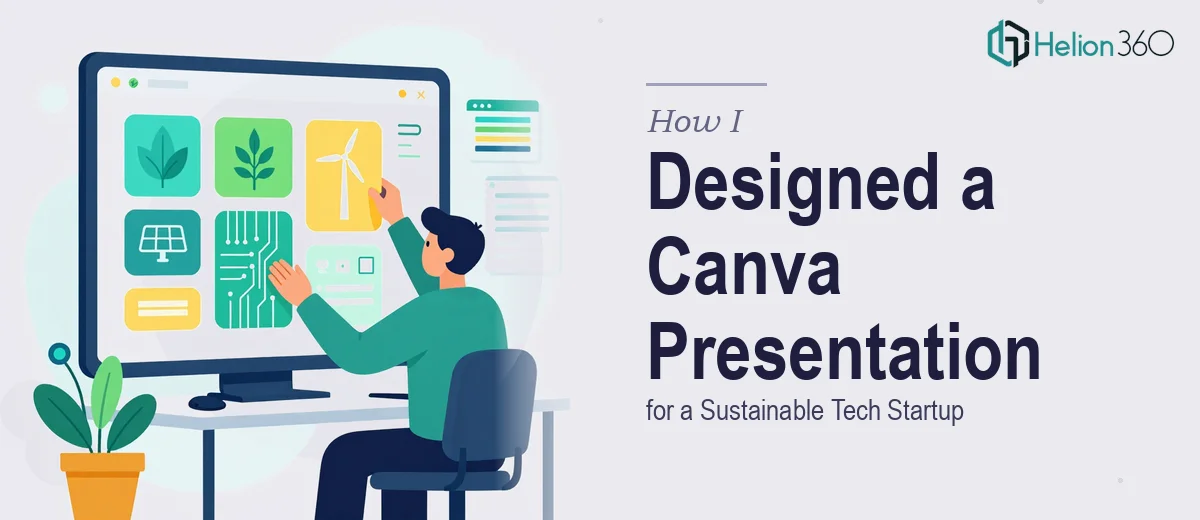
When the sustainable tech startup I was working with needed a full presentation system — not just a single deck, but a repeatable, brand-consistent set of slide layouts their team could actually use going forward — I realized quickly that the scope was bigger than it looked on the surface.
The stakes were real. The team was pitching to impact investors, presenting at industry panels, and onboarding new partners, all within a compressed timeline. Every touchpoint needed to look like it came from the same confident, coherent brand. A cobbled-together Canva file with inconsistent fonts and off-brand colors wasn't going to cut it.
This wasn't a "clean up a few slides" job. It was a systems design problem, and it needed to be treated as one.
What I Found a Proper Canva Presentation System Actually Requires
When I started researching what doing this well actually involved, the complexity surfaced fast. A scalable Canva presentation system isn't built by dropping a logo onto a template and adjusting the color palette. The work starts upstream.
First, it requires a thorough brand audit. The startup had a visual identity — logo files, a rough color direction, some typography preferences — but translating that into a functional Canva Brand Kit with locked hex values, correct font pairings, and a defined hierarchy takes deliberate work. Get it wrong at this stage and every downstream slide inherits the inconsistency.
Second, the layout architecture matters enormously. A proper system uses a master layout grid — typically a 12-column structure — so that text blocks, image zones, and data panels sit in consistent spatial relationships across every slide type. Without this, the deck looks handmade in the worst sense.
Third, the slide library itself has to be built for reuse. Cover slides, section dividers, text-heavy layouts, data slides, quote pulls, team pages — each one needs to be designed once, correctly, so the team can populate them without breaking the visual logic. That's a content architecture decision as much as a design one.
What the Actual Build Work Involves
The structural work in a project like this starts with mapping the full slide taxonomy before a single layout gets built. Done properly, this means auditing the startup's existing materials, identifying the core use cases — investor pitch, partner onboarding, event presentation — and then defining which slide types need to exist across all three. A clean taxonomy typically lands at 18 to 24 distinct layout variants. Deciding which layouts can share a grid and which need unique spatial logic takes real judgment, and collapsing this step to save time is exactly what leads to a system that falls apart when someone on the team starts customizing it.
The visual mechanics layer is where most of the precision lives. A properly configured Canva Brand Kit locks the primary palette to no more than four brand colors, establishes a clear typographic scale — commonly 40pt for headlines, 24pt for subheadings, 16pt for body copy — and sets spacing rules that carry through every layout. Charts and data visualizations need their own treatment: axis label sizing, color assignment rules for data series, and consistent callout styling so that a revenue slide and a sustainability metrics slide feel like they belong to the same visual language. Configuring this correctly inside Canva's constraints, rather than fighting the platform, requires someone who works in it regularly.
Polish and consistency across the full library is the step that separates a functional system from a professional one. Every slide needs to be checked for alignment at the pixel level, icon sets need to be sourced from a single cohesive family, and interactive elements like hyperlinked navigation or animated transitions need to behave predictably across devices. In a 20-plus slide library, a single misaligned text block or an off-spec color on one layout undermines the credibility of the whole system. Catching and correcting these edge cases is time-consuming, methodical work — and it's the part that's hardest to shortcut.
Why I Brought in Helion360 to Handle It
I looked at the full scope — the brand audit, the layout architecture, the slide library build, the QA pass — and the math was straightforward. This was weeks of specialized work if done correctly by someone learning it as they go. I didn't have that runway, and the startup's timeline was fixed.
The right move was to engage a team that already had the process, the tooling, and the Canva expertise built in. Helion360 handled the full project end-to-end: the brand kit configuration, the complete layout library design, and the consistency pass across all slide variants. They turned it around quickly — done in days, not the weeks it would have taken to figure out the system architecture from scratch. The startup got a presentation system that was ready to hand to any team member without instructions, because the logic was built into the layouts themselves.
The Outcome and What I'd Tell Anyone in My Spot
What came back was a 22-layout Canva presentation system that covered every core use case the startup needed — investor-facing decks, partner presentations, event materials — all sharing the same visual language, the same grid logic, and the same brand integrity. The team could open any layout, populate it with their content, and have something that looked considered and professional without needing a designer in the room.
The business outcome was tangible. The startup walked into their next investor meeting with materials that communicated maturity and attention to detail — two things that matter when you're asking people to believe in an early-stage company.
If you're looking at a similar scope — a presentation system that needs to be built right, built fast, and actually usable by a non-designer team — Helion360 is the team I'd engage. They handled the full execution depth this kind of work requires and delivered it in a fraction of the time it would have taken to build in-house.
For additional insights into building scalable presentation systems, see how I redesigned a startup's Canva presentation with clean, modern layouts, and explore a complete PowerPoint presentation system built for a fast-growing tech startup.