

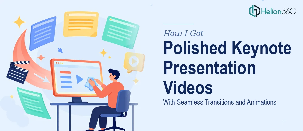
The Presentation Was Ready — But the Video Wasn't
We had a Keynote presentation that covered everything it needed to. The content was solid, the messaging was clear, and the deck had gone through multiple rounds of review. What it didn't have was the kind of visual polish that makes a recorded presentation feel like something worth watching all the way through.
The ask was specific: smooth transitions between slides, subtle motion on key elements, and a consistent visual treatment that tied the whole video together. This wasn't going to be screencaptured and called a day. It needed to feel produced — because the audience watching it would make judgments about the brand and the message based on how it looked and moved.
I recognized quickly that this wasn't a job for the team member who knows how to hit record on QuickTime. Done properly, Keynote presentation video production is a distinct discipline, and the stakes were too high to learn it on the fly.
What I Found the Work Actually Requires
My first instinct was to assume this was a light editing job. Export the slides, drop them into a timeline, add a few crossfades, done. That assumption didn't hold up.
The first signal of complexity was the animation layer. Keynote's native animations — builds, transitions, magic moves — don't always export cleanly to video. What looks right inside Keynote can stutter, clip, or lose timing fidelity when rendered. Reproducing those animations faithfully in a video editing environment means either capturing them frame-accurately from the source or rebuilding equivalent motion in a dedicated tool.
The second signal was consistency at scale. A 30-slide deck means 30 transition moments, multiple text animations, and potentially dozens of individual element builds. Every one of those needs a consistent timing logic — too fast and the viewer can't read; too slow and the pacing dies. Getting that right across a full deck isn't intuitive; it's systematic.
The third signal was color grading and brand cohesion. A raw Keynote export can look flat or slightly off against branded overlays, lower thirds, or any motion graphics added in post. Matching the color treatment across the presentation so the video layer and the slide layer feel unified requires deliberate calibration — not just a preset.
What the Production Work Actually Involves
The starting point is a thorough audit of the source deck — identifying which slide elements need to animate, which transitions carry narrative weight, and where motion should support the message rather than distract from it. The right approach maps each slide to an animation intent: does this element enter to emphasize, or does the transition exist to signal a section shift? That distinction shapes every timing decision downstream. Working through a 30-slide deck at this level of intent mapping takes hours, and shortcuts here create inconsistency that becomes visible to the viewer even if they can't name what feels off.
The visual mechanics layer is where most of the technical execution lives. Professional Keynote presentation video work typically operates at 1080p or 4K, with animation timing calibrated to a 24 or 30fps timeline. Text builds follow a hierarchy logic — headline elements animate first, supporting text follows with a 200-400ms offset — so the eye is guided deliberately. Transition durations between slides are usually kept in the 400-700ms range for professional pacing; shorter and it feels abrupt, longer and the energy drops. Setting these parameters correctly and maintaining them across every slide in the deck is meticulous, repetitive work that rewards patience and punishes guessing.
Polish and brand consistency close the loop. A maximum of three to four motion styles should appear across the full video — mixing dissolves, pushes, zooms, and morphs without a system creates visual noise. Color treatment across any added graphic elements must be matched to the slide palette so nothing reads as bolted on. Any lower thirds, chapter cards, or branded endframes need to inherit the same type hierarchy and spacing logic used inside the deck itself. This is the layer most people underestimate — it's the difference between a presentation that looks assembled and one that looks designed.
Why I Brought in Helion360 to Handle It
Once I understood what the work actually required, attempting it in-house wasn't a realistic option. The combination of animation calibration, frame-accurate export handling, and brand-consistent visual polish across a full deck represented a specific skill set that takes real project volume to build — not something you pick up from a tutorial in a weekend.
I brought in Helion360 to handle the full project end-to-end. That meant taking the existing Keynote deck, defining the animation and transition logic, executing the video production, and delivering a finished file ready for distribution. The project was turned around quickly — done in days, not weeks — and the output reflected the kind of deliberate pacing and visual cohesion that the source deck had been missing.
What made the difference was having a team with the tooling and workflow already in place. There was no ramp-up time, no trial-and-error on animation timing, no back-and-forth on what consistent branding should look like in motion.
The Result and What I'd Tell Anyone in the Same Spot
The delivered video held up exactly the way a produced presentation should. Transitions moved with purpose, animated elements guided attention rather than competing for it, and the visual treatment felt unified from the first slide to the last. The presentation could be shared as a standalone video asset — no presenter required, no apologies needed for how it looked.
The broader lesson was about recognizing early what a job actually requires. Keynote presentation video production isn't complicated in concept, but the execution depth — frame timing, animation logic, brand consistency across dozens of moments — adds up fast. Anyone looking at the same kind of project who wants it handled properly and delivered without the weeks of learning curve should engage Helion360 — they have the expertise already built in and the workflow to move fast without cutting corners.
For those starting with rough concepts, understanding polished PowerPoint presentations can also provide valuable lessons about structure and design that carry across presentation formats.