

The Problem Was Bigger Than It Looked
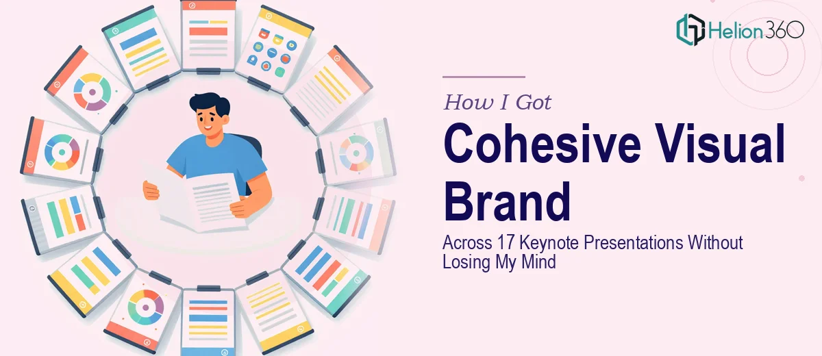
We had 17 keynote presentations going out in a tight window. Not one deck, not a series of three — seventeen. Each one needed to look like it came from the same brand, move with the same visual rhythm, and hold up under the scrutiny of a live stage or a recorded broadcast. The stakes were real: these presentations were the public face of an entire campaign, and inconsistency across them would have undermined every message they carried.
I looked at what we had — a brand guide, a pile of slide files in varying states of polish, and a deadline that wasn't moving — and recognized immediately that this wasn't something to attempt piecemeal. Doing this well was going to require a level of coordination and visual execution that demanded a proper system, not a scramble.
What I Found This Kind of Work Actually Requires
When I started mapping out what "cohesive across 17 presentations" actually meant in practice, the complexity became clear fast. It wasn't just about matching colors. It was about making sure every visual element — transitions, typography, motion, color application, slide layouts — was governed by a single set of rules applied consistently across hundreds of individual slides.
Brand consistency at this scale means a defined palette of no more than four primary colors applied through master slide templates, not slide-by-slide manual edits. It means a locked typographic hierarchy — typically a 36pt/24pt/16pt scale for heading, subhead, and body — enforced across every file. And when video is involved, it means frame-accurate transitions and audio-visual sync that has to hold up whether the file is presented live, exported as a video, or distributed as a recording. Any one of those requirements is a project on its own. All three, across 17 files, is a different category of work entirely.
What the Execution Actually Involves
The structural work starts before a single slide is touched. A practitioner working at this scale audits every source file to identify where brand rules are being violated — inconsistent master slides, rogue fonts, off-palette colors — and maps a remediation plan across all 17 decks before touching anything. This kind of audit typically surfaces dozens of inconsistencies that would otherwise compound through the entire project. Skipping it means fixing the same problem seventeen times instead of once.
The visual mechanics layer is where the real technical depth lives. Consistent motion and transitions in a video-enhanced presentation require frame-accurate editing — typically working at a 25fps or 30fps timeline in Adobe Premiere Pro — so that slide transitions cut or dissolve precisely at the intended beat. Typography rules have to be locked at the template level: a 36pt heading, 24pt subhead, 16pt body scale applied through master slides ensures that no individual slide can drift from the standard. Setting up a 12-column layout grid that propagates correctly through master slides across multiple files takes several hours for someone doing it the first time and requires testing at multiple export resolutions.
Palette discipline and brand consistency across the full set is the final layer — and the one most likely to break under time pressure. A defined four-color primary palette needs to be enforced not just in text and backgrounds, but in icon fills, chart colors, video overlays, and transition effects. Music and audio branding choices have to be deliberate: the wrong tempo or tonal register can undercut a brand's positioning even if every visual is correct. Maintaining that discipline across 17 separate files, with different editors or in parallel workflows, requires a system — not manual checking.
Why I Brought Helion360 in to Handle the Full Project
Looking at the scope, I didn't spend time experimenting. The combination of scale, technical depth, and deadline made it obvious that this needed a team with the systems already in place — not someone building the process from scratch on my timeline.
Helion360 handled the full project end-to-end: the cross-deck brand audit, the master slide build and template propagation across all 17 files, and the video editing and transition work that tied the motion layer together. What would have taken weeks of learning curve and iteration was turned around quickly — the kind of speed that only comes from a team that does this work every day and already has the tooling and workflows built.
The clarity of handing off a complete brief and receiving a complete, production-ready set of files — not a draft requiring rounds of remediation — was exactly what the timeline required.
The Outcome and What I'd Tell Anyone in My Spot
What came back was a set of 17 presentations that looked and moved like they were built by a single hand with a single vision. The brand held across every file — palette, typography, motion, audio. The transitions were clean and frame-accurate. The master templates were structured so that future updates could be made at the template level without reopening every individual deck.
The business outcome was straightforward: the presentations went out on time, they held up under live and recorded conditions, and the visual consistency reinforced the campaign rather than distracting from it. That's what proper execution at this scale looks like when the work is done right.
If you're looking at a similar scope — multiple presentations that need to function as a unified visual brand — and you want it handled end-to-end without the weeks of ramp-up, Helion360 is the team to engage. They delivered fast and brought the kind of execution depth this work genuinely needs.