

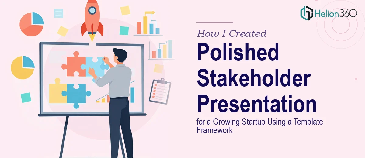
Starting With a Template That Was Only Half the Answer
When our startup reached the point where we needed to present ourselves to stakeholders — partners, potential investors, key clients — I knew the stakes were high. This was not a quick internal update. This was the kind of presentation that shapes how people perceive your business for months.
We had a template. That felt like a good starting point. The structure was already mapped out: mission statement, service overview, market differentiation, team bios, client testimonials, and future roadmap. On paper, all we had to do was fill in the blanks.
Except it was never that simple.
Where the Template Framework Started to Break Down
The template gave us a skeleton, but the moment I started placing our actual content into it, the problems became obvious. Our mission statement needed more visual emphasis than a plain text box could give it. The services section had too much information to fit cleanly into the existing layout. Our market differentiation data needed charts, not bullet points. And the team bios — with photos, titles, and short descriptions — were breaking the design every time I adjusted one element.
I also realized that a stakeholder presentation carries a different communication weight than an internal deck. Every slide needed to feel considered, not just populated. The visuals had to support the narrative, not compete with it. I spent a full day trying to fix the layout on just three slides before I accepted that the problem was beyond what I could resolve with the time I had.
Bringing In the Right Support
After hitting that wall, I reached out to Helion360. I explained where I was — that we had a template, we had our content, and we had a clear picture of the audience — but the execution was falling apart under the weight of the details. Their team took it from there.
What helped was that I did not need to start over or hand off a vague brief. I shared the existing template, our raw content for each section, the data behind our market positioning, and notes on the tone we were going for. Professional but approachable. Structured but not corporate-stiff.
What the Final Presentation Actually Covered
The team worked through each section methodically. The mission statement slide was redesigned to lead with visual impact — large type, clean background, no clutter. The services overview was restructured so each offering had its own visual lane without cramming everything into one dense slide.
The market differentiation section was where the charts made the biggest difference. Rather than describing how we stand apart in paragraph form, the data was translated into clean, readable visuals that made the comparison immediate and clear. That single change made the argument far more persuasive than any written explanation could.
Team bios were laid out in a consistent grid format with photos and brief descriptions that felt human without being informal. The client testimonials were pulled out of plain text boxes and given design treatment that made them feel like genuine endorsements rather than filler. And the future roadmap — arguably the most important section for stakeholders — was visualized as a clear timeline with milestones rather than a list of vague goals.
What I Took Away From This Process
Working through this project taught me something practical: a template is a starting point, not a finished product. The real work is in adapting the structure to your specific content without losing visual coherence. That requires both design judgment and an understanding of how stakeholders actually read and respond to information.
The two-week deadline we had set was tight, but the presentation came together on schedule. When we ran through it before the stakeholder meeting, the feedback from the team was immediate — it looked like something a company with real backing would produce, not something assembled under pressure.
For that kind of result, the design has to carry the story. And that is exactly what it did.
If you are at the same point I was — with content ready and a template in hand but the execution not coming together — Business Presentation Design Services is worth exploring. They stepped in where I could not keep up and delivered exactly what the presentation needed.
For similar real-world insights, explore how others tackled investor presentation challenges and franchise presentation conversions.