

The Task That Looked Simple at First
When my team rolled out a new CRM platform, I was asked to put together a PowerPoint training deck that would walk users through the database search feature. It sounded straightforward enough — document the workflow, add some screenshots, explain the steps. I figured I could knock it out in a day.
But the more I dug into it, the more complicated it became.
The CRM had multiple search modes, filter combinations, and lookup behaviors that varied depending on user permissions. I had notes from the product team, a few rough flowcharts, and a handful of UI screenshots that were inconsistent in size and quality. Turning all of that into a coherent, visually clean PowerPoint presentation — one that would actually make sense to non-technical staff — was a different problem altogether.
Where My Draft Fell Apart
My first attempt produced about 18 slides that were dense with text and cluttered with screenshots. The flow was technically accurate but visually exhausting. Every slide tried to do too much. The database search workflow alone spanned six slides with no clear visual hierarchy, and the tips-and-tricks section read more like a bulleted manual than a training tool.
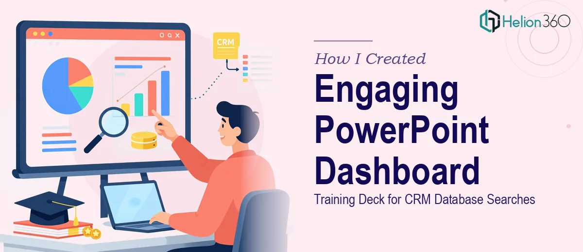
I also struggled with the dashboard walkthrough section. The goal was to show users how to navigate the CRM search interface step by step, but my mock-up made it look like a user manual from 2009. It needed to feel like modern software training — clear, visual, and easy to follow at a glance.
I spent two evenings trying to fix the layout and simplify the slides, but every revision just moved the clutter around. The deadline was close, and I knew I was going in circles.
Bringing in Helion360
After hitting a wall, I reached out to Helion360. I sent over the raw materials — my draft slides, the product notes, the screenshots, and a brief explaining the audience and purpose. Their team reviewed everything and came back with a clear plan for restructuring the deck.
They started by reorganizing the content into a logical training flow: an overview of why the CRM database search feature matters, a visual walkthrough of the dashboard interface, practical search scenarios with annotated screenshots, and a clean tips section at the end. Each section had a clear purpose and a consistent visual language.
What stood out was how they handled the dashboard walkthrough. Instead of stacking raw screenshots on a slide, they rebuilt each step as a framed, annotated visual — the kind that shows exactly where to click and why. It made the CRM interface feel approachable rather than intimidating.
What the Final Deck Looked Like
The finished PowerPoint training presentation came in at 24 slides and covered everything the team needed. The CRM database search workflow was broken into digestible segments, each with a clear heading, a focused visual, and just enough supporting text to guide a user without overwhelming them.
The practical examples section was particularly well done. Helion360 used real search scenarios — filtering by date range, searching by record type, combining multiple query parameters — and illustrated each one with a clean slide that showed the input, the result, and why it mattered for day-to-day data retrieval.
The overall design was consistent and professional, with a color palette that matched our internal branding. The deck worked equally well as a guided presentation in a live training session and as a standalone reference document.
What I Took Away from This
Building a CRM training PPT is not the same as knowing your CRM. I understood the database search tool well enough to document it, but translating that knowledge into an engaging, well-structured PowerPoint deck required a different skill set — one that involves visual storytelling, slide architecture, and instructional design.
The gap between a working draft and a presentation that actually teaches something is real, and it is wider than it looks from the inside.
If you are working on a similar project — a CRM training deck, a software walkthrough, or any kind of dashboard presentation that needs to land clearly with a non-technical audience — Helion360 is worth reaching out to. They handled what I could not and delivered a training deck that the whole team could actually use.