

One Slide. Five Circles. A Lot More Complexity Than I Expected.
It started with what seemed like a straightforward request. A tech startup preparing for a conference needed a single PowerPoint slide — five circles, each representing a core pillar of their business, each with concise copy that could hold up on a big screen in front of a packed room.
I figured I could knock it out in an afternoon. I had PowerPoint open, a rough layout in mind, and the content brief in hand. What I did not have was a clear sense of how much precision this kind of slide actually demands.
Why a Single-Slide Design Is Harder Than It Looks
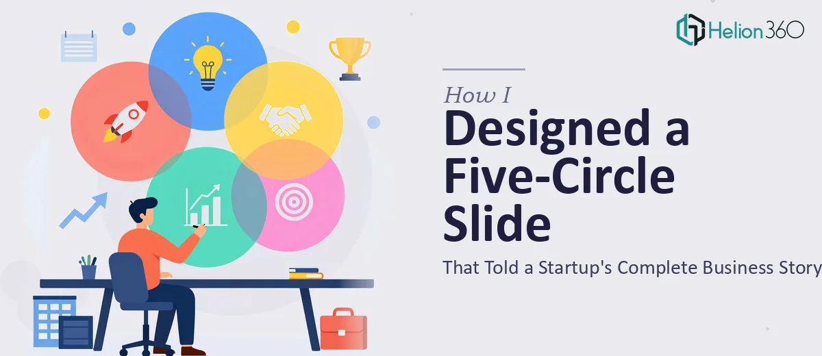
The moment I started placing the five circles on the canvas, the real challenge surfaced. Five equal shapes need to feel intentional — not just symmetrical, but visually weighted so the eye moves through them in a logical order. You can arrange five circles in a row, a pentagon, an arc, or a hub-and-spoke layout. Each choice sends a different message about how the business areas relate to each other.
I tried a horizontal row first. It looked flat and crowded. Then I shifted to a circular arrangement, which felt more dynamic, but the copy inside each circle became unreadable at smaller font sizes. The startup had specific branding guidelines — particular colors, a custom typeface, and a logo placement rule — and none of my early layouts were respecting all three at once.
On top of that, the copy for each circle had to do serious work. Each caption needed to communicate an entire business function in under fifteen words, stay on-brand in tone, and remain legible from a distance. Writing tight copy for a visual format is a different skill than writing paragraphs, and I kept second-guessing every word choice.
After two rounds of self-revision and a growing sense that I was making it worse rather than better, I stepped back.
Bringing in a Team That Does This Every Day
A colleague had mentioned Helion360 when a similar design crunch came up on another project. I reached out, explained the brief — one slide, five circles, startup branding, conference deadline — and shared the brand guidelines and the draft copy I had been wrestling with.
Their team asked a few sharp questions upfront. What was the visual hierarchy? Should the circles feel equal, or was one the anchor? Was the copy fixed or still flexible? Those questions alone helped me see what I had been missing: I had been treating it as a layout problem when it was actually a communication design problem. The circles were not decorations. They were an argument about how the business worked.
Helion360 came back with a pentagon arrangement that placed the company's core value proposition at the center — implied rather than stated — while the five circles radiated outward in a way that felt like a system rather than a list. The copy they refined was tighter and punchy without losing the startup's voice. The branding landed cleanly: colors matched the guidelines exactly, the typeface was applied at a size that remained legible at conference-room scale, and the logo sat in the one spot where it did not compete with the content.
What the Finished Slide Actually Did
Seeing the completed version made the gap between my draft and the final product very clear. It was not just prettier — it was more readable, more confident, and more aligned with what a conference audience actually needs. When you have thirty seconds to scan a slide, every design decision either helps or hurts. This one helped.
The five-circle layout worked because it treated the circles as connected nodes rather than isolated badges. The copy worked because each phrase was written with the visual space in mind, not just the information. That combination — design and copy solved together — is what I had been unable to achieve working alone on a tight timeline.
What I Took Away From the Experience
A single-slide design for a startup conference is not a small task dressed up as one. The constraint of one slide raises the stakes for every element on it. Layout, hierarchy, copy, branding, and legibility all have to work in the same frame at the same time, with no extra slides to recover on.
If you're working on a similar challenge — one high-stakes PowerPoint slide, a circular diagram, or a visual layout that needs to carry real meaning — consider professional startup pitch deck design services. They handle the parts of projects that are genuinely beyond what solo work can resolve on tight timelines, and deliver exactly what the brief requires.
Learn more from real case studies: how compelling pitch decks were designed for investor attention, and how professional PowerPoint presentations won over stakeholders.